

I’ve never cared much for color photography. Never shot it in the film era, don’t pay any attention to it in the digital era. Not that I’d be so militant as to buy a Monochrome; it’s much easier to simply chimp, edit and print RAW files in B&W. It’s partially a function of when I came of age photographically – the early 1970s, when B&W constituted the majority of both journalistic photography and whatever photography aspired to personal expression. Color photography was the product of the inconsequential snap-shot, the throw-away photo taken with the Instamatic. Color photographs were thin and transparent, lacking the visual ‘heft’ of B&W. They valued the superficial – color! – at the expense of the visually complex – form. I’ve carried these prejudices with me into the present.
Of course, that’s ancient history, certainly by the 80’s with the introduction of ‘professional’ color films, which was itself the result of larger trends in visual media – the rise of color television as the common visual medium, replacing print media like LIfe and Vu and Look as defining the visually normative. You see the change most obviously in the transformation of photojournalist imagery from the 60s to the late 70s and onward. Compare Larry Burrow’s B&W Viet Nam photos – while thematically distinct from the WW2 photographs of Capa etc, still sharing a common B&W visual language – with the late 70’s color work of Susan Meiselas in Nicaragua and El Salvador. Both are exceptionally skilled and thoughtful photographers; what differentiates their work is the medium they used. To my eye, Burrow’s work has an emotional impact that Meiselas lacks; it’s almost impossible for me not to aestheticize Meiselas’s work, even though some of it is remarkably gruesome. It’s the color, which seems to connote two things to me: banality, and cheap beautification. Understand, I’m not accusing Meisalas of cheapening what she photographs, rather, I’m reflecting on my own inherent biases and using them as an example of how each of us constructs meaning from photos.
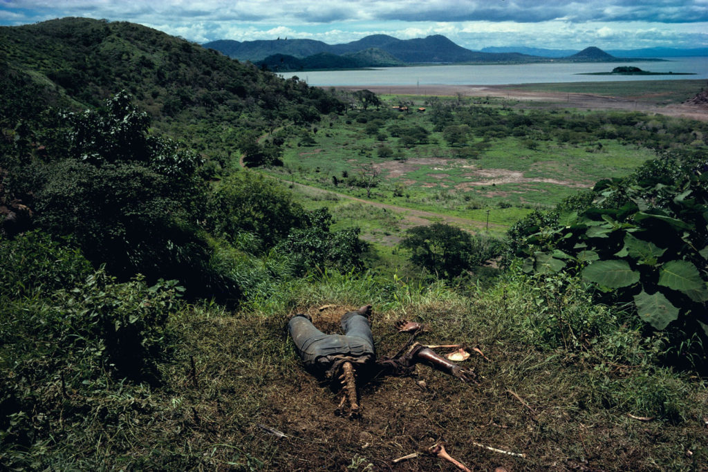
Susan Meisalas, “Cuesta del Plomo”, showing a half-devoured body on a hillside outside Managua. Gross…but I can’t help thinking of how beautiful Managua’s landscape must be. Need to put that on my “to visit” list.
*************
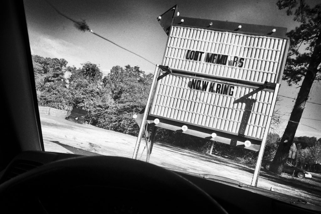
Above is a photo that will probably find its way into Car Sick, the book I’ve been shilling for the last few weeks. While it looks like a B&W film photo (nice Tri-X contrast and grain) it’s from a RAW file taken with a Ricoh GXR (10 years old now, and “obsolete” or so I’m told, it remains a remarkable camera, especially when using the M-Mount mated with an older LTM optic; why anyone shooting “leica style” would need anything else is completely beyond me). The “original” leads off the post; a banal color snap of no visual interest. But monochromed, with some pronounced grain added, a hint of light fall-off at the edges of the frame, now, to my eye, it’s just right, the perfect confluence of B&W contrast and grain and film era optics to produce my idea of what a photo out a car window should look like. 5 years ago I’d have a vague sense that I was ‘cheating’; now I couldn’t care less. I’m tired of arguments about media and technique. It’s the image that counts; who cares how you get there (up to a point: see below for the usual qualifications). The point is the aesthetic. I understand and have internalized the B&W aesthetic, maybe in a way that photographers born after 1980 can’t. I ‘see’ in grainy B&W. Luckily for me, there’s seemingly no Instagram ‘filter’ for my look, so I get to claim it legitimately. Instead of selecting a random ‘filter’ on a photo app or social media site, I learned it the hard way. I earned it; it’s been incorporated into my vision. It’s how I see, not some pre-selected veneer I’ve made an arbitrary decision to paste over my subject. My style is, in some way, my subject.
What’s remarkable to me is how foreign this is to today’s photographers. Raised with the easy color capture of digital – but also raised in the visual language of color TV and the ubiquity of public advertising – color is their normative way of seeing, which it should be, right? Talk to them of B&W and they’ll reply, “The world is color. We should reproduce it as such. It’s B&W which is artificial, necessary only for so long as the technology hadn’t matured to the point to transcend it as a limitation. It’s no longer needed. we’ve moved past it.”
Except that, ironically, one can argue that this new visual language- the language of color that’s become synonymous with photography since the 1980s – is the ultimate artificiality now at the core of photography. It is so because it further obfuscates for us the inherent artificiality of photography as a medium. We hold a 3×5 piece of paper with 2D colored ink (or silver halide) representations engraved on its surface and consider it a transparent slice of the real. Its color is one more means of obscuring the fact of its artificiality, of its inherently constructed nature. It seduces us, the viewer, into thinking we’re seeing an objective representation of something real out there, when what we’re really looking at is a piece of paper of abstracted signs in our hand.
What we’re viewing on that piece of paper (or screen) is someone’s coded representation of their subjective interpretation of the real, subjective in the same sense that Cezanne’s paintings of late 19th Century French life were subjective takes on that life. And just like paintings, some photographs are more compelling than others, they being so not because they more accurately reproduce reality than that they create a coded reality that compels us as viewers. It’s why we venerate Robert Frank while laughing at the junk that gets posted on enthusiast websites. And it’s why some people – myself included – continue to shoot in B&W. It’s how we see.
Views: 685