

I’ve never cared much for color photography. Never shot it in the film era, don’t pay any attention to it in the digital era. Not that I’d be so militant as to buy a Monochrome; it’s much easier to simply chimp, edit and print RAW files in B&W. It’s partially a function of when I came of age photographically – the early 1970s, when B&W constituted the majority of both journalistic photography and whatever photography aspired to personal expression. Color photography was the product of the inconsequential snap-shot, the throw-away photo taken with the Instamatic. Color photographs were thin and transparent, lacking the visual ‘heft’ of B&W. They valued the superficial – color! – at the expense of the visually complex – form. I’ve carried these prejudices with me into the present.
Of course, that’s ancient history, certainly by the 80’s with the introduction of ‘professional’ color films, which was itself the result of larger trends in visual media – the rise of color television as the common visual medium, replacing print media like LIfe and Vu and Look as defining the visually normative. You see the change most obviously in the transformation of photojournalist imagery from the 60s to the late 70s and onward. Compare Larry Burrow’s B&W Viet Nam photos – while thematically distinct from the WW2 photographs of Capa etc, still sharing a common B&W visual language – with the late 70’s color work of Susan Meiselas in Nicaragua and El Salvador. Both are exceptionally skilled and thoughtful photographers; what differentiates their work is the medium they used. To my eye, Burrow’s work has an emotional impact that Meiselas lacks; it’s almost impossible for me not to aestheticize Meiselas’s work, even though some of it is remarkably gruesome. It’s the color, which seems to connote two things to me: banality, and cheap beautification. Understand, I’m not accusing Meisalas of cheapening what she photographs, rather, I’m reflecting on my own inherent biases and using them as an example of how each of us constructs meaning from photos.
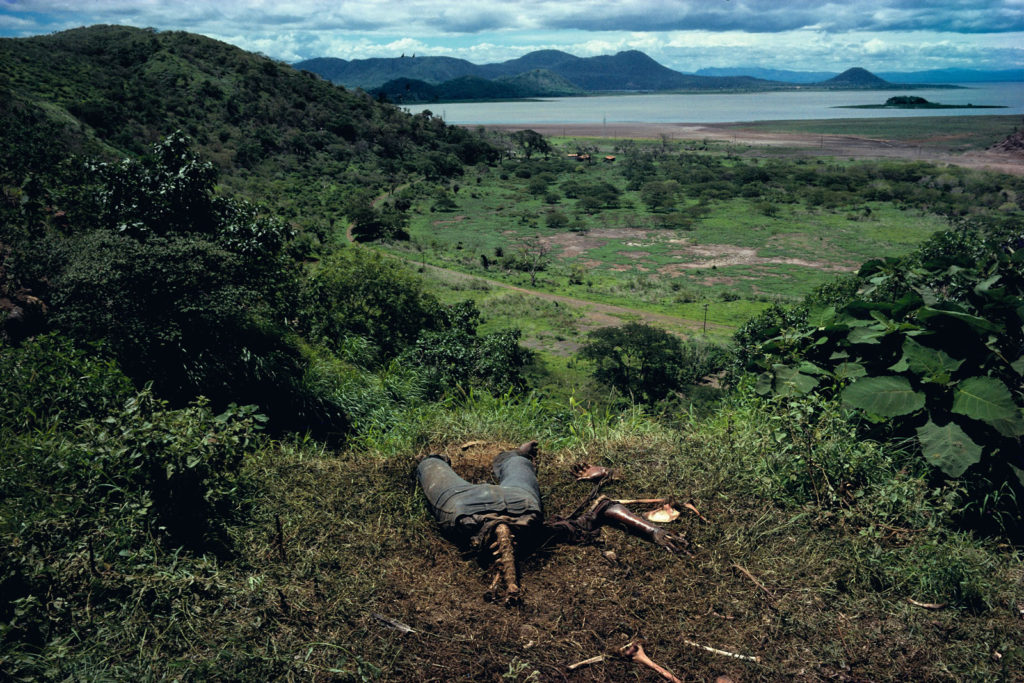
Susan Meisalas, “Cuesta del Plomo”, showing a half-devoured body on a hillside outside Managua. Gross…but I can’t help thinking of how beautiful Managua’s landscape must be. Need to put that on my “to visit” list.
*************
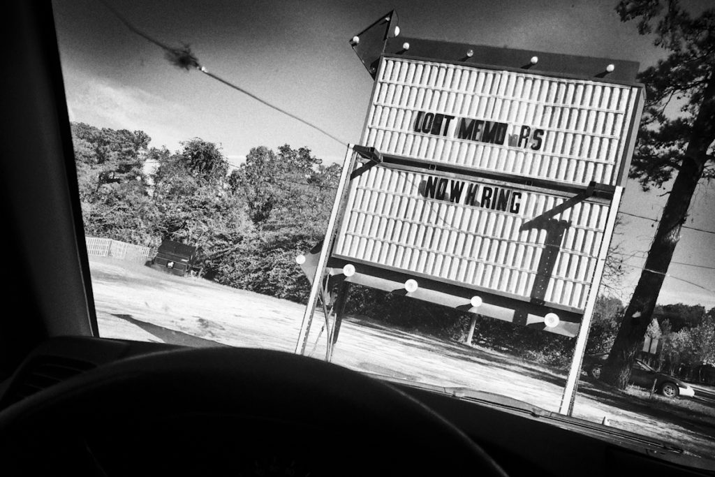
Above is a photo that will probably find its way into Car Sick, the book I’ve been shilling for the last few weeks. While it looks like a B&W film photo (nice Tri-X contrast and grain) it’s from a RAW file taken with a Ricoh GXR (10 years old now, and “obsolete” or so I’m told, it remains a remarkable camera, especially when using the M-Mount mated with an older LTM optic; why anyone shooting “leica style” would need anything else is completely beyond me). The “original” leads off the post; a banal color snap of no visual interest. But monochromed, with some pronounced grain added, a hint of light fall-off at the edges of the frame, now, to my eye, it’s just right, the perfect confluence of B&W contrast and grain and film era optics to produce my idea of what a photo out a car window should look like. 5 years ago I’d have a vague sense that I was ‘cheating’; now I couldn’t care less. I’m tired of arguments about media and technique. It’s the image that counts; who cares how you get there (up to a point: see below for the usual qualifications). The point is the aesthetic. I understand and have internalized the B&W aesthetic, maybe in a way that photographers born after 1980 can’t. I ‘see’ in grainy B&W. Luckily for me, there’s seemingly no Instagram ‘filter’ for my look, so I get to claim it legitimately. Instead of selecting a random ‘filter’ on a photo app or social media site, I learned it the hard way. I earned it; it’s been incorporated into my vision. It’s how I see, not some pre-selected veneer I’ve made an arbitrary decision to paste over my subject. My style is, in some way, my subject.
What’s remarkable to me is how foreign this is to today’s photographers. Raised with the easy color capture of digital – but also raised in the visual language of color TV and the ubiquity of public advertising – color is their normative way of seeing, which it should be, right? Talk to them of B&W and they’ll reply, “The world is color. We should reproduce it as such. It’s B&W which is artificial, necessary only for so long as the technology hadn’t matured to the point to transcend it as a limitation. It’s no longer needed. we’ve moved past it.”
Except that, ironically, one can argue that this new visual language- the language of color that’s become synonymous with photography since the 1980s – is the ultimate artificiality now at the core of photography. It is so because it further obfuscates for us the inherent artificiality of photography as a medium. We hold a 3×5 piece of paper with 2D colored ink (or silver halide) representations engraved on its surface and consider it a transparent slice of the real. Its color is one more means of obscuring the fact of its artificiality, of its inherently constructed nature. It seduces us, the viewer, into thinking we’re seeing an objective representation of something real out there, when what we’re really looking at is a piece of paper of abstracted signs in our hand.
What we’re viewing on that piece of paper (or screen) is someone’s coded representation of their subjective interpretation of the real, subjective in the same sense that Cezanne’s paintings of late 19th Century French life were subjective takes on that life. And just like paintings, some photographs are more compelling than others, they being so not because they more accurately reproduce reality than that they create a coded reality that compels us as viewers. It’s why we venerate Robert Frank while laughing at the junk that gets posted on enthusiast websites. And it’s why some people – myself included – continue to shoot in B&W. It’s how we see.
There’s another way of looking at the matter, and that’s from the perspective of who is making the photograph, and to what purpose.
Colour photography has been around in advertising for a long, long time; it used to be very expensive if it was going to be any good, and processing colour was also logistically pretty difficult for the amateur.
That instantly put a major barrier in place, because as beautiful as they might have been, transparencies were a bit if a bastard medium best reserved for reproduction purposes than domestic use. Why? Well, if you have ever been subjected to anyone’s slide projection shows, you will know exactly what I mean: complications of screen, projection, darkened room etc. etc. and the difficulty of escape. A show was an event!
Colour negatives meant colour prints, and that usually pushed people to yet another outlet in order to get the things processed and printed. Those prints were a lottery, with the odds stacked just as highly against your success; though prints from slides became possible without internegatives (more expense) by virtue of materials such as Cibachrome, if you have worked with it, you realise why it is both difficult to get good prints from it and why so expensive when you can.
Consequently, for the amateur photographer, black and white represented – and still does – a far more accessible medium that also provided the unexpected bonus of being surprisingly enjoyable to work with even after you made the shot. (That’s where I start to lose admiration for people like H-CB, who didn’t do their own processing, yet spouted forth about never having to use a light meter because they “just knew light”. Bullshit: the pain was felt by the schmucks in the darkrooms that handled their production.)
Technical considerations and price aside, I am in no doubt that the two mediums are poles apart. It is really a matter of horses for courses, with the courses ever more polarised, I believe. If it’s true that the majority of photographers post to social media, then the cellphone and colour must be the default condition. That kinda suggests that the other users (or even the same people in some cases) of cameras use them to make memories. Memories are perhaps? best served by a print, because you can pop it into your wallet or into a frame. If your cellphone dies and you don’t have backup, ciao ciao, bambini.
Should one like to think of one’s photography as an art form, then I think that black and white gives far wider scope, if only because as it starts from a point of abstraction, it can be pushed further than can colour, which tied to the commonly held belief in its reality of representation of what was there, starts to look silly after very little manipulation.
I agree with Tim that in the end, the only thing that matters is the final result, the image we show the world. How we get there is our business, our personal road to the image, and shouldn’t interest the viewer unless he, too, is a photographer. Which becomes his problem, not ours.
When one does develop a deep interest in photography, it’s pretty certain that the work of those who went before us becomes ever more enthralling, and the further back we dig, the more black and white we discover. That can’t but influence our own later choices. For those of us who began our adventure in photography from admiring other photographers, it’s a natural route; for the current, casual user of the cellphone camera, it might be the opposite way around: his own work drives the effort to improve, and when he does, that’s perhaps the time when he looks outwith his own world to the history of the medium. However, if he stops digging too soon, he will never discover the founding giants of black and white, the guys who invented both the language and the conversation.
Rob
Glad to see that everything is working. Cheers
I always tell people the story about when Cartier-Bresson met William Eggleston at a dinner party and said to him, “You know, Bill, colour is bullshit”.
I recently was forced to upgrade my iPhone (my old one started making random phone calls without my intervention!). So I have now a much better digital camera in my possession, even if i didn’t want one. But I set all the photographs to black and white, i don’t even want to see them in colour for an instant! After several hundred rolls of black-and-white film photography this is easy, but before it would have been much harder to make that switch. It is all about pre-visualization. I don’t think I could take a colour photograph now….
Though I usually prefer a final black/white image, I still like the idea of having choice right up to the end. It has sometimes altered my perception of what it was that I thought I had been photographing.
HC-B has made some odd pronouncements during the years, sometimes, I feel, simply in order to mask a mistake or to promote the aura of seer. The notion of looking at contact sheets upside down, for instance, seems ridiculous: I have had to look at thousands of my own 135 format contact sheets in my lifetime and it’s difficult enough to be sure exactly what you are looking at, never mind the finer details! And pretending that “geometry”, the shape, reveals itself better standing on its head is crazy: you just need to flip an image left-to-right on the monitor to understand that even that little change can make or break a mood, the sense of psychological balance.
I have my doubts about previsualisation, as it were; in my own case, I believe that I can see something and think that it holds some inner significance, but only when I look at it on the monitor can I honestly claim to see a definite “message” or that there is a significance, if that’s a better word for it. Sometimes, I see absolutely nothing, and wonder what on Earth I thought I’d seen. Sure, if you have to shoot to a layout, then you have almost all of the shot previsualised for you, but that’s a different concept to free shooting, driven by reaction. It’s one reason why good stock photography is not that easy to do: you need to dream up something pretty good that can stand on its own, and still be better than somebody else’s amazing fluke.
You nailed it again!
While I love Eggleston and others, it’s the gray tones that inspire my photography.
Hmmm. I am not sure I am convinced that colour is “ultimate artificiality now at the core of photography.” B/w is also artificial, and in the same way. The heart of the artificial in photography now probably resides in its electrical nature (the iphone 11 now proudly produces ‘computational images’) , but there have been worries about the misleading, deceptively lifelike in image making since at least Myron and Phidias (contemporaries were astonished that anything so real had been made) and reflected in the statue scene in Shakespeare’s ‘A Winters Tale’. But that is another debate. What interests me is why we/I shot colour as well as B/w. For my own part it is because among my most treasured possessions are colour slides from my childhood in the 1960s and 1970s, and those of my own children’s childhood in the noughties. Colour is informational and historically fixed in a way that black and white isn’t, and sometimes that historicity is what we want, whether it be to indulge the nostalgic or to know what colour something was. There is a quality to the browns, creams and oranges of 1970s wallpaper for example, that still reveals itself even though kodakchrome fades. Oddly, Portra 400 prints look vintage to me. So, I shoot colour slides as well as Tri-X, and I do it because I know that in 15 or 20 years (if I am still here) I will pick them up and see on a light box a world that is no more, but once was, and I will see it in a way that I would not with a b/w print. Of course, two dimensional images can’t be the real thing but they can release our memory and our imagination in such a way as to recall the past to us.
Good points, Gavin, but it feels as if you are really writing about family shots rather than photography as “art”. There may be nostalgia – and an embarrassed giggle – to be enjoyed from looking again at the horrors of 50s and 60s wallpapers, and those ubiquitous china ducks that flew eternally across it without ever getting to the other side of the wall.
I’m not sure that too much realism or memory is a good thing. My late father-in-law was fond of making home movies; how many times can a wife walk from point A to point B, wave, and look convincing? Not even once. It’s excruciating to have to watch: the same brief walk in every holiday destination they enjoyed. He shot some footage of my wedding with his daughter. A year or two after she died her brother sent me a CD compilation of it. I watched once and the experience was very painful, not something I want to inflict upon myself again any time soon; I have two small prints – a portrait of her torn from her International Driving Licence that I shot when she was about forty, the other a spare copy wedged into a corner of a framed shot of our two kids as kids. To me, those are worth dying for in an attempt to rescue them should the place catch fire.
I guess that if we accept that photography is never realistically accurate, that it is always nothing more than an impression from one angle, that forensic photographers have a helluva time working to suit legal requirements to overcome that subjectvity, maybe we can at last look at photography as just an expression of something, and not as a documentation of fact.
Then, we can enjoy the freedom of it.
Rob, you are right that I wasn’t thinking principally about art (if it is possible for photography to be art (my aesthetics tutor in philosophy thought not, but I disagreed); if my practice of photography (its’ a hobby – I am not and have never been a professional) was aimed at being art I doubt that I would manage more than a roll of film a year, and I would probably not bother with 35mm at all (even with a Leica)
What fascinates me in photography (and it has this at least in common with painting and literature) is that the significance of what we do reveals itself over time and often only after some significant gap in time. What we think is important, or what we intend at any one moment, may not be important and our intention may not be what we think it is. For at least 2,500 years we have been puzzling over inspiration (being breathed within by a god, as the ancient Greeks would say) and where it comes from. I prefer black and white (I probably use it 90% of the time I pick up a camera) but there is something about colour and in particular, chromes, that is magnificent when it works (it is very demanding to do well). The people who made the stained glass windows at Chartres and York cathedrals and who painted in the 13th and 14th centuries using lapis lazuli brought from Afghanistan to Europe must have thought so as well. Jacques Lartigue’s autochromes are marvellous, as are his family snapshots in b/w.
“What fascinates me in photography (and it has this at least in common with painting and literature) is that the significance of what we do reveals itself over time and often only after some significant gap in time. What we think is important, or what we intend at any one moment, may not be important and our intention may not be what we think it is.”
This is wonderfully insightful.
I think Saul Leiter was a color photography master. His B&W is fine; his color work is genre defining. But it is not representational photography, and I think that is key.
Yes, I pretty much agree with that. However, a lot of the emotional kick that it gives me is due to the way the medium looks when seen on a computer or in a magazine. By medium, I mean the thing on which the image has been captured; the softer, more gentle look of film.
I had been looking at more of his work this afternoon, and I came across shots that I think have a digital provenance. And here’s the thing: I don’t think they work. They look too sharp, too saturated and just like somebody else’s homage stuff might look were it being shot today. In other words, as if he had been ripping himself off. Could it be that, had he been working on digital back then, his magic might never have happened, that he’d have missed the emotional boat?
I think this ties in with Gavin’s suggestion that what we shoot today may not be what we see a few years down the line. And equally so, it might also differ in the mind of the viewer with memory of that earlier period, which, as I found Leiter in a Popular Photography Annual back at the close of the 50s, puts me pretty close to the time of shooting, even if I was relatively young compared with Saul.
Would the graphics – as in the shapes – have been enough to cast the same spell? Similarly, would Sarah Moon’s Pirelli calendar of the early 70s have been as memorable if, instead of being shot on Ansco’s GAF 500, the very same images had been produced on finest, slowest Kodachrome? I very much doubt it: it’s oils and watercolour.
I agree that the “digital” stuff isn’t a match for the filmic photography. But… is this a case where the photographer uses the medium (film) to his/her/its fullest extent, and to its fullest capabilities? No, Leiter on digital isn’t the same. Which maybe makes Leiter on film all the better. (?)
Is there anyone out there using digital in a way that is totally unique? Can digital be totally unique? Or is it always a pale reminder of what once was?
No, I think digital is totally unique, in the sense that unique may signify different.
For a start, it allows a lot more second-guessing on the part of the author, lets him save something that is on the borderline, for one reason or another. Using the tools available to a colour file allows for post-shooting filtration (on black/white pictures) without loss of speed ( ISO sensitivity), one good reason for not buying into the concept of a black/white only camera like the Leica Mono. In my view, the more possibilities you have, the better off you might be if you need them. You are not obliged to use ’em if you don’t want to. But you can’t use ’em when they aren’t there.
Digital, if you get into SHOWstudio.com on youtube, and watch a few of Nick Knight’s videos, you see he has turned the professional game on its head. It has made possible what we imagined to be impossible. Whether or not he’s able to claim uniqueness is another mattter, but he sure can do things with his digital Nikon that were impossible with his film one. There are two videos of his, a making of, and the final production, of a fashion shoot in Brighton, England, over two rainy days. Available light, two light cameras: a Nikon D810 for stills and a little Sony for the motion. The irony with this, as I noted over a while with the late Peter Lindbergh making ofs, is that the videos are eventually more interesting than the stills for the magazine (Vogue) with the videographer, Nick’s female assistant, shooting entirely off her own bat and making a fine job of it.
The two links to Nick Knight’s Brighton video, but whether one should call it his or his assistant’s is another matter!
https://www.youtube.com/watch?v=Uc5OaTiRuFA
https://www.youtube.com/watch?v=xV2Ea_046hk
Your photo of the sign is fascinating in the way it changes character when the color is taken away.
I don’t particularly notice the after effects, but I think what really drives the difference is that the “text”on the sign is vastly more important in the b&w. In the color there’s a lot going on, the text is a non-entity. The “lot going on” is pretty lousy.
Draining the color pushes all the lousy stuff into the background, and brings out the enigmatic text.
I’m not sure if this says anything about the superiority of b&w, since more often than not the opposite occurs when you translate to monochrome.
I think.
Nice to see you posting; I don’t think you are correct in that last sentence: most of my current photography is converted to black and white, precisely because it allows me to isolate or otherwise focus attention on the guts of the thing in the frame.
As I think I’ve mentioned before, black/white allows the fiddling about with a capture to a greater degree than does colour, simply because with colour, fiddling with it soon removes it from experience and rings aesthetic alarm bells. Starting from the accepted convention of black/white being at least one remove from reality, further work doesn’t seem out of place unless done badly.
Superiority of one over the other may be a false premise, either way. Horses for courses generally wins the award.
Shooting through a Bayer filter and then desaturating won’t give you that unquantifiable that was portrayed by film. Your interpretation of the photo is perceived by the conscious mind but you won’t be able to express the identification of the subconscious perception in a conscious mind.
We are always trying to acquire information and we believe that the conscious mind is the arbiter of our perceptions but we are not consciously aware of the subconscious drives that help us to distinguish the emotional aspect of what we have integrated through seeing.
As humans we have a set “ingredient list”, so to speak, and we check off the boxes as we interpret what we are seeing….it’s a subconscious requirement to identify as many relevant inputs as possible. We are junkies for information, the more we get the more certain (or satisfied) we are, at least consciously.
The way we interpret these inputs (or lack of) leads to statements like “It’s not quite getting it all” , or “there’s something missing”….whatever it is, it’s less than satisfying. Or, you’re having to do a lot of post processing to try and convey rather than having the file do the work.
I think the reason that we relate to film in a stronger way is that we aren’t having to work through a filter to get those check boxes, checked.
“I think the reason that we relate to film in a stronger way is that we aren’t having to work through a filter to get those check boxes, checked.”
That’s one take, but it ignores the fact that many photographers do/did exactly what you state they do not: they use(d) filters to get what they think they want to see, and if they know their film, filters and processing pretty well, might actually get there. If your reference to filters was a bit wider than filters, literally, don’t overlook the fact that film came bundled with lots of problems of its own, such as batch fidelity, screening radiation perils, vulnerability to temperature, degredation of latent image if processing held off too long, the list of how film could screw you is endless. The filter that is a darkroom was one pretty important filter, too! In the case of the quality of prints, vital.
From whatever my own experience may be worth, any love of film stems not from film (black/white) per se, but greatly from the look of a silver paper print. And even there, in my case, paper only pulled those special rabbits out of the hat when it was WSG, very well glazed. A good 8″ x 10″ colour transparency on a proper lightbox provides the finest display of colour photography I have ever seen. Nothing beats it, especially not prints, limited as they are to reflected light viewing.
Should we widen the net a bit further, the very machines used for film capture came with their own cachet of magic. Using one of those classic cameras such as a Leica M3, a Nikon F or the Hasselblad 500 Series took one to another level of self-belief and confidence: one just felt at the top of one’s game, and that is always very important. For myself, I cannot think of a single digital camera that could make me feel that way, which is perhaps why I have no lust for them these days. The top of the new school may be infinitely more expensive in relative terms, but it wasn’t simply about price: it was also about that psychological boost that I have just outlined, which is not to deny that exclusivity came with a smile. As did the Rolex that was stolen from me.
;-(
Rob
I think I was referring more to the Bayer filter and the in camera processing of the image as a “filter”. To oversimplify, we are getting a straight shot of the electromagnetic energy directly on to a substrate rather than a computer manipulation.
Given that…I’m old so standing in a darkroom is certainly less attractive than roaming around so I’m using a Monochrom and M240 but I completely agree on the prints and potential for problems in the darkroom.