You’re right: had the giants of early Magnum being shooting in colour, there would, today, be no legend
LeicaphilaPost author
I totally agree. And I think that’s one major reason I dislike most contemporary photography – it’s in color. It justs doesn’t have the punch of a good b&w photo. Less is more.
I tend to agree with that, but there are many exceptions should one move outwith the street/reportage genre.
My own stuff has been b/w most of the time since going digital. I simply don’t feel much attraction to colour and, anyway, it’s very limiting in where you can take many pictures. To me, highly manipulated colour is usually ugly. Perhaps that’s because we all have a native idea of what things are actually like in colour – assuming normal vision – and so manipulation instantly corresponds with fake. No such natural comparison is made with b/w since it is already removed from any reality, and we have had generations of human experience behind us to prepare our brains to accept and not question too much.
Black and white photography lends itself very nicely to the old comparison with music, that the neg (untouched file) is the score, and the performance resides in the print or finished file, depending on where you choose to display your efforts. I have not found that to be the case with colour, where getting it right in camera – especially in the golden era of Kodachrome – meant you got one reasonable chance to be right in any single shot.
I did have the run of the pro colour lab in the engineering company where I first worked as a photographer – for a while I did all the colour printing – and naturally enough, the odd personal colour neg found itself in the Durst. I tried a few wild diversions from sensible filtration just for fun, but it never worked very well, at least in my view. Crude looking stuff was all I managed to produce for my trouble.
Rob said “No such natural comparison is made with b/w since it is already removed from any reality”
Am I alone thinking that it’s weird that photojournalism could be considered better in B&W and yet B&W could be considered as being “removed from any reality”?
LeicaphilaPost author
It is somewhat of a paradox. Probably just a learned prejudice. You’ve hit on something.
In my mind color in some way detracts from a photo. B&W has a more pronounced formal quality (i.e. its less about the content than the form). Of course, this is exactly counter to what we expect of a journalistic photo, where it should always be about content.
Do you not think that it is perhaps the polar opposite? That B&W as photojournalism tends to be documentary in form, there is only tone and contrast. Whatever, you are a specialist.
I dunno, but the weird colours that Saul Leiter (for instance) managed to squeeze out could be anything, and rather than a street scene, since the first thing you see are the bold orangey blocks of colour, perhaps something more abstract?
What I do see all too often – not here I hasten to add – are subjects of little or no interest being given monochromatic treatment in an attempt to add interest.
LeicaphilaPost author
Interesting. I see the opposite. After a year or two of exhaustive gallery hoping in Paris in 03-05, I fashioned the following rule of thumb for photographs worthy of gallery space: If your photos aren’t very good, make them really colorful; If that doesn’t work, make them really big.
Well, Keith, I think it goes back to what I mentioned about us having several generations of b/w experience behind us, and let’s face it, the news theatres and magazines of the WW2 era (and before that time) were in b/w, at least as far as I can remember. Some bigger movies were colour, but not any news material that I recall.
So, seeing war in b/w would have been seen through the filter of familiarity. If anything, censorship was a greater distortion of any reality than colour/black and white considerations.
In the Genius of Photography series, there’s an American photographer who was with their army shooting stuff with his personal Argus, because the army-supplied 4×5 was a useless tool. He mentions the fact that lots of his films were confiscated because it was prohibited to show Allied corpses. He sports an Italian name, and went on to be a successful showbiz photographer. Tony Vaccaro! It came back! (All is not yet lost up there inside; just takes time, now and again!)
Rob
Stephen J
I reckon that Tony Vaccaro’s most famous war photo is the polar opposite to some other more sensationalist stuff on that subject.
Even though I went to his gallery show at the Getty gallery a few years back, I did not know about that prejudicial behaviour. As you say, memory is a strange beast.
I do remember his relating the story of how he looted a photographic shop in France and developed his rolls in his tin helmet. Further “authentication” was serendipitously arrived at by a flood in the place where his negatives were stored.
1. If you use the “Reply” link with the down pointing arrow, the reply becomes a response to a specific post and creates a thread with indented entries. However, indenting is apparently limited to about three responses, probably due to linewidth concerns.
2. If you use the Reply box directly, it creates a new post at the bottom of the list, however:
3. Our replies go through a validation process which means that the response may not be the next in line.
Regarding my remark:
It was meant (in jest) to refer to the last couple of responses lauding B&W as the next best thing since sliced bread, especially for journalism. I think Keith brings up a very interesting and important point. I also believe it flies directly into the face of Tim’s general thesis on this blog that our reality is shaped by our visual intake (and that visual reality is becoming more and more malleable). If you put any form of photography on a pedestal like that, then whatever prejudices we do have with that processing, apparently blocks us from flowing the creative juices to generate expressions in other modes.
It is interesting to note that you guys talk of B&W as “medium” where I, distinctly as a child of the digital age, think of B&W as a “modus”.
And for me B&W is simply a modus to emphasise shape and contrast. Whenever images lean on shape and contrast, they are good candidates for B&W. The images in this article being prime examples of this. However, a quick visit to the world press photo of the year website will immediately show the error of the B&W supposition. Most images depicting flames for example have a lot more impact in color. (for me personally, in my never humble opinion, ymmv, c.e., yada yada).
An interesting discussion for sure. My apologies if my previous posting didn’t come across correctly as a mere jest.
I think you have explained your own problem re. the place in life of black and white: you were born too late for it to feel natural. For older folks, it’s decidedly not a mannerism but a natural space to be.
Pretty colours create romance where there is perhaps only hell. For colours I don’t need flames; I need long-haired blondes of East European descent, turquoise seas, perhaps flame-coloured blouses, if you insist, but no fires, trust me, no fires! Not even down below.
Wars are for madmen. Or suicide jockeys, which are something a degree or two different.


Intense, soulful images. Thank you.
Yet more fine examples of document and expression.
Beautiful images. How did you capture them?
How very droll Tim.
Still at least the snaps are decent.
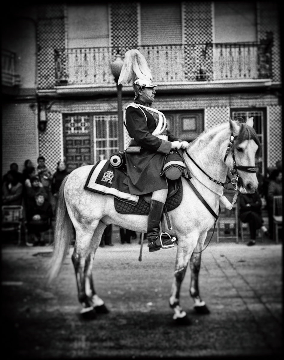
Not sure about the pointy hats though, they look a bit sinister.
Had to look up “droll.”
Made my day; but then, I don’t ask for much these days.
🙂
Great photographs in a classic photojournalism style. Black and white is the perfect, most powerful medium for this type of photography.
Agreed. B&W is photojournalism.
You’re right: had the giants of early Magnum being shooting in colour, there would, today, be no legend
I totally agree. And I think that’s one major reason I dislike most contemporary photography – it’s in color. It justs doesn’t have the punch of a good b&w photo. Less is more.
I tend to agree with that, but there are many exceptions should one move outwith the street/reportage genre.
My own stuff has been b/w most of the time since going digital. I simply don’t feel much attraction to colour and, anyway, it’s very limiting in where you can take many pictures. To me, highly manipulated colour is usually ugly. Perhaps that’s because we all have a native idea of what things are actually like in colour – assuming normal vision – and so manipulation instantly corresponds with fake. No such natural comparison is made with b/w since it is already removed from any reality, and we have had generations of human experience behind us to prepare our brains to accept and not question too much.
Black and white photography lends itself very nicely to the old comparison with music, that the neg (untouched file) is the score, and the performance resides in the print or finished file, depending on where you choose to display your efforts. I have not found that to be the case with colour, where getting it right in camera – especially in the golden era of Kodachrome – meant you got one reasonable chance to be right in any single shot.
I did have the run of the pro colour lab in the engineering company where I first worked as a photographer – for a while I did all the colour printing – and naturally enough, the odd personal colour neg found itself in the Durst. I tried a few wild diversions from sensible filtration just for fun, but it never worked very well, at least in my view. Crude looking stuff was all I managed to produce for my trouble.
Rob
Is that the stench of elitist drivel with a complete lack of creative ingenuity that I smell?
Oh, wait…
Leica.
😉 <———-
Quite possibly. Tell me more….
The format makes it difficult to know to what you refer, to a single post or to the entire thread.
Rob
The formatting appears to be inconsistent which can lead to confusion, offence even.
And that last one of mine was supposed to be tagged to the 32BT post, but appears to be added to Tim’s instead, thus making no sense.
Rob said “No such natural comparison is made with b/w since it is already removed from any reality”
Am I alone thinking that it’s weird that photojournalism could be considered better in B&W and yet B&W could be considered as being “removed from any reality”?
It is somewhat of a paradox. Probably just a learned prejudice. You’ve hit on something.
In my mind color in some way detracts from a photo. B&W has a more pronounced formal quality (i.e. its less about the content than the form). Of course, this is exactly counter to what we expect of a journalistic photo, where it should always be about content.
Precisely.
Do you not think that it is perhaps the polar opposite? That B&W as photojournalism tends to be documentary in form, there is only tone and contrast. Whatever, you are a specialist.
I dunno, but the weird colours that Saul Leiter (for instance) managed to squeeze out could be anything, and rather than a street scene, since the first thing you see are the bold orangey blocks of colour, perhaps something more abstract?
What I do see all too often – not here I hasten to add – are subjects of little or no interest being given monochromatic treatment in an attempt to add interest.
Interesting. I see the opposite. After a year or two of exhaustive gallery hoping in Paris in 03-05, I fashioned the following rule of thumb for photographs worthy of gallery space: If your photos aren’t very good, make them really colorful; If that doesn’t work, make them really big.
Let’s face it, most photography, colour and B&W is crap. It’s very easy to see bad examples of either.
Well, Keith, I think it goes back to what I mentioned about us having several generations of b/w experience behind us, and let’s face it, the news theatres and magazines of the WW2 era (and before that time) were in b/w, at least as far as I can remember. Some bigger movies were colour, but not any news material that I recall.
So, seeing war in b/w would have been seen through the filter of familiarity. If anything, censorship was a greater distortion of any reality than colour/black and white considerations.
In the Genius of Photography series, there’s an American photographer who was with their army shooting stuff with his personal Argus, because the army-supplied 4×5 was a useless tool. He mentions the fact that lots of his films were confiscated because it was prohibited to show Allied corpses. He sports an Italian name, and went on to be a successful showbiz photographer. Tony Vaccaro! It came back! (All is not yet lost up there inside; just takes time, now and again!)
Rob
I reckon that Tony Vaccaro’s most famous war photo is the polar opposite to some other more sensationalist stuff on that subject.
Even though I went to his gallery show at the Getty gallery a few years back, I did not know about that prejudicial behaviour. As you say, memory is a strange beast.
I do remember his relating the story of how he looted a photographic shop in France and developed his rolls in his tin helmet. Further “authentication” was serendipitously arrived at by a flood in the place where his negatives were stored.
1. If you use the “Reply” link with the down pointing arrow, the reply becomes a response to a specific post and creates a thread with indented entries. However, indenting is apparently limited to about three responses, probably due to linewidth concerns.
2. If you use the Reply box directly, it creates a new post at the bottom of the list, however:
3. Our replies go through a validation process which means that the response may not be the next in line.
Regarding my remark:
It was meant (in jest) to refer to the last couple of responses lauding B&W as the next best thing since sliced bread, especially for journalism. I think Keith brings up a very interesting and important point. I also believe it flies directly into the face of Tim’s general thesis on this blog that our reality is shaped by our visual intake (and that visual reality is becoming more and more malleable). If you put any form of photography on a pedestal like that, then whatever prejudices we do have with that processing, apparently blocks us from flowing the creative juices to generate expressions in other modes.
It is interesting to note that you guys talk of B&W as “medium” where I, distinctly as a child of the digital age, think of B&W as a “modus”.
And for me B&W is simply a modus to emphasise shape and contrast. Whenever images lean on shape and contrast, they are good candidates for B&W. The images in this article being prime examples of this. However, a quick visit to the world press photo of the year website will immediately show the error of the B&W supposition. Most images depicting flames for example have a lot more impact in color. (for me personally, in my never humble opinion, ymmv, c.e., yada yada).
An interesting discussion for sure. My apologies if my previous posting didn’t come across correctly as a mere jest.
I often use the reply (down arrow) to respond to a specific post but it doesn’t seem to work consistently.
I used it for this post, so we’ll see.
It didn’t work for me right now: I tried it for 32BT’s post about colourful flames.
Seems to work. Your flame post(*) is indented level 1 like Keith’s post. Your post here is indented level 2.
(*) flame post 😉
I think you have explained your own problem re. the place in life of black and white: you were born too late for it to feel natural. For older folks, it’s decidedly not a mannerism but a natural space to be.
Pretty colours create romance where there is perhaps only hell. For colours I don’t need flames; I need long-haired blondes of East European descent, turquoise seas, perhaps flame-coloured blouses, if you insist, but no fires, trust me, no fires! Not even down below.
Wars are for madmen. Or suicide jockeys, which are something a degree or two different.
🙂
Once again I have no idea who you are addressing.
Ditto!
This starts to sound like the lyrics of a Bob Dylan song: mean what you want them to mean, but you’re probably wrong!.
😉