Category Archives: Aesthetics

Parerga and Paralipomena – Chapter 3. Revisiting the Old, Tired Question: Can Photography Be “Art”?

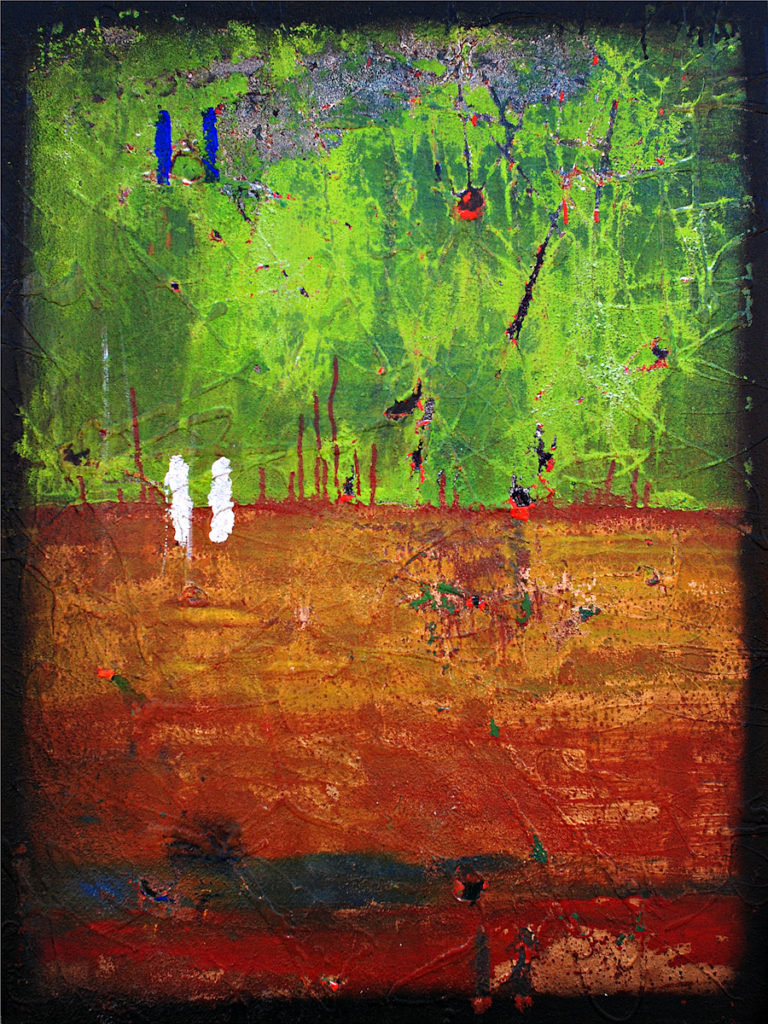
Untitled, 2005, (20×30 Acrylic on Canvas)

Above is a painting I did in 2005. It’s previously been exhibited in an ‘Art Gallery’ in Chapel Hill, North Carolina, which means the gallery owner thought it appropriate to consider as ‘Art.’ Now, irrespective of what you think of the painting and my skills as a painter, chances are you don’t find it unusual that it’s considered ‘Art’ and was offered as a work of ‘Art’ by a gallery that’s in the business of selling such things. Putting aside critical valuation, we agree that a painting is a work of ‘Art.’ I took a blank canvas, took various pigments, and using a brush I made something, a thing, physically created by me from an aesthetic idea I had in my mind. Voila! Art.

Using those same criteria, photography as an ‘Art’ form can be problematic. Photography (still and moving) is a different sort of a creative medium. It has its subjective element – what’s within the frame will always depend on someone’s choice and interpretation – but generally we consider it objective, objective in the sense that it’s a mechanical reproduction of an existing set of visual phenomena. The second characteristic – its status as an objective reproduction, a truthful documentation, the fact that it’s a mechanical means to more or less faithfully record whats “out there”, is seemingly what prevents many otherwise broad-minded people from considering it ‘Art.’

The argument- Is photography ‘Art?’ – is as old as the medium itself. Early photographers naively thought to claim it as ‘Art’ by selectively photographing “scenic” things, thus mimicking the ‘artistic’ treatment of traditional subjects of representational painting – a more exacting form of landscape painting, where the goal was fidelity to the real. Later photographers, like Alfred Steiglitz, founder of the Photo-Secessionist movement, sought to claim it as ‘Art’ by rejecting the larger definition of Art and placing it on equal footing with other forms of expression commonly considered as Art:

“Photography is not an art. Neither is painting, nor sculpture, literature or music. They are only different media for the individual to express his aesthetic feelings… You do not have to be a painter or a sculptor to be an artist. You may be a shoemaker. You may be creative as such. And, if so, you are a greater artist than the majority of the painters whose work is shown in the art galleries of today.”

This doublespeak, of course, is just another way of claiming its status as an art form without using the loaded word itself, to my mind ample evidence that, deep down, even Steiglitz himself felt a wee bit self-conscious about claiming photography to be ‘Art.’ Much has happened since Steiglitz’s era. From an institutional perspective, photography has been presented in American art galleries and art museums since the 1970’s, when “post-modernist” photographers like Friedlander, Winogrand, Arbus and Eggleston, among others, became recognized within the larger ‘Art World.’

*************

Whatever the official Art World line, from a lay perspective there continues to be a common-sense resistance to claim photography as ‘Art.’ Even I, who’s been involved with photography as a creative medium for most of my life, cringe when a photographer bills him or herself as an “artist”, and I’d like to explore the philosophical underpinnings of that discomfort. I suspect it has something to do with the “handedness” we associate with Art, the requirement of creating some ex nihilo, something unique and new. A precondition of ‘Art’ is that the Artist physically make it, physically impose form on undifferentiated material, whether that material be words or tones or rock or canvas. In photography, you could argue, we’re not doing that; instead we’re recording something already existent, something  whose creation resides elsewhere. I’ve touched on this subject before in a piece entitled Formalism and Photography (Can Photos of Statutes Be Art?).

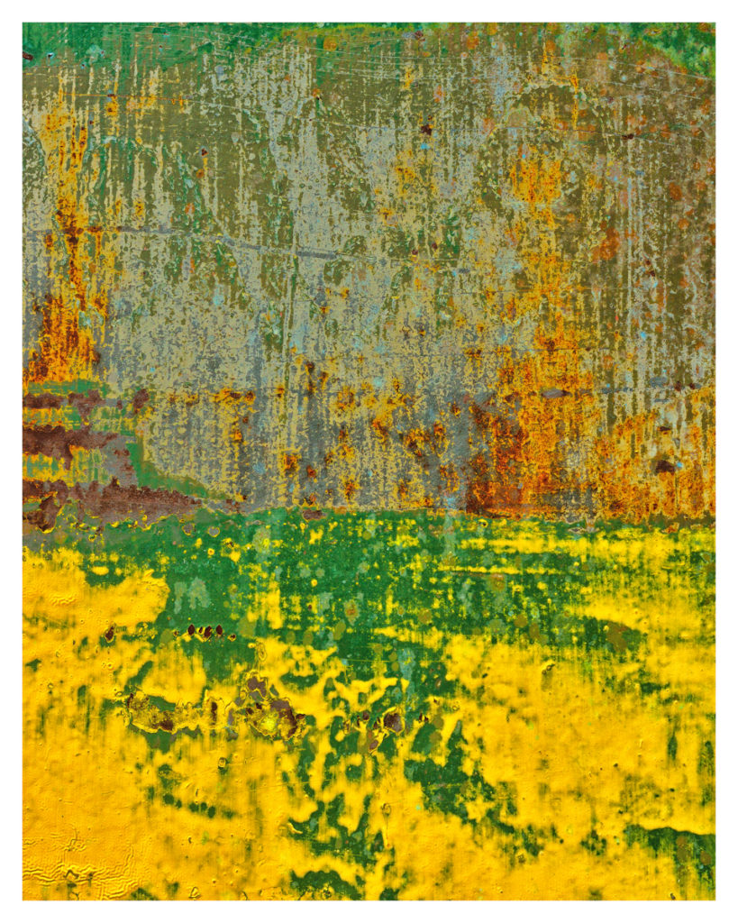
Untitled, 2016

How about Untitled, 2016 above? Is it ‘Art’? It’s something I did in 2016. Formally, it’s remarkably similar to Untitled, 2005 above. Like the former, it’s “modern” in the sense that it’s not representational but rather its own aesthetic reality, created from the ground up by the artist. I consider it competently drawn, its color scheme consistent and complimentary, its pictorial elements situated in an aesthetically pleasing manner. I like it, and would be pleased to have a piece like it hanging in a conspicuous place in my home or, better yet, in someone else’s home, someone who valued it enough to purchase and exhibit it. Except, its not a painting. Its a photograph, a straight-up close-up of a section of a wall of a building recently torn down in the service of progress. What I did was merely isolate it from its larger context by photographing it and, with some very minor post-processing (contrast, saturation, sharpening etc), created the finished work you see, “created it” in the sense that a series of 1’s and 0’s now resides in a certain pattern on a hard disk on my computer. Its literal creation – how those pigments came to be in the manner they are – is an unintended consequence of  building paint, weather and time.

As mentioned previously, we commonly consider a precondition of Art that the Artist physically make it, physically impose form on undifferentiated material. If this is so, then the work itself – a photograph – is problematic; have I “created” anything by simply recording it? Have I imposed form on something undifferentiated, i.e. incoherent and messy, when I photograph? Haven’t I rather just seen and selected, noted for other’s benefit as it were, something that already had a certain form, essentially simply pointing out something aesthetic that already existed, created naturally or by happenstance? Could it be the fact that I isolated the view itself be the creative act? Is that enough?

Additionally, there’s the issue of uniqueness. There’s only one of any given painting. We can reproduce it photographically, yes, but we don’t consider the reproduction to be a piece of Art. Now think about that in terms of photography. Unlike a painting, I’m able to print out my photograph in any number of sizes on any number of different media, run limited editions etc, and sell each individual print as its own work of Art. Yet, irrespective of the size or the type of medium I print it on, the underlying ‘artwork’ will be the same (or will it?). [ This has become an issue with the endless exact replicability of digital capture, as opposed to old school silver halide prints where each print is a unique individual interpretation of a negative.]

I suppose I could do the same thing with the painting i.e. photograph it and present the photographic reproduction as its own work and offer it for sale in a gallery in different sizes and on various media. Why not? Except there’s something intuitively wrong with that when we’re talking about photographic reproductions of two dimensional paintings, or so I think. What’s intuitively wrong with it are two things: first, the fact that it’s a photograph as opposed to something created ‘by hand,’ and second, that it’s not the unique created thing itself.  These facts seem to change the terms of the debate.

*************

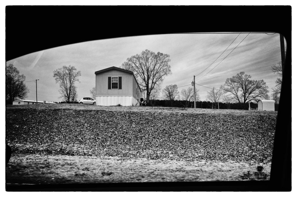
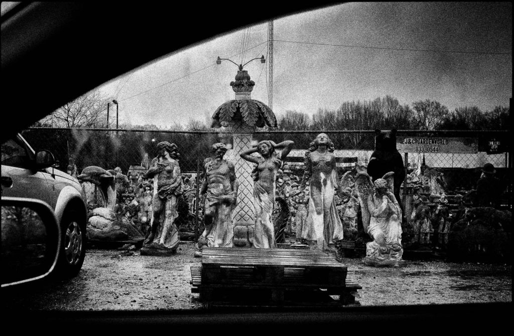
A Simple Picture I Took Out My Car Window Recently. If I Hung it in a Art Gallery and Titled it Untitled 2018 Would That Make it Art?

Of course, maybe the best response, and probably the closest to the truth, is the ” Institutional” definition of Art, somewhat cynical, that holds that ‘Art’ is whatever gets exhibited in an ‘Art Gallery’. We decide what it is simply by defining it as such. This is what Marcel Duchamp was claiming for Art when he exhibited a toilette bowl as part of an exhibition of his work in a gallery, asking his audience to look at the toilette bowl aesthetically by placing it in a context where we are, by definition, asked to do these things. Duchamp’s definition simply requires that there be an intent on the part of the artist to have what’s presented be seen in a certain way, even if the creative act is simply the presentation itself. What then, of things created without the aesthetic intention, where the intention can be understood as conveying the state of things at any given moment, like a photograph? Can Nick Ut’s My Lai photos be ‘Art’ if they’re viewed in an art gallery? How about the found photographs  that Melissa Cantanese put together in her book Dive Dark Dream Slow that I’ve discussed before?

To my mind, learning to think of photography as an Art Form means first to recognize in a literal sense what a photograph is. It’s a two dimensional piece of paper with “indexical” markings on it. That’s it. That’s the most an Athenian citizen of Socrates’ time (Socrates himself, for that matter) or some primitive man pulled out of the forest in Papua, New Guinea, would be capable of seeing it as, because they’d not have the conceptual (as opposed to he intellectual) ability to do so, that conceptual ability given to us by the social, cultural and technical knowledge which we possess and which is a precondition to understanding it as something more. Without this embedded knowledge – what we take for granted – they literally couldn’t see the representational nature of the photo. They’d simply see the thing itself – the flattened 12×18 2 dimensional thing with a certain form embedded as part of it.

Somewhat paradoxically, I think it’s this two dimensional reality of photographs that opens the way to seeing them as ‘Art.’ Abstract painting only started making sense to me when I started thinking in non-representational terms, when I accepted the notion that paintings don’t need to be a transcription of anything; they can just be what they are, a thing, something with no function other than being its own reality. It’s what art historians term an understanding of the painting’s inherent “flatness.” Photos can be the same way. Forget for a second that Untitled 2016 was produced by a camera and in some sense depends on an existing visual arrangement contained somewhere “out there”; We can choose to see it as we’d see Untitled 2005. Just look at it, try to see what’s literally in front of you. Stop thinking of it as referencing something else. Just let it be itself. Analyse it in those terms. For that matter, there’s nothing keeping us from seeing Untitled 2018 in the same way…or is there?


This is the third in an ongoing series about philosophical issues and what they might have to say about photography. Part One can be found here, Part Two here.

Hits: 2423

Parerga and Paralipomena – Chapter One

Parerga and Paralipomena is Greek for “Appendices” and “Omissions”. Arthur Schopenhauer, an influential 19th century German philosopher, published a book by that title. Given the title, you’d expect a staggeringly obtuse, unreadable scholastic tome…which it’s not. It’s actually a fascinating book, containing Schopenhauer’s thoughts on any number of things, from his mommy-issues and professional jealousies to the ultimate nature of reality ( which for him is “Will,” that striving urge we all have and which he claims every living and even inanimate thing has). In any event, the work is mostly a series of short thoughts – philosophical odds and ends – thrown together without much connection between subjects.

I always wanted to title a blog post “Parerga and Paralipomena” since it sounds cool and intellectual but really means nothing more than “odds and ends.” So bear with me as I process a few thoughts that have come to me recently, thoughts that arise out of philosophical concerns that have obvious implications for us as photographers. I expect I’ll have a number of chapters – this on Schopenhauer being merely the first of a series – so I’ll label them all the same thing – Parerga and Paralipomena – and you can ignore them if they aren’t of interest to you. Suffice it to say that you’re not going to find this on Ken Rockwell’s site. Whether that’s good or bad is up to you.

*************

If you’ve never read Schopenhauer I recommend him highly. In addition to being a fascinating guy with all sorts of human foibles, some of them quite entertaining, [e.g he and his mother engaged in a vicious lifetime battle about who was smarter, his mother being an early 19th century German novelist; he taught at the same university as GW Hegel, who at the time was considered the most profound intellectual on the continent – Schopenhauer considered Hegel a complete moron – while everyone considered Schopenhauer a nobody] he has much to teach artists and people with creative aspirations, given he is generally considered to have articulated a pretty impressive theory of Art and the origin and meaning behind the creative impulse.

For Schopenhauer, the reason people paint or sculpt or photograph is because it helps us distance ourselves from desiring – “willing” –  which invariably causes pain and dissatisfaction. This is something that Leicaphiles, if they’re honest with themselves, should recognize. Think of how bad you wanted that Leica M9 or MM, and think about how inevitably disappointed you are once you’d gotten it used it for a bit and then started dreaming of trading up to the M11. That’s the nature of human reality, always willing things, striving for more in an endless search for something we can never reach. For Schopenhauer, it’s that striving that powers reality and the ceaseless change that defines it. Everything from humans down to one-celled organisms exhibit it. It’s also what keeps Nikon and Leica in business, because we are constitutionally incapable of being satisfied with the status quo. Gotta have more, better. That AF on the top of the line camera from 2 years ago is now hopelessly outdated, not sufficient for rank amateurs. The 12 mpx Ricoh you bought ten years ago, junk; your photographic purposes require the 50 mpx full-frame Canon. And so it goes. We’ve all been there whether we admit it to ourselves or not. We’ve all been there because Schopenhauer says that’s the nature of human reality, we can’t avoid it.

*************

Or maybe we can, at least temporarily. For Schopenhauer, a temporary way to escape the pain brought about by our ceaseless striving is through aesthetic contemplation. Planning and envisioning that photograph, or acting pursuant to that envisioning, or engaging with the finished product hanging on a wall – stops you perceiving the world as separated from you, something we are constantly grasping for; rather in the simple aesthetic act, every time you find yourself lost in the willlessness of the beauty around you “one can thus no longer separate the perceiver from the perception” i.e. you stop being an unhappy, willing being and just are. From this immersion with the world you aren’t an individual who suffers in the world due to one’s individual will but, rather, you’re a “subject of cognition” to a perception that is “pure, will-less, timeless” where the essence of the world is found. You’ve just found the closest thing to nirvana human reality allows.

Think about the consequences of this and what it means for the issues we’ve been discussing on this blog for years – the simple miraculousness of photography, the joy in its doing, in contrast to the stupid and blinkered idea that the pleasure and validation you can find in photography will be found in owning and using certain equipment, or that the artistic impulse is about your tools in any significant sense. For me, my lifetime interest in photography has been about that will-less, timeless enjoyment. It’s my argument that, at base, to be a photographer has no real connection to being a camera fondler, although the enjoyment of fine photographic tools has it own aesthetic character and is legitimate in itself. Just don’t confuse it with photography, and don’t consider yourself a photographer because you’re using a Leica. That’s for shallow meatballs like Mr. Overgaard, lost souls and con men who’ve conflated the worth of the camera they use – or the bag they throw it in – with their worth as photographers. If you learn anything from a great mind like Schopenhauer, it’s don’t fall for the con.

*************

NEXT UP: Chapter Two – What Martin Heidegger, the Nazi Rector of the University of Freiburg, can teach you about photography

ADDENDUM: Yes I know the site is screwed up. Yes, I know the links are broken. Yes, I know the comments section doesn’t work. Yes, I’m going to fix it. And yes, I’ve really enjoyed all the supportive emails I’ve received since my last post. Keep em coming to [email protected], because its nice to know people actually read this.

Hits: 1183

The Plain Sense of Things

Rungis, Paris, 2004. Sometimes you’ve got to look hard to see what’s in front of you

If I were to describe, as best I’m able, what I’ve spent a lifetime of photography doing, it would be this: I’ve tried to document “the plain sense” of the things that constitute my life. Putting words to something which is intuitive and ineffable, it’s the intellectual equivalent of trying to squeeze an elephant into a mason jar – it doesn’t capture all of the buried motivations, but it gets as close as words allow, so it’ll have to do. I’ve always respected Garry Winogrand’s explanation for why he photographed things, “to see how they look when photographed,” which is as good a no bullshit, anti-Artspeak explanation as I’ve yet heard.

All of this assumes my photography has any purpose. I can’t articulate any overarching explanation for why I photograph or why I photograph what I photograph. Attempts feel like ex post facto justifications for something that can’t put into words, the logic behind it being ineffable. My photography just is; the subject creates itself. I point the camera at things that make sense to me to photograph. Any needed rationalizations come later, at the point of editing, selecting, sequencing, articulating. What I’m left with defines what I’ve seen and how I’ve seen it.

*************

Portland. I love this Photo. Why? Hard to Say

There’s nothing more pretentious than an artist explaining his work. Invariably, the explanation sounds silly, forced, as if he has no real understanding of what he’s been doing. Some of my most awkward moments have been those times when a gallery visitor has asked me what a painting “means.” Anything you say will sound pretentious and foolish.*** The best response I’ve been able to come up with is “I don’t know, you tell me,” except that’s not really correct either. The honest response would be “I can’t articulate its meaning…but I know what it is. As for you, interpret it as you will.”

Our creative motivations are often opaque to us, but always larger than the restrictions imposed on them by words. Putting words to them often circumscribes rather than illustrates the work and, as such, weakens the work itself, boxing it in with artificial constraints. Dragan Novakovic, the subject of a recent post, described the impetus behind his early 70’s British photos, a coherent body of photographs if there ever was one: “I wish I could tell you that these photos are the fruit of a well-thought-out project and expatiate upon it (projects and concepts seem to be all the rage these days), but the truth is, they are all completely random shots.” I admire him for saying that.  It takes courage to admit your conceptual naivete; in Mr. Novakovic’s defense, his photographs are so good they need no explanation. Whatever ‘naivety’ Novakovic possesses isn’t born of ignorance but rather his intuitive understanding that whatever he’s done – inspirationally and procedurally – can’t be reduced to an explanation. The explanation is the work itself.

One of my favorite recent photo books is Dive Dark Dream Slow by Melissa Catanese. No words, just a sequence of vernacular photos from the photography collection of a guy who collected anonymous 20th century “found” photography, the kind of photographs we paste into albums or stash in boxes stored in the attic along with other detritus of our lives. Ms. Catanese is the curator of the book in the sense larger than simply “editing” it. The work is really her’s, in that through her selection, sequencing and presentation of the photos she’s created something unique to her, something apart from the intentions of the various photographers or of the collector himself. What it “means”? Clearly, it “means” something to Ms. Catanese given the constraints she imposed on the materials. As to what that meaning is, she’s not saying, or, more precisely, she seems to be saying “It means what you make it mean.”  And that’s the fascination of it. We as viewer get to give it a meaning.

************

Loch Ness, Scotland 2016. There’s a monster down there somewhere…or so I’m told.

Photography, for me, is an activity in service to an internal, idiosyncratic dynamic. I’ve never made photographs for someone else’s consumption or delectation; I’ve made them to give exterior form to something interior. Hence the doing of it itself has been the payoff, sort of like going to therapy. Certainly there’s a sense of wanting to do it well, but ‘doing it well’ has little to do with what other people think of it, which to me is largely irrelevant. Doing it well means feeling as if what I’ve created expresses some logic internal to me. It’s got to resonate with me. If it does, I consider it done well; if it doesn’t, it isn’t, even if other people like it.

The reason why photography has interested me for so long is because it’s not been ‘about’ anything. I’ve never viewed it as a means to anything, and when I’ve put myself in a position to view it as a means to make a living I’ve quickly, and radically, lost interest.  Whatever it is, it isn’t about that.

So, with all that said….I’ll try to articulate what I’ve been trying to do in a lifetime of photography. If it is anything, its been my attempt to locate my self, to give it contours by locating it in a specific time and place [see how pretentious that sounds?]. It’s been my attempt, to document what was (is) me. At heart I’m a documentarian. Anything said beyond that will just muddy the waters, so don’t ask me to explain.


*** My Artist Statement, generated after a few bourbons:

 Ever since I was a student I’ve been fascinated by the ontology of mind. My work – scattered across various media yet forming a coherent whole – explores the relationship between subjective profundities and banal, prolifigate experience. Influences as diverse as Homer, Pynchon, Schopenhauer, van Gogh, Joyce, Aristotle, Coltrane, Pollock, and Pound inform my creative narratives. What started out as naive childish hope is now corroded by the hegemony of time, yet it has been leavened by the rich fund of common experience and memory. My work is the synthesis of these things, a re-imagining of what time sweeps into the past, the flux of phenomena screened through the bounded conceptual schema that is me, leaving the receptive clues to solipsistic meaning, assuming, of course, that we, in radical subjectivity, may ‘share’ a solipsism in any meaningful way.


Hits: 1061

White Skies


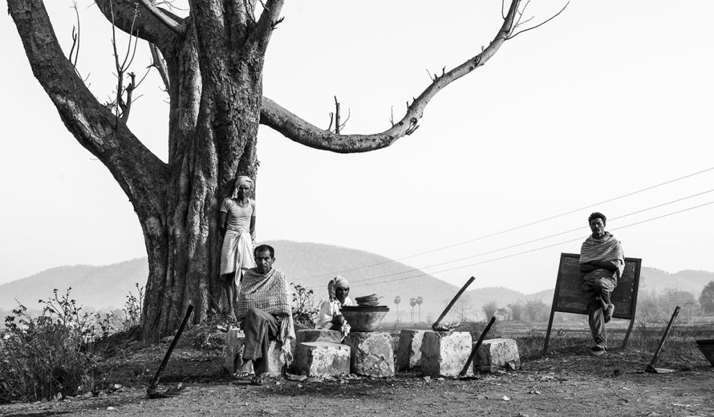
Waiting for Work, Jharkhand, India, 2014. Prabuddha Ray

If you were to show me the photo above and ask me guess whether it was film or digital, my guess would be film. I’d say film because the sky is white. White skies, with little or no distinction between the sky and clouds, are a fairly reliable signature of traditional silver halide b&w photography. Panchromatic black-and-white film is more sensitive to blue than to other colors (although by how much varies with the emulsion, some being more sensitive to greens and others to reds than others. Orthochromatic b&w film is very sensitive to blue) and thus, film will overexpose blue skies relative to terrestrial subjects, giving you a white sky.

When shooting b&w film, if I want a detailed sky, I’ll use a K2 yellow or #25 “light red” filter. The principle is basic. A filter transmits light of its own color and absorbs its complementary color. It follows that the way to darken sky and make clouds stand out is to use a yellow or red filter, red being blue’s complimentary color. A yellow filter will render the sky more or less “normally” – i.e there’ll be a distinct tonality to the sky, lighter at the horizon and getting darker as you move up, clouds visible. The #25 light red will give you a  darker sky and more dramatically contrasted clouds, more like what you’d expect with digital b&w. To get the full-on dawn-of-the-dead look, I’d use a #29 dark red filter.

*************

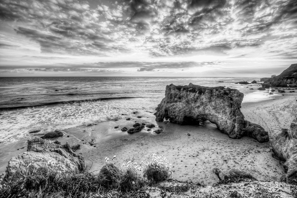
B&W Digital Skies. Nikon D800 (photographer unknown)

Above is an example of how a digital sensor renders sky. Digital sensors don’t have the same color biases as do film stocks. A digital sensor typically has equal Red, Green and Blue sensitivity, the result being photos that represent sky with much more detail than does film.

It’s that, along with its increased sharpness/acutance and less highlight roll off, which differentiates digital b&w from film b&w. While ‘film emulation’ software like Silver Efex helps narrow the aesthetic difference, no amount of running native digital files through emulation software will completely eradicate the differences inherent in the capture, and a trained eye can see the difference.

Of course, arguing the relative merits of either is a matter of taste. Each medium is a transcription and not an objective rendering. The reason I prefer the first photo to the second, apart from other subjective aesthetic issues, is because my photographic tastes were created and shaped during the film era and that look is the standard I use when judging digital b&w. It looks “natural” to me, the digital looking like an affectation. Someone coming of photographic age in the digital era might, and probably does, see things differently. That’s OK.

I do like Mr. Ray’s photo, for reasons over and above its ‘film look.’ Interesting then, that it’s not from a negative but was shot with a Nikon D800, proving that for every generalization there’s a thousand exceptions. What’s notable to me about the photo is that it hasn’t been self-consciously post-processed with all the usual b&w film clues – grain, specific tonal looks etc. It’s just the sky, or the lack of it, that drew my eye to it after googling “Nikon D800 B&W,” it being an outlier in a sea of overdone “zombie apocalypse” skies like the photo below. Something that simple.


Hits: 1048

Formalism and Photography (Can Photos of Statues be Art?)

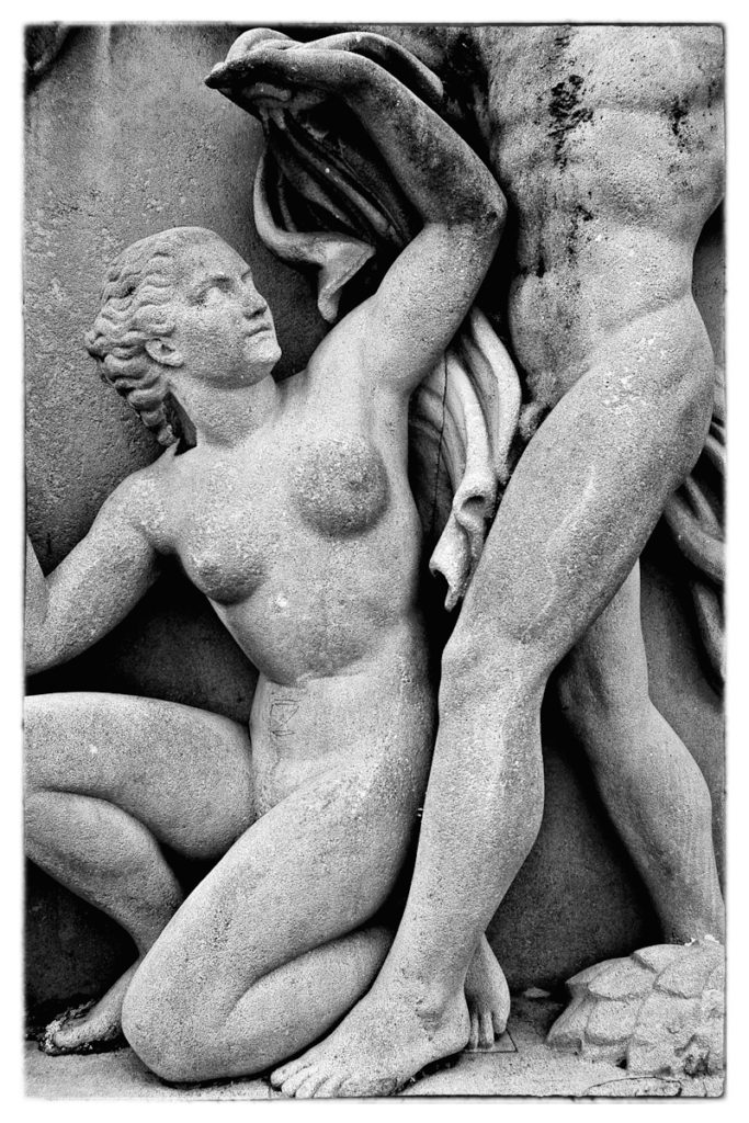
Trocadero, Paris

Above is a photo of a portion of a statute that sits in the Jardins du Trocadero directly across the Seine from the Eiffel Tower.  I’ve long been intrigued by Eugene Atget’s photos of Paris from the turn of the century, so once there I went around trying to do the same thing. Atget, a commercial photographer, spent his career in anonymity documenting Paris and environs with an 8×10 view camera. In addition to photographing streets, courtyards, cafes and city denizens, he photographed a lot of architectural details…and statuary. Lot’s of statuary. Like Vivian Maier, his work was “discovered” by someone who made it know to the wider world after his death.

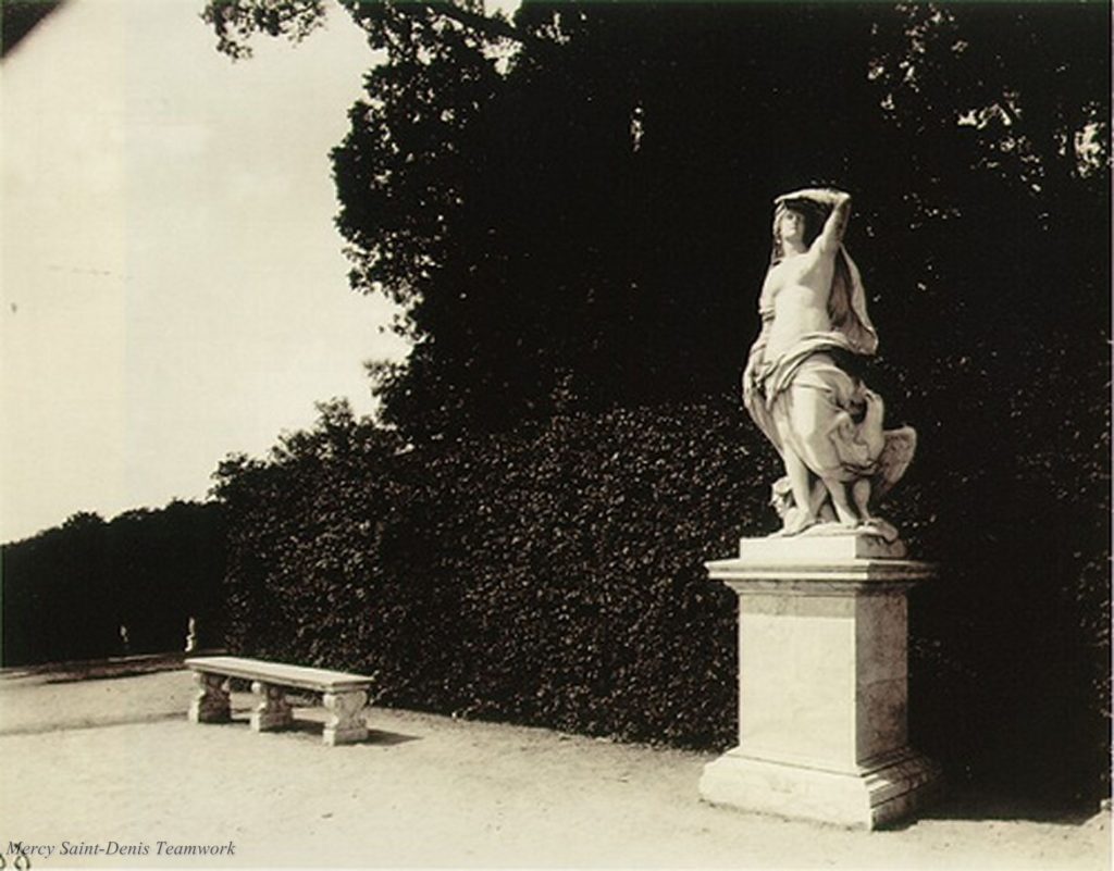
John Szarkowski, photography writer and curator of photography at the Met in New York, published a book about Atget wherein he claims Atget not merely a great 20th century photographer but “one of the great artists of the 20th Century.” The book Atget, published by the Museum of Modern Art, contains 100 duotone and tritone photos, most of people-less fixed scenes, statuary included. Below is the jacket’s cover photo:

What’s interesting, given the acclamation of Atget as a “great artist,” is that Atget didn’t consider himself an ‘Artist,’ He never tried to manipulate his photographs to reflect a specific artistic sensibility or any defined artistic principle. He was a working photographer trying to document things as accurately as possible. Yet it’s hard to argue with those who claim him to be an ‘Artist.’ His best work has an immense formal beauty somehow apart, or more precisely added onto, the formal beauty of his subjects.

*************

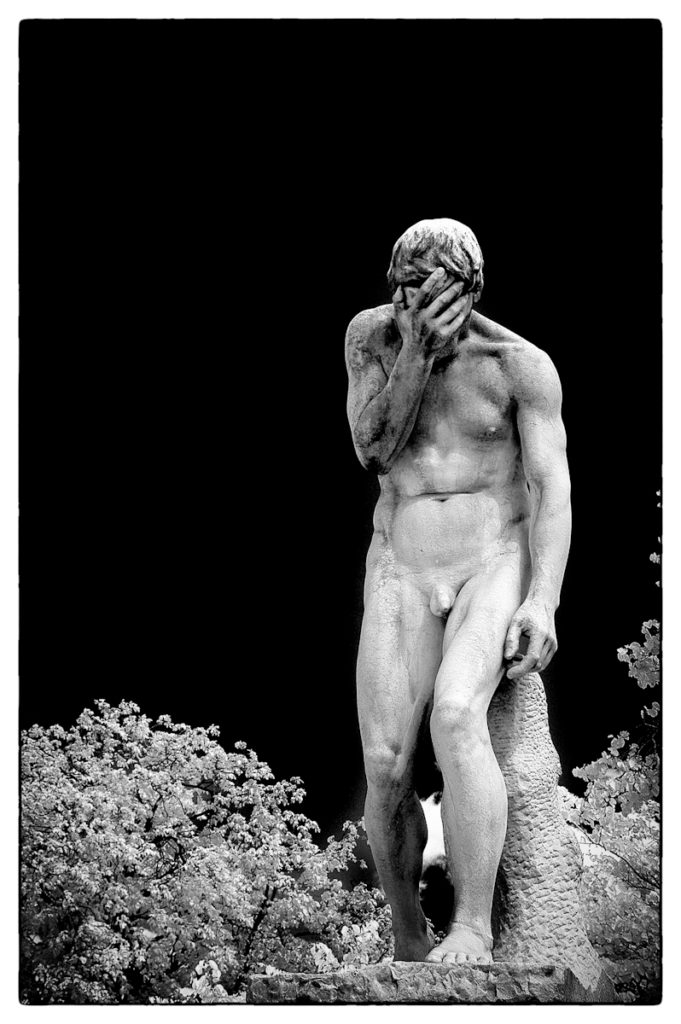
Jardin des Tuileries, Paris

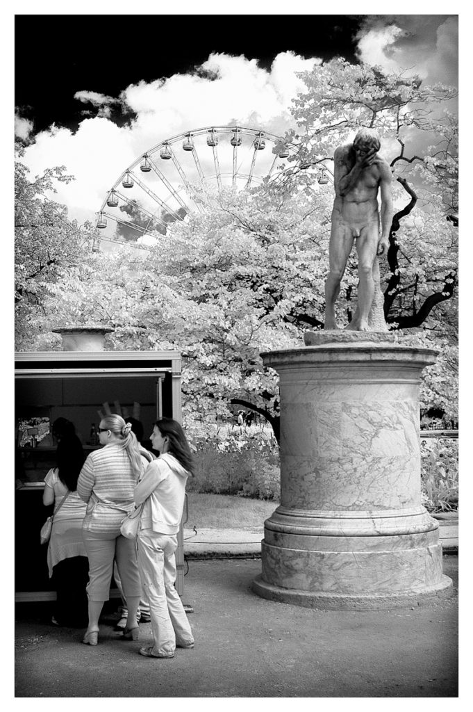
Above is a picture of a statute in the Tuileries. You could argue that it’s not the same as Atget’s; the photographer (me) attempted to impose some sort of individual sensibility onto the subject. Its a pretty straight shot…shot with a Nikon D100 modified for IR use. The only “sensibility” I brought to the photo was the composition and the choice of IR. It isn’t a straight document. Could I call it ‘Art?’   The reason I ask is because a lot of otherwise sophisticated viewers might chafe at calling Atget’s photos Art. I assume they’d say that any aesthetic value found in the photos inheres in the subject itself and not the photograph of it.

Jardin des Tuileries, Paris

Above is another photo of the same statute in the Tuileries, this time with other formal and documentary elements the photographer has chosen to include. It’s easier to claim this for ‘Art,’ because I’ve presented the pictorial elements so that their relation to each other suggests a meaning, might hint at something more than what simply appears in the picture.

What about the Trocadero photo that opens the piece? Same thing, or different? I’ve got a 16×20 platinum print of it hanging in my office. I love it. Is it a photo f a thing – a documentary record – or is it itself it’s own creation when considered apart from the content? It speaks to me both formally and emotionally. I’m sure other people, visitors to my home, have looked at it and thought of it only as a snapshot of a Parisian statute I’m inordinately fond of, when in fact what I see is a photograph with its own aesthetic worth  apart from the specific subject.

In my last post I’d referenced a few photos I’d taken on a recent walk. The premise of the piece is that everyday things can possess a formal beauty. What’s important is that you be open to it. I used a couple of photos I’d taken while walking dog to illustrate.  What I hadn’t mentioned was that one of the photos, the one I’d used to open the piece, had been germinating in my mind for some time. I’d walked past the subject daily; I’d eyed it a thousand times, each time thinking “I need to photograph that.” I finally got around to doing it. I love what I got. A 16×20 is going on a wall somewhere, for no other reason than it speaks to me. Maybe it’s my eye as a painter that’s allowed me to abstract from the objective, public nature of things ‘out there’ and consider them in their formal natures. Maybe it’s my formative years having been fascinated by Walker Evan’s photography, Evans being much like Atget in his sensibilities and aims. Maybe I’m just a photographic hack massively overthinking all of this, or worse yet palming off my cliched photos as ‘Art.’ Damned if I know.

I love this. It’s Gonna Hang on my Wall Somewhere

Hits: 1676

A Walk With Buddy


“The first mistake of art is to assume that it’s serious.”  Lester Bangs


I love that quote. Let’s assume, for sake of argument, that photography can be ‘Art’ and that those who do it can be “artists.”

Photography should be fun. It should come from a place of ease and spontaneity. If it comes from your head instead of your heart, it’ll likely be forced. If it’s forced, it won’t be very good. This doesn’t mean it isn’t hard work. That’s the paradox of it. Good work is hard…but it usually comes easily. When I’m “seeing” it seems everywhere. When I’m not, it’s nowhere to be found. At the risk of sounding metaphysical, I’m a firm believer in one’s muse, an animating creative force that comes and goes on its own volition. The trick is to take advantage of it when it’s present. It’s a free gift you can’t expect on schedule.
It being a lazy Sunday morning, I intended to stay in bed, enjoy a cup of coffee (maybe a demitasse of calvados on the side) and read. I’ve recently commenced reading back issues of Aperture Magazine, which I’ve subscribed to for at least 25 years, although I hadn’t really read an issue in the proper sense since Fall, 1999, instead filing them for later perusal on the bookshelves dedicated to photography. Now suddenly inspired, I’ve committed to catching up on 20 years (that’s 80 issues). Sunday morning in bed, sipping calvados, seemed as good a time as any.  Buddy the dog had other ideas. Traditionally, Sunday is his day for the extra-special, extra-long walk off-leash on the Dorothea Dix Campus grounds. I know it. He knows it. And he knows that I know. To let me know he knew that I knew, he picked up one of my walking shoes, jumped on the bed and dropped it in front of me. Then he stared. This went on until I complied by asking him the totally rhetorical question – “Do you want to go for a walk?” – that sent him prancing to the door while I threw on my pants and tied my shoes.

As we left I dropped my Sigma SD Quattro in a shoulder bag and took it with. I’ve been feeling inspired all of the sudden – blog posts coming a mile a minute; thinking of, and seeing, pictures everywhere. Visual inspiration usually comes to me in one of two forms, either the urge to document everything around me, usually wife, kids, friends, animals, or a heightened sensitivity to shapes and form I see in the things around me. I’m presently being visited by the second muse, and when I am I’ll typically buy a canvas and paint, but I’ll occasionally gratify the urge with a camera, photographing form I see latent in everyday things.
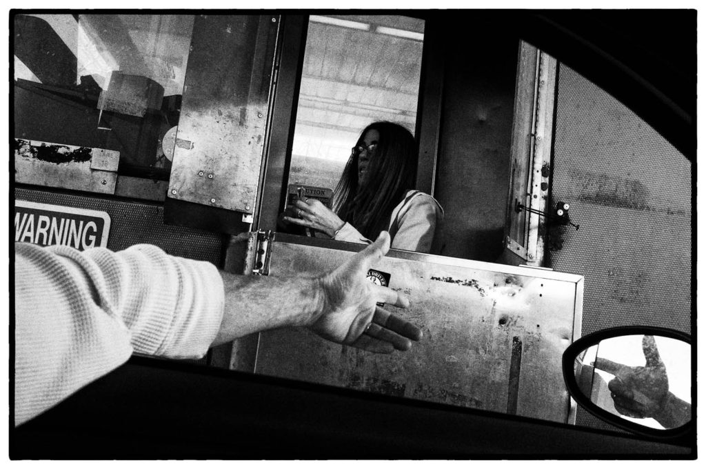
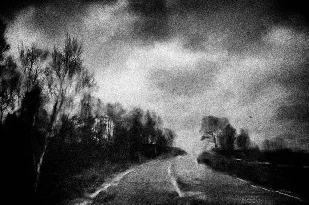
So, Me and Buddy went for our walk. We were gone about an hour, In that time I took maybe 20 pictures with my Sigma. Here’s four that caught my eye. What’s remarkable to me is that the entire process, from conception/initiation to execution and presentation, took 2 hours total, maybe. In the spirit of my last post, I can’t decide whether that’s good or bad. Shouldn’t it be hard? Can it be easy? If “easy,” isn’t it that the “hard” part has been done over many years of reading, looking, thinking and seeing?

Hits: 1287

A Deal With the Devil

Intersection, Hwy 49 and Hwy 61, Clarksdale, Mississippi, 4×5 “Wet Plate”

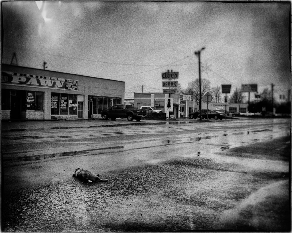
Above is a picture of  the Mississippi crossroads where blues legend Robert Johnson sold his soul to the Devil in return for the ability to play guitar. Unfortunately, it didn’t work out well for Mr. Johnson; while he created some great blues, he died young and broke and unrecognized, his grave somewhere unknown in the Delta. It’s been sung and talked about enough in popular American culture to have become a recognizable thing globally. The Crossroads. Located at the corner of Highway 61 and Highway 49 in Clarksdale, Mississippi, I took the photo on Highway 61 just north of the Highway 49 intersection so I could get the dead dog in the picture.  Seemed appropriate. If you look to the right side of the photo you’ll see the traffic lights that sit at the intersection.
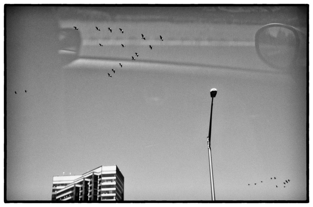
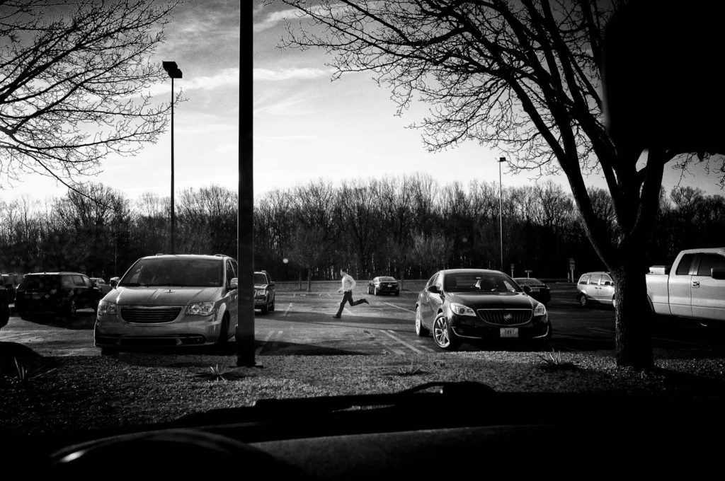
The bargain Johnson supposedly struck at this intersection is what we call  “Faustian,” not really a ‘bargain’ at all, where someone trades something essential for personal gain, the gain being to receive what they think will make them happy but doesn’t. It makes things worse when all is said and done.  If you’re familiar with classical European literature you’ve read about Dr. Faustus, the famous scientist who trades his spiritual and moral integrity for knowledge and power and then comes to a ruinous end. Writing a gloss on the legend in his play Faust, Goethe took some liberties with the story, now a wager between Dr Faust, who can find no meaning in his life, and Mephisto, the Devil, who promises to give his life meaning if Faust  agrees to serve him forever after.

The the story is this: a man strikes a deal, depriving himself of a freely-willed human future in return for the quick and easy, a quicksilver shortcut to the goal, and in the process loses the good of what he possessed without gaining anything better when it’s all done, in fact, what’s been gained is a much impoverished version of what he started with. It’s called “a deal with the Devil.”

*************

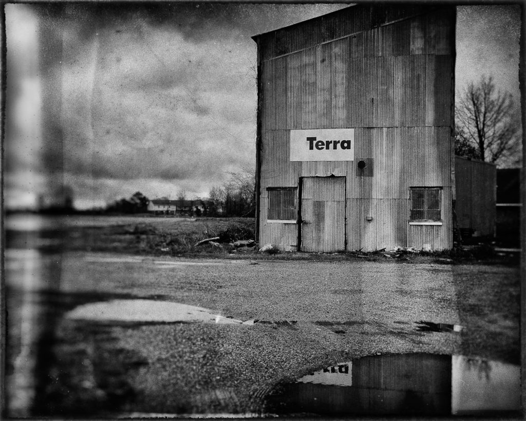
Somewhere in the Mississippi Delta (Can’t Remember), 4×5 “Wet Plate”

As I mentioned in a previous post, I’d recently read Sally Mann’s Hold Still, a great read if you’re interested in the interior lives and thought processes of artists. There’s few photographers I’d class as ‘artists,’ but Sally Mann would be one of them, so I was interested to read what she had to say. In the process, I got to thinking about her use of a view camera and the slow, deliberate nature of her craft. It’s so unlike what digital, or even 35mm film, allows. I also like the results. There’s nothing more beautiful than an 8×10 b&w contact print. She’s also a Southerner, as am I, with an eye for the Gothic details of life in Deep South America. Her recent work involved a trip from Memphis to New Orleans via the Mississippi Delta taking pictures of things that caught her eye along the way. She did it with her view camera and with wet plates, liquid emulsions she brushed onto 8×10 glass plates and used as the negatives for her 8×10. In addition to involving a lot of prep work, she’d also have to immediately develop the plates in the back of her pickup under a black cloth. What she gets when she gets a good shot is something really interesting, imprecise, sometimes blurry and diffuse, often with serendipitous features that give a powerful character to the final prints. It’s obviously a difficult process to master, which gives heft to the work because they’re the result of skill and hard mastery. They say “this is something that took skill and hard work and incredible perseverance, and in the end produced something beautiful.”

Which got me thinking: I’ve been through the Delta a number of times with my camera, so I know it well, and I’ve also spent some time with alternative processes, and – you know – the idea of shooting the Delta with a view camera and some funky emulsions sounded like a great trip, so I started thinking of what I’d need to do the work. I’ve got a view camera and tripod, I’ve got the time; all I’d really need to do is figure out how to do the emulsions. Or even simpler, I could do set pieces on regular 8×10 negative film – they still make it – and then contact print it. That would be a fun project, and certainly one I could exhibit if the work was decent.

But then I had a further thought: I wonder, in all of the post-processing software I’ve got loaded onto my computer but never much use, do I have a “wet plate emulation?” I searched around and, yes, I did. So…I pulled up my Mississippi Delta photos and after cropping them to 4×5 for authenticity, started running a few of them through the wet plate emulation and damn!, a lot of them looked really good. Exhibition quality if printed on good pigment paper at 8×10. It really is powerful work if I might say so myself.

*************

But…there’s something wrong with this. I’m not sure I can articulate it, except to say that my ‘wet plates’ and Sally Mann’s wet plates occupy two different poles of artistic merit. Assuming you think my wet plates are as evocative as Ms. Mann’s from a visual standpoint, you could say they have equal creative merit, but is that really the criterion for assessing the relative worth of our Delta work, or is there something more, something more evanescent but crucial, that’s present in her work and absent in mine?

I would argue there is. Her’s possess an authenticity that mine mimics, even though they might look similar technically. She dragged an 8×10 view camera around for 1000 miles, jugs of dangerous chemicals in tow, which relegated her going places that would accommodate her. I drove around, pointed my Leica M8 at everything and shot. At each location, she’d spend an hour or two developing her plates, drying them, inspecting them, repeating the process until she got what she wanted. I pushed a shutter and chimped the results, brought thousands back on an SD card and ran the keepers thru emulation software on my Mac.  Once home she fastidiously contact printed her best plates, producing 20 or so exquisite silver prints. I tee’d up my Epson R3000, loaded in the Moab Lasal Exhibition Luster Paper, and effortlessly printed off 40 8×10 prints that could pass in a pinch for contact prints.

So…am I going to exhibit my Delta “wet prints?” No. Because to do so would be deceptive, although many photographers born in the digital age might disagree. It’s the result that matters, right? Tell that to Sally Mann. That’s the Devil’s Bargain we’ve made with digital. What used to be the product of craft and deep skill is now just a mouse click away. We still get the same results, but the honest pride of work well done has been taken from the process. We’ve wished for one thing and received another in the guise of the quick and easy, the thing that we thought would liberate us. Same thing Robert Johnson did at those crossroads in Clarksdale, Mississsippi, the story old as civilization.

Hits: 1844

Unfortunately There’s No Free Lunch

The cause of these ruminations

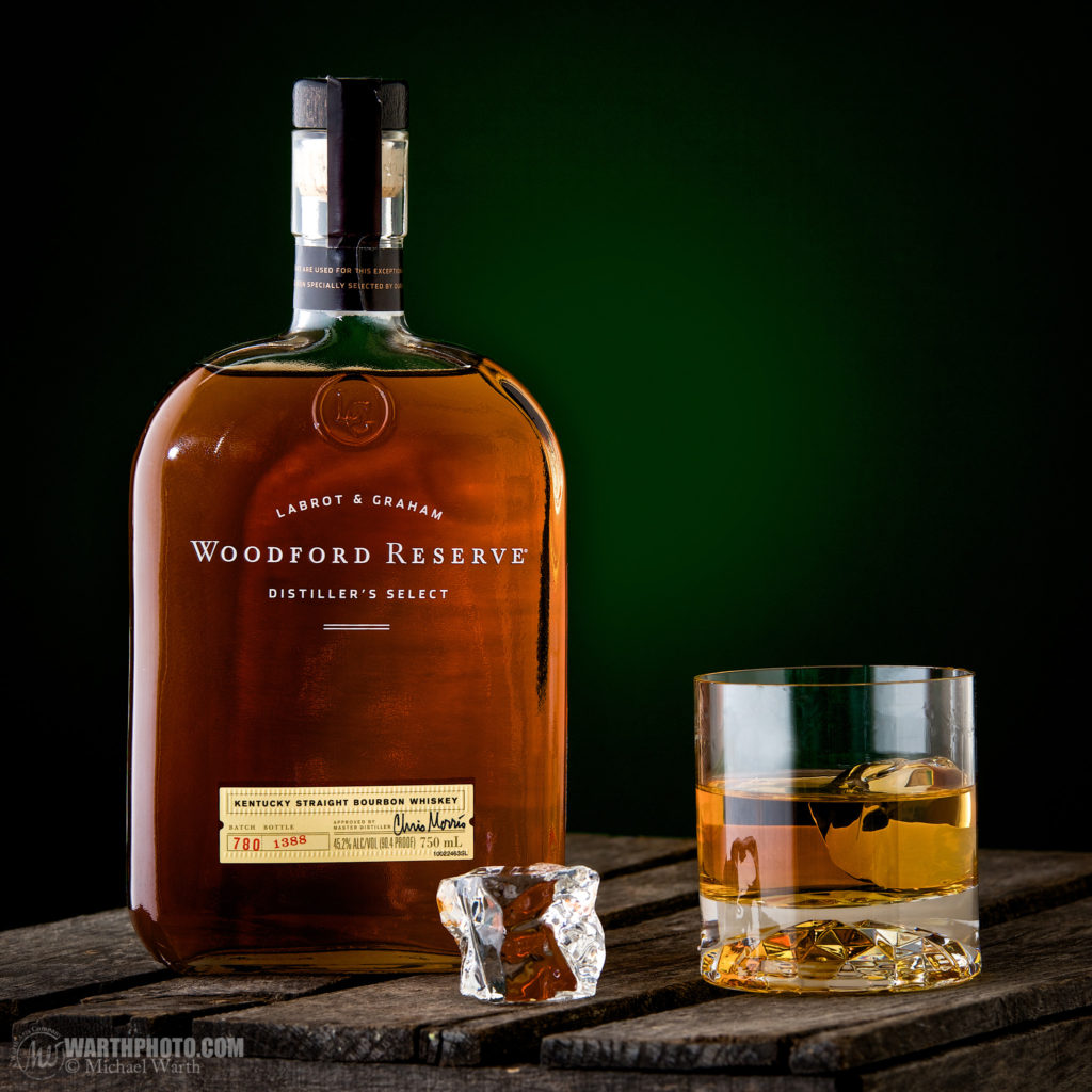
I’m currently housebound in Raleigh, North Carolina- 4:00 PM, raining like hell outside, iTunes blasting Neil Young’s Cinnamon Girl through headphones while working through my third snifter of  Woodford Reserve Bourbon, a bottle of which a friend was foolish enough to leave here the other night with the promise that it’d be here the next time he visits (the bottle most certainly will be).  I’m printing work prints on an Epson R3000 for an exhibition I’ve entitled Car Window. There’s a couple of things presently on my  mind other than the fact that I’m glad my friend was dumb enough to leave his bottle of bourbon in my possession: first, how is it possible that the music I’m currently blasting from my iTunes account sounds so god-awful compared to what I used listen to with my Marantz amp and KLH speakers, way back in the ice-age of the 70’s?

I thought technological innovation i.e. digitization was going to revolutionize my hi-fidelity listening experience? Didn’t happen, not even close; go listen to the album I’m currently listening to – Neil Young’s Everyone Knows This is Nowhere – on vinyl on any half-decent turntable, amp and speakers, and then listen to it run thru iTunes as an mp3 and you’ll be shocked at the diminunition in audio quality we now accept as a given in the interests of quick and easy. It pisses me off when I think of the vinyl collection I once had – the usual 60’s and 70’s era Rock and Roll, but also an impressive collection of 50’s and 60’s era jazz: Coltrane, Rollins, Shorter, Monk, Gordon, Adderley, Webster, Coleman, Ellington, Miles Davis, Bill Evans – all now mp3 files on my computer and phone, pushed out through earbud headphones or streamed through my Apple TV to the attached Bose sound system, where they sound like shit – thin, tinny, screechy, hollow – whenever you try to play them at a decent volume (if ever there was a song that deserved to played loud, it’s Cinnamon Girl).

Car Window prints.  All shot with a film camera. Not sharp, bad corners, harsh bokeh.

Of course, ruminating about hi-fidelity leads me logically to the next subject, the fact that the prints I’m producing, while nice enough by current digital standards, just don’t have the depth and fullness of a comparable silver print printed in a darkroom, the tonal transitions just a little too abrupt, the obvious sharpness somehow slightly unpleasant to a discerning eye. In their defense, they certainly are easier to produce. No nasty chemicals, endless repeatability as opposed to the laborious reproducibility of a fine silver print. And those born into the digital era probably won’t even understand the differences.

A few years ago, while in Los Angeles, I saw a Walker Evans exhibition of his 1930’s Cuba photos at the Getty. Gorgeous 8×10 silver contact prints, one in particular, a frontal portrait of a Cuban stevedore that just blew me away with its simple beauty. That’s it, to the left, where, reproduced digitally and viewed on a computer monitor, it’s just another picture of some guy, nothing special. Were I to post it to some forum for critique I’m sure critics would take issue with any number of things – the framing, the lighting, the sharpness, the lack of acceptable bokeh etc etc, the usual herd animal opinions. Luckily, I saw that same print again in Paris this past Summer at the Evans exhibition at the Pompidou Center. So simple, yet profoundly arresting, impossible to look at and appreciate through the facile categories of sharpness, resolution, ease of capture, repeatabilty. It was a singular work that someone had laboriously produced in a darkroom. Art of the highest order, the exquisite confluence of singular critical decisions by Walker as to both construction and production, things that took time and thought and energy, all things the digital age promised us we could do without in our mad rush for the quick and easy.

I’ve been to my share of art exhibits and museums in my 59 years, and I can think of a number of times when I was profoundly moved by a work of art – Walker’s Cuban Stevedore, the van Gogh self-portrait at the Fogg Museum At Harvard, a huge Jackson Pollack I saw in Paris, Botticelli’s The Birth of Venus in the Uffizi in Florence, Michelangelo’s Sistine Chapel in the Vatican – all of them the product of a slow, discriminating  process of creation, the very processes that the digital era promises to liberate us from.  Of course, I look at myself in the mirror and see, surprisingly, just another old man, my opinions considered by the current digital generation the sad ravings of a man who’s era has come and gone. Fair enough. But remember, there’s no ‘free lunch;’ everything you gain is purchased at the cost of something else. Consider that when you’re upgrading your Nikon D whatever every two years, or you’re listening to your music with those shitty earbuds or you’re running your plastic-looking digital photos through Silver Efex. Everything has its price.

Hits: 2689

What Do You See?

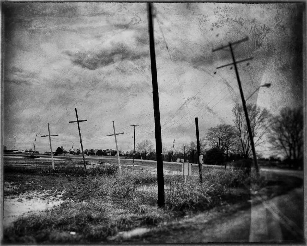
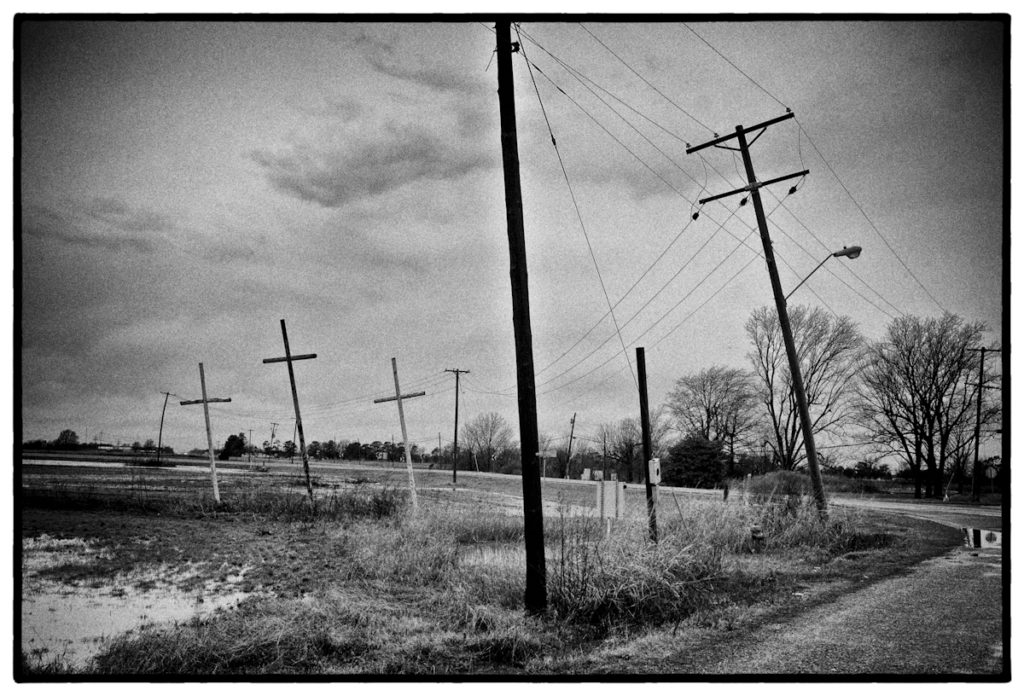
 I love the photo above. It’s one of a small number of photos I come back to when I review what I’ve done (…and yes, I took it with a Leica, an M8). Which is interesting, because most viewers will scan it visually and move on without much further thought. Aesthetically it’s properly done; were I to submit it to an art school critique, viewers would probably say it’s competently framed, formally interesting, if i’m lucky might use rhetorical cliches like “original,” “strong”, authentic.” Some with a picturesque bent might quibble about the decisions I’ve made, noting the pole that divides up the horizontal plane in a way upsetting to the rule bound. I can see someone saying it’s interesting… but what’s it supposed to be about? I can hear the critique moderator now talking of the mirroring of the pole by the crosses…or maybe the crosses by the pole, a commentary on man’s need to be heard etc (if you’ve ever endured an art critique you know how pretentious they can be; my standard response when I’m asked what a photo or painting “means” is to say I don’t know. That’s for the viewer to decide).

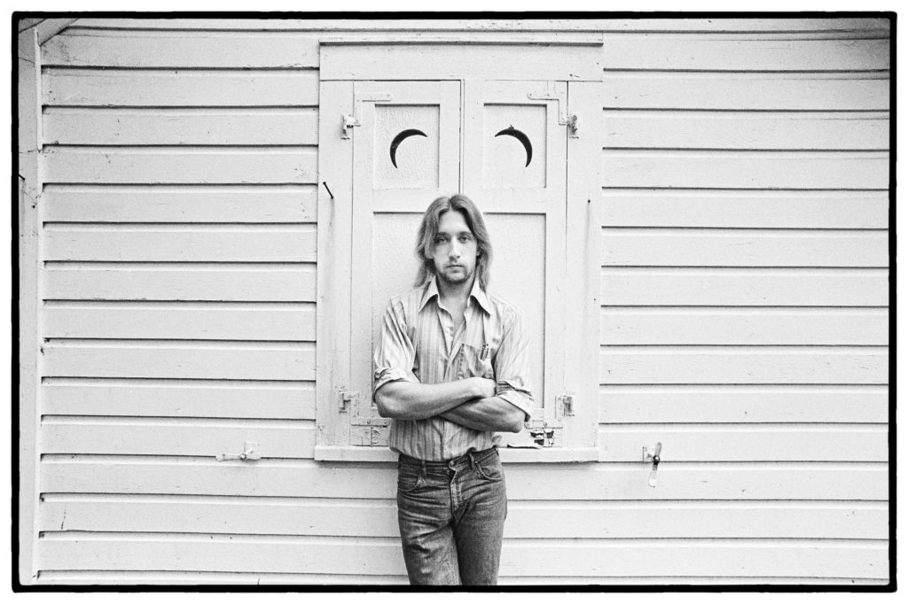
Art School Cool, circa 1977. I’m pretty sure my standing there with those crescent moons over my head was meant to mean something – what I no longer remember. I probably went to CBGB’s that night to see the Talking Heads.

As I’ve presented the photo here, without context, the “subject ” is what you will make of it. You have only the photo and whatever interpretive scheme might be floating around in your head to make sense of what you see. That’s the interesting thing about the supposedly “objective ” craft of photography. There’s an undeniable subjective element to what we do as viewers of ostensibly “objective” photographs. Your interpretation will vary depending on the formal arrangement, the context in which it’s presented to you, the knowledge and biases you bring to the viewing. While I find most post-modernist theory turgid and incomprehensible, it’s gotten one thing right – the meaning of things, whether it be a writing (a “text” in PM parlance) or a visual representation, whether a photo, drawing or painting, resides with the reader/viewer. The meaning of the photo you view depends on you. And that’s why, presented as it is to you – little context, no explanation- you might struggle to make sense of it or appreciate it in the manner I might. You might like it, hate it, be indifferent to it, depending on what criteria you bring to your viewing and how unmoored its presentation.

*************

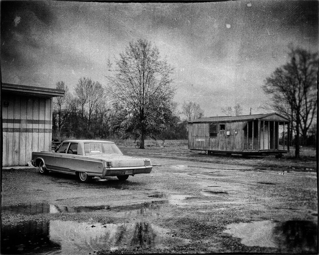
Which leads to the following reality: the means I use to present my picture is crucial to how you will understand the photo. Effective presentation is the responsibility of the photographer, and it’s what separates the successful from the frustrated. I can publish it in a newspaper or hang it on a gallery wall, or glue it into a scrapbook, whatever choice I make signaling to the viewer what I’d like you to think about the picture. I can write a caption that identifies the objective facts of the photo [Route 61, Mississippi Delta, Leica M8];  I can go further and write a caption that puts the photo in context for you [...in Money, Mississippi, about 50 yards from where 14 y/o Emmett Till allegedly whistled at a white woman and set in motion a murder that would change American history]; I might simply place it within a sequence of other photos inviting you, by process of induction, to surmise a common thread that links those sequenced into a larger whole which both helps you interpret the individual photo while imparting a larger meaning on the collection itself. The important thing is that in each individual case, the meaning is extrinsically imposed on the photo. The single photo without context means nothing. The good photographer understands that a large part of his obligation to the viewer is to put his photos in a context that assists the viewer in making sense of the photo.

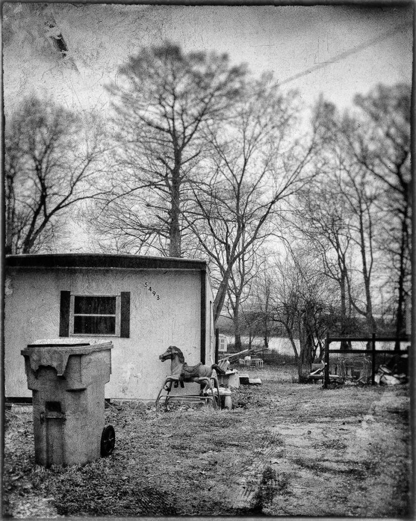
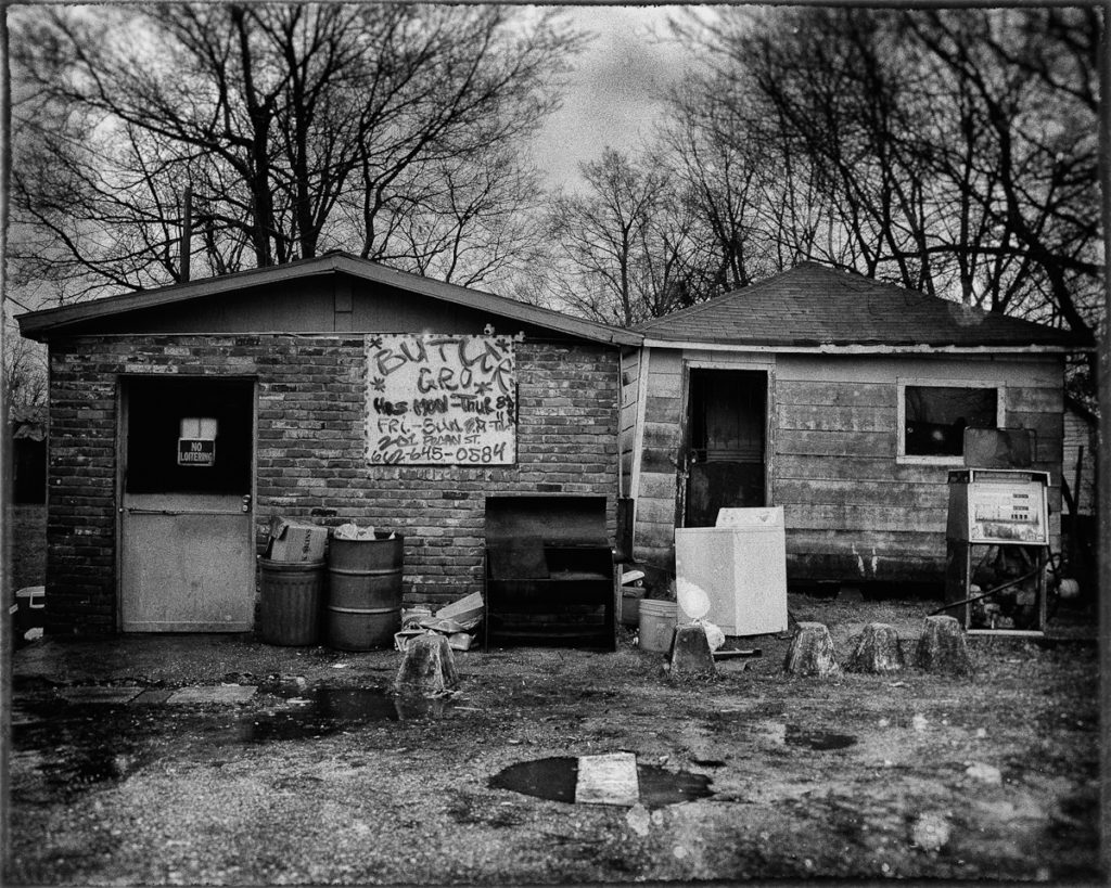
Mississippi Delta.  Same day, same camera as the first photo. Ultimately chosen for the same photo series. Does this help you make sense of the initial photo?

I suppose this explains why we might differ so radically in what we consider good photography, and it points to the difference between a naive and a sophisticated understanding of photographic quality. Naive photo critiques judge a photo on its technical and formal arrangements [Is it sharp? In focus? Good tonal values? Composition pleasing? Rule of thirds applied etc]. This is the world of gearhead forums and Flickr, the reason we chase after the newest Fuji X body with the new super-duper sensor, thinking something a little better will make the difference. Stay at this level and you’ll become a proficient photographic artisan. A more educated approach looks only to whether the photo communicates a compelling meaning. It’s also why naive photo artisans tend to be confused by and dismissive of the best things being done in the field at any given time – not only are they passing judgment with inappropriate criteria, they usually don’t possess the knowledge, experience and discernment borne of broad thinking to conjure a sufficient meaning from a work, a meaning that turns the picture into something more.


Hits: 1135

Transcribing the Real – Part One

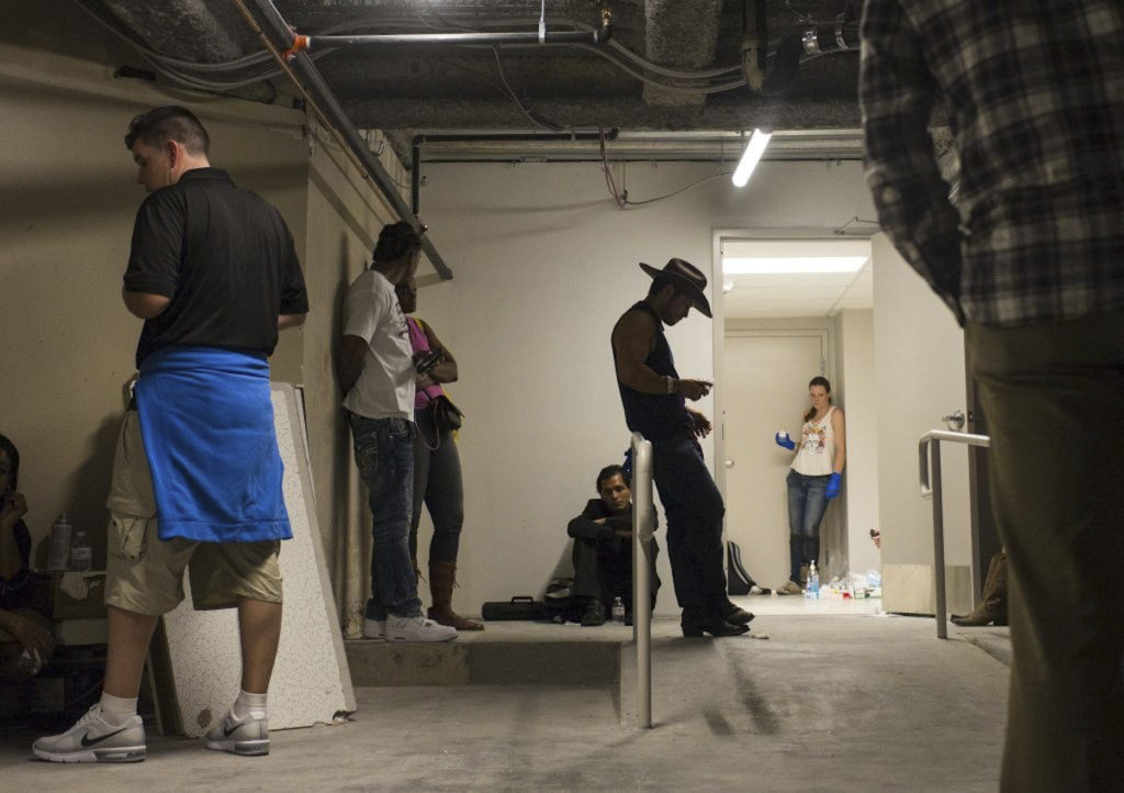
Above is a photograph that immediately caught my eye among the mass of photos coming out of Las Vegas in the wake of the insanity there. It was taken by Chase Stevens, a staff photographer with the LV Review-Journal. At the risk of aestheticising other people’s misfortune, it’s a beautiful photo in its own way in addition to having documentary value. Were I to know nothing about Mr. Stevens, I’d assume he’s familiar with Frank/Friedlander/Freed/Winogrand, as the photo mirrors that aesthetic, and the use of black and white references the film era. As for its documentary value, it’s less a stand-alone photo than one in a series of photographs illustrating what happened that night, but it certainly works as one in a series. You can see the series here, along with a short article about Steven’s excellent work that night.

If you clicked through the link I’ve provided, you’re probably confused, because the photo used in the link is not the one above but rather this one:

The Las Vegas Tropicana on lockdown on Oct. 1, 2017. Chase Stevens—Las Vegas Review-Journal/AP 

same photo, but in color and obviously digital. I prefer the b&w version; you may be indifferent or prefer the later.

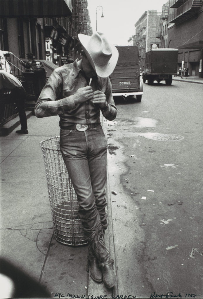
The B&W version is actually my creation (apologies to Mr. Stevens). I downloaded his photo as published and ran it through Silver Efex with a B&W film emulation that specified certain tone, contrast and grain values inherent in a given film stock (in this instance I think it was Kodak Plus X, maybe my favorite B&W film of all time, unfortunately no longer manufactured). I did it because my aesthetic sense told me, the first time I saw the photo, it should a ‘B&W photo’; that what seemed to me the obvious reference back to Robert Frank’s 1955 Manhattan cowboy photo required it be B&W:

Or maybe I’m overthinking this, but I suspect not.  I’m fairly certain that Mr. Stevens has some familiarity with Frank’s image, and the photo he decided to take that night owes some unconscious debt to Frank. I’m certainly not criticizing him in any way: that’s how creativity works. We learn by assimilating the work that’s come before, and if we’re good, we find a way to put our own small spin on an established aesthetic, the result being our own idiosyncratic photographic style. Creators who are truly sui generis, unique with no real creative antecedents, come along very infrequently, maybe once or twice a century in any given discipline. The painters Vincent van Gogh and Jackson Pollack come to mind, in photography HCB and Robert Frank.

*************

The larger question for me, what led me to manipulate Mr. Steven’s photo to suite my tastes, is the issue of the “objectivity” of photographs. As photographers, I assume all of us have at some point in our photographic evolution realized that the naive belief that photos objectively show “things that happened” in an unbiased way, without containing any subjective adulteration is, well, naive.

If Mr. Stevens had done what I’d done – ran his files through Silver Efex before he turned them in to his editor, would that have constituted an improper manipulation of his supposedly objective photographs that violated journalistic ethics? If so, what if, in the race to get to the scene Mr. Stevens had grabbed an old Leica loaded with Tri-X and shot his assignment with it? How would that differ, from an ethical perspective, from him shooting the scene with an M240 in RAW mode and sending the whole thing off to the editors for selection and editing? Is one more genuine, more real than the other? And if one is, what gives us the right to say so?

I’ve been thinking about these questions because I’ve been binge-watching Ken Burn’s documentary on the Viet Nam War, currently running on public television here in the States. What strikes me is the incredible aesthetic beauty of the era’s photography (as distinct from the often disturbing subject matter), most of it B&W 35mm film, a beauty that digital documentary simple is incapable of. This is the photography I cut my teeth on, so I’m biased, but my opinion is that that B&W Film documentary aesthetic, de rigeur through the late 70’s, is effective in a way that digital capture simply isn’t. Is it “more real?” No. More “objective?” No. “Better?” Yes. Of course, this claim for the relative quality of one versus the other is subjective to an extent, but I’ll argue in future posts that it has an objective basis. I may even drag a few “philosophers” into the discussion. Humor me as we proceed.


Hits: 1506