| Andre Kertesz, 2005 | 50 | HC | Very Good, Dust Jacket | | |
| Antoine D’Agata, Vortex, 2003 | 100 | SC | Good. Opening crease on cover. Rare book |
| Antonin Kratochvil, Broken Dream, 20 Years of War in Eastern Europe, 1997 | 50 | HC | Very Good , some wear to dust jacket | |
| Antonin Kratochvil, Michael Persson, 2003 | 100 | SC | Like New | | | |
| Ari Marcopoulos, Out and About | 150 | HC | Very Good, Dust Jacket | | |
| Atget Voir Paris | 50 | HC | Very Good, small bend on back cover in top corner |
| Atget, John Szarkowski, Museum of Modern Art, 2000 | 50 | HC | Good, wear to dust jacket | |
| Beat Generation, NY SF Paris 2017 | 50 | SC | Very Good | | | |
| Beat Memories, The Photographs of Allen Ginsburg | 35 | HC | Very Good , some wear to dust jacket | |
| Chris Killip, Seacoal, Second Edition, 2015 | 50 | HC | Like New. Dust Jacket | | |
| Daido Moriyama, Complete Pocket-Sized Monograph, 2012 | 50 | HC | Like New. Dust Jacket | | |
| Daido Moriyama, Edited by Simon Baker, 2012 | 75 | SC | Very Good | | | |
| Daido Moriyama, Labrynth, 2012 | 400 | SC | Very Good , some wear to dust jacket | |
| Daido Moriyama, Tales of Tono, 2012 | 25 | SC | Good. Dust Jacket. Some wear to dust jacket and cover |
| Daido Moriyama, The World Through My Eyes, 2010 | 60 | HC | Like New | | | |
| Danny Wilcox Frazier, Driftless, Photographs from Iowa, 2007 | 75 | HC | Very Good. Dust Jacket | | |
| Diane Arbus, An Aperture Monograph, 1972 | 25 | SC | Good, opening crease on cover, bend mark on back cover |
| Diane Arbus, Revelations | 60 | HC | Very Good. Dust Jacket | | |
| Diane Arbus, Untitled, 1995 | 35 | HC | Very Good , some wear to dust jacket | |
| Don McLullin, Aperture, First Edition 2001 | 50 | HC | Like New. Dust Jacket | | |
| Eudora Welty Photographs, 1989 | 20 | SC | Very Good | | | |
| Eugene Richards, Dorchester Days, 2000 | 100 | HC | Like New. Dust Jacket | | |
| Flesh and Blood, Photographers Images of Their Own Families, 1992 | 20 | HC | Very Good , some wear to dust jacket | |
| Friedlander First Fifty, 2019, First Edition | 55 | HC | Like New – no dust jacket | | |
| Garry Winogrand, Edited by Leo Rubinfen, 2013 | 125 | HD | Good-Very Good – slight tear on side dust jacket |
| George Tice, Selected Photographs, 1953-1999, 2001 | 25 | SC | Very Good. Library copy | | |
| Germaine Krull, Photographer of Modernity, 1999 | 50 | HC | Very Good. Dust Jacket. Some slight discoloration on jacket |
| Helmut Newton, Work, 2000 | 40 | HC | Good Slight wear to cover | |
| Henri Cartier-Bresson, Lemeut Cheroux, 2014 | 150 | HC | Like New | | | |
| Henri Cartier-Bresson, Vive la France, Franccois Nourissier, 1970 | 100 | HC | Very Good , some wear to dust jacket | |
| Henry Wessel, Waikiki, 2011 | 50 | HC | Like New. Dust Jacket | | |
| Imogene Cunningham, Ideas Without End, A life in Photography, Richard Lorenz, 1993 | 35 | SC | Good | | 2 Copies 1 is fair with wear to cover |
| In Our Time, The World as Seen by Magnum Phtographers, William Manchester, 1989, First Edition | 50 | HC | Good, Library copy | | |
| Jackson Pollock, Ellen G Landau, Paperback, 2005 | 20 | SC | Good, Wear to cover | | |
| Jaques Henri Lartique, A Life’s Diary, 2003 Exhibit, Pompidou | 20 | SC | Good | | | |
| Karsh, A Biography in Images, 2003 | 30 | SC | Like New | | | |
| Koudelka, Nationality Doubtful, 2014? | 150 | SC | Very Good | | | |
| Larry Towell, El Salvador, 1997 | 25 | SC | Good Slight wear to cover | |
| Larry Towell, In the Wake of Katrina, 2006 | 20 | HC | Very Good | | | |
| Larry Towell, The Cardboard house, 2008 | 45 | SC | Very Good | | | |
| Lee Friedlander, Kitaj, First Edition 2002 | 85 | HC | Like New | | | |
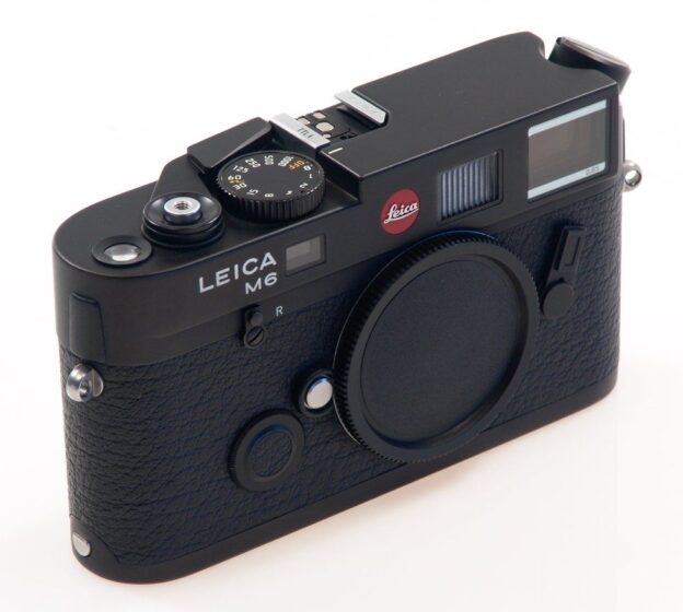
| Leica, Ninety Nine Years, 2012 | 125 | HC | Book Like New. Some wear to cardboard cover |
| Leica, Witness to a Century, 2012 | 85 | HC | Very Good, Dust Jacket | | |
| Lisette Model, An Aperture Monograph, 2nd Edition, (2007?) | 50 | HC | Very Good, Library copy | | |
| Lust & Madness, Murder & Mayhem: Harm’s Way, Editor Joel-Peter Witkin, First Edition, 5000 copies | 100 | HC | Very Good. Dust Jacket. Some slight discoloration on jacket |
| Magnum Contact Sheets, Editor Kristen Lubben, Reprint 2013 | 200 | HC | Book is very good, wear to dust jacket | |
| Magnum Stories, Paperback, 2013 | 40 | SC | Good, wear to dust jacket | |
| Michael Lesy, Dreamland America at the Dawn of the Twentieth Century, 1997 | 30 | HC | Very Good. Dust Jacket | | |
| Mike Brodie, A Period of Juvenile Prosperity, Third Edition, 3000 copies, 2012 | 150 | HC | Like New. Dust Jacket | | |
| Montmarte Secret 2002 | 40 | HC | Very Good. Dust Jacket | | |
| Nan Goldin, Complete Pocket Sized Monograph, 2001 | 75 | HC | Like New. Dust Jacket | | |
| Paul Kwilecki, Lowly Wise, Book One: Scenes of Religion in and Around Decatour County, Georgia, 1992 | 50 | SC | Fair, marks on Cover. Pages good. Signed |
| Peter & Oriel Caine, Paris Then and Now, 2007 | 25 | SC | Like New | | | |
| Photographers, Writers, and the American Scene, Visions of Pasage, First Edition, 2002 | 35 | HC | Fair – Book is Good lots of wear to dust jacket |
| Rex Miller, All the Blues Gone, 1996 | 45 | HC | Very Good , some wear to dust jacket | |
| Robert Frank, Come Again, First Edition, 2009 | | | | | | |
| Robert Frank, London/Wales, 2003, First Edition | 45 | HC | Very Good, Dust Jacket, insert | |
| Robert Frank, The Americans, 2000 | 35 | HC | Very Good, Dust Jacket | | |
| Robert Frank, Valencia, 1952, 2012, First Edition | 50 | HC | Very Good, Dust Jacket | | |
| Sandy Lesberg, Violence in Our Time, 1977 | 30 | HC | Good | | | |
| Saul Leiter, Retrospektive | 60 | HC | Very Good, includes outer case, book is like new |
| Sebastiao Salgado, Les Enfants de L’Exode, 2000 | 45 | HC | Very Good , some wear to dust jacket | |
| Snapshot Painters and Photography Bounard to Vuillard, 2011 | 125 | HC | Very Good. Dust Jacket | | |
| Stephane Gizard, Paris Silence, 2020 | 50 | HC | Very Good | | | |
| Street Photography Now, Sophie Howarth & Stephen McLauren, 2010 | 20 | SC | Good. Opening crease on cover | |
| Susan Meisalas, Mediations, 2018 | 75 | HC | Like New. Signed 2018 | | |
| Susan Meiselas, Nicaragua, 1981 | 25 | SC | Fair | | | |
| The Book of Shadows, Ed. Jeffrey Fraenkel, 2007 | 25 | HC | Very Good | | | |
| The Mexican Suitcase | 150 | SC | With cardboard case. Case is beat. Books like new |
| The Photographs of Ray K Mitzker, 2012 | 500 | HC | Like New | | | |
| Tim Page, Another Vietnam, Pictures of War From the Other Side, 2002 | 25 | HC | Good, wear to dust jacket, Library copy | |
| Trent parke, Minutes To Midnight, 2013, First Edition | 250 | HC | Very Good | | | |
| Vivian Maier, Street Photographer, Edited by John Maloof, 2011, First Edition | 75 | HC | Like New. Dust Jacket | | |
| Walker Evans, American Photographs, The Museum of Modern Art, 75th Anniversary Edition, 2012 (Fourth Printing) | 25 | HC | Like New | | | |
| William Klein, Paris & Klein, 2003 | 75 | HC | Book is very good, wear to dust jacket | |
| William Klein: ABC | 65 | HC | Book is very good, wear to dust jacket | |
| Wisconsin Death Trap, Michael Lesy, 1973 | 20 | SC | Good | Some bending of cover and initial pages |