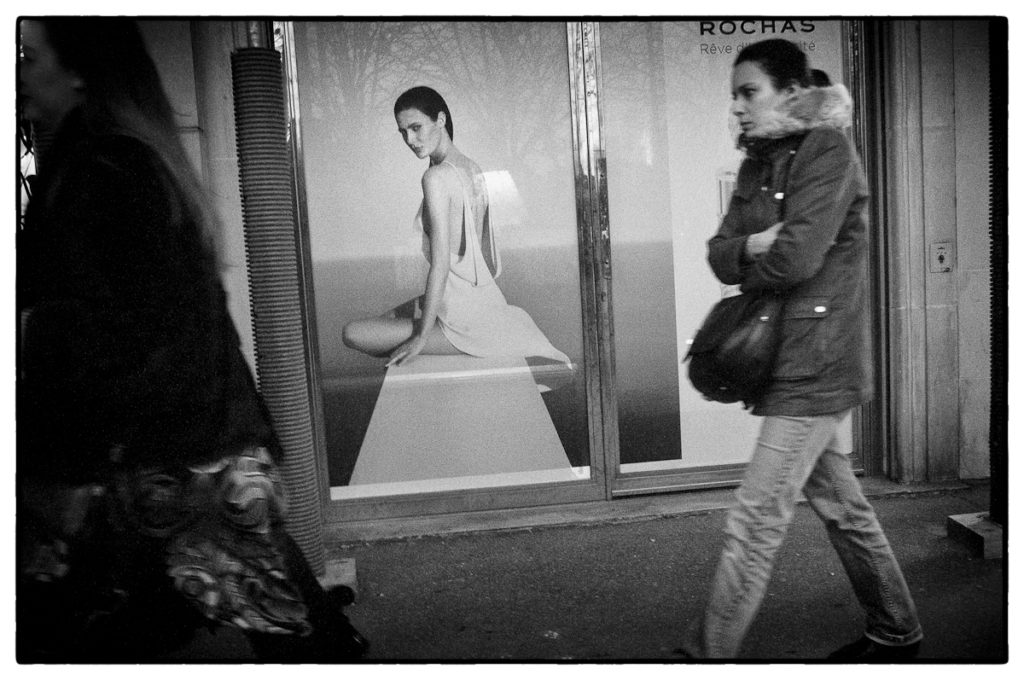
“When it comes to organizing the world into a picture, the photographer has little to go on…[his] only constraining form is his frame. Inside those four edges there are no structural traditions, only space.” — Ben Lifson
Robert Capa famously said that if your pictures weren’t good enough you weren’t close enough. I always thought that was wrong. Sometimes you can miss a picture by being too close.
Aesthetics is a question of where you place the frame. As psychologist Rudolf Arheim notes, the visual world surrounds us as an unbroken space, subdivided conceptually but without limits. Photography is the practice of isolating a portion of that whole, always with the understanding that the world continues beyond the frame’s borders. Part of what gives a photo meaning is the larger context within which it resides; sometimes that context is implied, sometimes it’s expressly pictured. Sometimes the subject is found within the frame while its context lies out of frame. Other times the photo is the dynamic of context and form within the frame; for this you need distance. Robert Capa would be an example of the former; Henri Cartier-Bresson would be an example of the latter. There’s room for both in photo aesthetics.
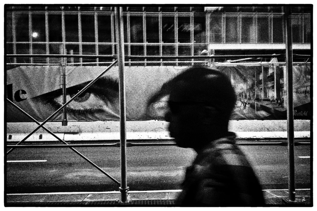
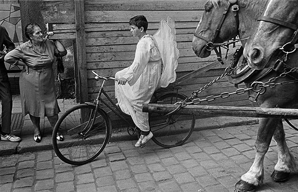
I say all of this because I’ve been admiring the photography of Erik van Straten, a Dutch amateur photographer [‘amateur’ in the sense that he doesn’t photograph for profit] whose work you’ll find in various corners of the net. If anything, his photography is a rejoinder to the cliche of getting close. His work possesses a dynamic power precisely because he’s chosen to stand back when necessary. For van Straten, the key is not getting near, or sufficiently far, but “being the right distance.”
*************
Erik van Straten was born in 1954 in Leiden, the Netherlands, and grew up in Amsterdam. In 1971 he was admitted to the photography department of the applied arts school in Amsterdam. While there he realized that professional photography didn’t interest him. Photographically, he went his own way while nurturing his own style.
He remains a dedicated film shooter and darkroom printer. He has never ‘transitioned’ to digital photography because a well-made gelatin silver print is simply more beautiful than any photo on a screen or from a digital printer. A traditionalist, he uses various film Leicas or a Nikon S2 with standard focal lengths of 50mm and 35mm. His preferred film is Tmax400, developed in Perceptol. He makes his prints with a Leitz Focomat IIc. The photos reproduced herein are scans of gelatin-silver prints he’s created in his darkroom. You can still see in them the beautiful gray tonalities and granular textures of the gelatin-silver process even when they’ve necessarily been scanned to be presented here.
*************
Refreshing in this age of disembodied digital processes, van Straten’s photographs remain material documents in addition to being visual observations. They possess the tactile elements of paper and emulsion. They are physical things one centers in frames and hangs on walls. A traditionalist, van Straten considers this materiality a necessary feature of a photograph.
I find van Straten’s photos to be beautiful in a literal sense, and that isn’t a criticism but a compliment. There’s a fullness about them, an intuitive sense of space that creates a coherent whole. They’re mannered without devolving into mannerism; they are representational and yet self-referential, realistic while being stylistic. His photos are simultaneously portraits of the individual and the archetype, a blend of the specific and the universal. If they are stamped with van Straten’s psychological imprint, they also have a universal aspect, a mythic quality – what Arther Lubow calls a “trinocular vision,” a confluence of personal, objective, and mythic. They are allegories playing out in the moment, liminal zones in which the everyday touches something eternal.
What else, I should like to know, have art and artists ever done except to perceive the individual thing, isolate the object out of the welter of phenomena, elevate it, intensify it, inspire it and give it meaning?” —Thomas Mann
“The manner in which one waits for elements to fall into place is far more important than the assistive capability of the software in your camera […] Two truths, one created by a bunch of Adobe’s programmers to impress and allegedly to aid in creativity, the other is the truth of aggregated knowledge along with the quirks inherent in every human mind.” — Stephen Jenner
“Perfect camera tech creates the illusion of unmediated vision. That amazing picture that looks like it’s real? That’s a deception. This – sort of what it looked like, something like what I saw, something like what I felt – is the truth” — Jeff Sharlet, This Brilliant Darkness: A Book of Strangers
As you probably can tell by all the references I’ve recently made to German philosopher Martin Heidegger (1899-1976), I’ve had the misfortune of reading him at some length in the past few years. (Try reading Being and Time on your day off and you’ll better understand what I mean). I say ‘misfortune’ because he’s pretty much unreadable, obtuseness being part of his philosophical schtick, his assurance to you that he’s telling you something deep and profound if only you’re smart enough to understand.
Heidegger did say some important things, evident by his continued relevance in current academic discourse, even if, in addition to being unreadable, he was an odious fascist who embraced Nazism and flourished under it. Specifically, for our purposes, some interesting things to say about the visual artist and art, about the artist’s need for ‘authenticity’ and the process of self-definition creative pursuits offer us. [Remember: you as a photographer are a ‘visual artist’, so all of this applies to you].
Heidegger is considered an ‘Existentialist’, which, in addition to requiring you to sit in Parisian cafes and expound radical political theories, requires your belief that you don’t have any fixed nature but make yourself up as you go along i.e. there’s no such thing as ‘human nature’; you get to define yourself any way you want. For Heidegger, you are a ‘self-interpreting being’ who makes yourself what you are in the course of the activity of your life. To be human is to be an Artist of yourself.
Heidegger sees your ‘Art’ – the self-conscious practice of creating palpable expressions of your inner being i.e. you taking photos- as a part of the process of self-construction that constitutes your life. Heidegger is pointing to the immense importance of creative activities in the process of you being human. The process of creating ‘Art’ i.e. palpable things like novels or paintings or photographs – is distinct from, yet part of, that larger creative act that is your being. Think of your art as permanently fixed creative action, a temporal snapshot – a slice of life – you take from the larger evolving creative process that is your lived life.
*************
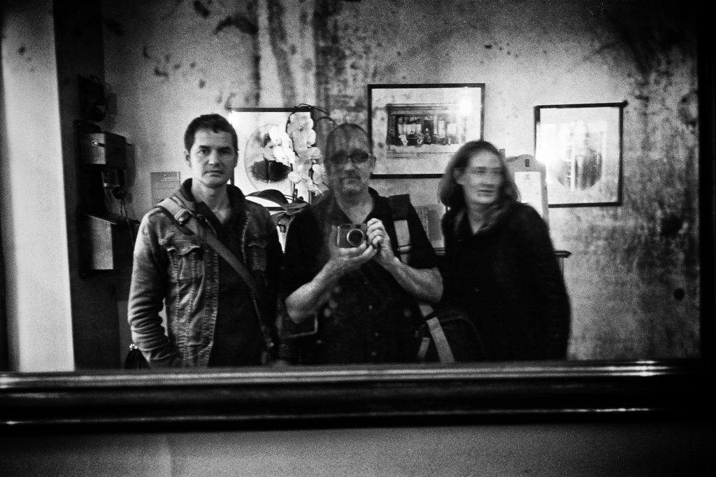
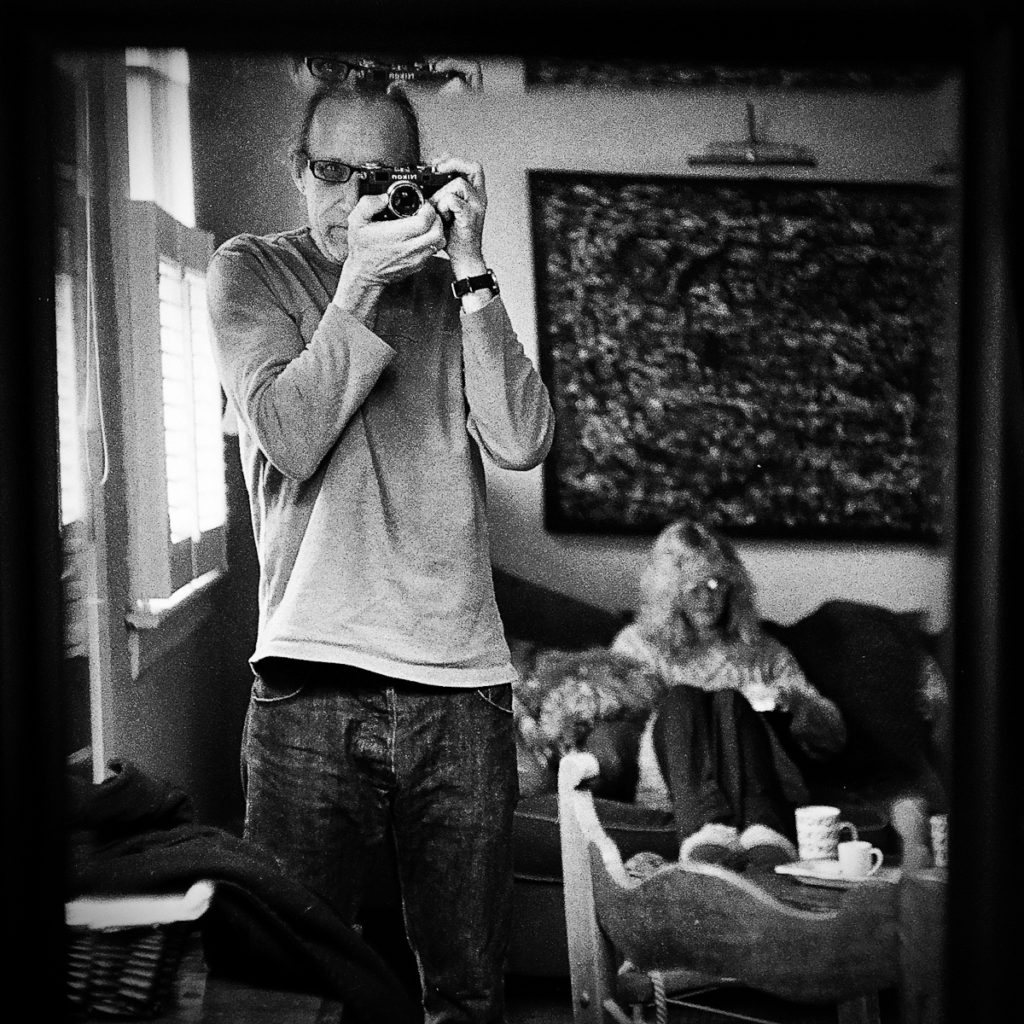
Susan, Cape Cod. Me Looking at Her Looking at Me – A Perfect Visual Encapsulation of Heidegger’s Theory of Self
We aren’t alone in this process of creating ourselves. In Heidegger’s view, our being is also defined by the world into which we are “thrown.” Your identity is only possible in what Heidegger calls “shared forms of life” in a “public life world.” There’s no you without the context provided by others, the world you didn’t choose but rather are thrown into. If this is true it introduces a certain serendipity into your supposed ‘self-creation’; you are responsible for creating yourself, yes, but your ability to do so is circumscribed in some sense by the existential realities of others. Insofar as your palpable creations are concerned i.e. your photos, they are the creations of an interactive process that presupposes a third party, the recipient of your work – the viewer, the critic – as a necessary part of the process by which you create yourself. If your art is a formative exchange between you and your work, Heidegger also understands it as a formative exchange between your work and others, and this dynamic is as much a part of the artwork as is your relationship to the work.
Post-Heideggerian heavy thinkers like Merleau-Ponty, Hans-Georg Gadamer and Paul Ricoeur share this ‘dialectical’ concept of truth in art. Only through this dialogue with your work and with others through your work can you authentically express yourself. The ‘meaning’ of an artwork is the sum of dialogue of differing viewpoints brought to the exchange, both spoken and unspoken, between you, and its viewer. What others think about your work matters to you.
*************
Philosophical speculation can be fascinating. Often, though, I find myself wondering whether a given philosopher’s thought mirrors reality rather than an elaborately spun intellectual puzzle. Is Heidegger correct? Are we really somehow defined by how others see us? Are we at the mercy of other’s understanding of what we’re doing? Does it really matter what others say of our self-expression? If so, it seems to compromise the very premise of Heidegger’s notion of art as self-construction. How is it ‘me creating myself through my life and my artistic decisions’ if my truth, my definition, is also dependent on your understanding? How could you possibly participate in my own self-definition? Seems a contradiction in terms.
I don’t buy it. If my photography is a form of ‘self-creation’ I shouldn’t need input into what I’m doing. I’m doing it for me, not you, and it needs to make sense to me and if it does it doesn’t matter to me if it makes sense to you. It’s why I’ve often resisted showing my work in public. I can’t remember ever getting a comment or critique that helped me understand what I was doing. It’s why photo competitions and portfolio critiques seem deflections of creative energy, and at worst, self-destructive. It’s the off-loading of creative responsibility on others, or, at the least, a refusal to take responsibility for your creative autonomy.
Critique my work all you want, it’s your right. I’m glad it’s out there and possibly a small piece in what helps you achieve your own self-definition. But don’t confuse your critique with something that’s going to aid me on my own creative path. You can’t know. You don’t have that power…unless I cede it to you, and if I cede it you, I’m abdicating my own responsibility for self-definition.
The bottom line: use your photography in a way that makes sense to you. Stop apeing others and create photos that have meaning for you. Forget the ‘shoulds’ that others always seem to want to impose on what is a uniquely personal and singular quest. Allow others to do the same. Each of us, in exercising our creative capacities is building a self. Build the self that works for you.
Buddy, Donna and Abby, Carolina Beach, Summer 2020
Stuck as I am at home, a function of Covid and Chemo, I’ve been reading a mind-numbing amount of internet arguments re: film vs. digital. Everyone has an opinion. I certainly do; much of this blog for the last 7 years has been dedicated to flogging that opinion at every available opportunity. My take: yes, there’s a ‘film look’ that differs from digital, and it’s ‘better.’ Film has an unmistakable heft to it, a solidity, that digital capture is incapable of reproducing however much you run the file through whatever emulation software you prefer. It has to do with 1) the non-linear vs. linear capture of film v. digital; 2) the organic grain structure of film and its function in capturing the image v. ‘grain’ superficially overlaid after the capture; and 3), to a lesser extent, the more “classic” rendition of film era optics v. the clinical perfection of highly corrected digital era optics. Or so we say.
FILM :Me, Jorge and Florence, Van Gogh House, Auvers sur Oise, 2014 Contax G2, HP5, D76
DIGITAL: Me in My Paris Flat, 2003, Nikon D2
*************
So, I was thinking of all these issues as I printed the photo of my wife and the mutts above. Take my word for it – it’s a technically stunning print, wet or digital, a perfect B&W print…or at least I think so. (You can right-click on any of the three images here and ask that it be viewed in a new window..and it will bring up a higher resolution image that you can pixel-peep). Hopefully, the scan of it above gives ‘some’ sense of it as a print. Of course, given we are, by definition, debating this via a digital medium makes the whole issue suspect to begin with. But, as you know, half the fun is in debating these insoluble issues and holding firm opinions on them. So, putting that aside for a moment, and given that almost all photography is viewed digitally these days…can you tell whether this is film or digital capture? And if not, what are we arguing about anymore?
You have two options:
It’s taken with a Leica M5, 25mm f4 Voigtlander, yellow filter, (expired) Ilford Pan-F rated at 50 ISO and developed in D76, scanned with a Plustek 7400, marginal contrast post-processing in Lightroom, output sharpening (low); or
It’s taken with a Sigma sd Quattro, Sigma DC 17-50 2.8 EX HSM, effective focal length 25mm, ISO 125 DNG file pre-sharpened in Nik Sharpener, processed in Silver Efex Pro as a Pan-F emulation.
Can you tell the difference? Can you articulate why? What, if anything, gives it away? I’d love to hear your thoughts.
“I photograph to see what things look like photographed.” Garry Winogrand
One of the things I appreciate about photography is that it gives you permission to look. Most of the time I don’t. I’m usually operating on auto-pilot, oblivious to anything around me except something that’s outside normal expectations. I suspect we all live this way, conserving our limited attention for when evolution had bred in us a need – fight/flight, sex, food. What about our aesthetic sense – which evolution has clearly prioritized as a basic human need? How might we indulge a sense of beauty? Does being a photographer assist in some way? I think it does.
Garry Winogrand was onto something when he decided to photograph things to see what they looked like when photographed. He was one of the first photographers to recognize the camera’s potential to make us see things. It both gives us permission to look and creates new visual realities, showing us things we otherwise wouldn’t see. The nice thing about the digital age is I now always carry a camera with me, which allows me to always be looking at things in terms of what they might look like photographed. Back in the film era, that really wasn’t possible, unless you were a lunatic like Winogrand who left behind 6500 unprocessed rolls of film at his death. Today, all you need is your iPhone and some attention. Winogrand would have gone nuts with an iphone.
Think of photography as a means to discover things, a way of saying “Look at what I saw!’ Often times (not always) it’s not so much a way of documenting what is but rather discovering new ways things might look if you leave yourself open to it. And because it’s about leaving yourself open to seeing how things might look, everything is opened up to you as a subject. An afternoon walk with the dogs and an iPhone can become an exercise in seeing things. This is a profound gift digital photography gives us. It turns a routine walk into an aesthetic experience…if we let it. That’s pretty cool.
All photos taken with an iPhone 8 and processed in camera with Snapseed
“Silence is the hidden content of the words that count.” A.G Sertillanges
I’m suspicious of critics who write about photography as an art form. I don’t think I’ve ever read a critical essay about a specific photograph or body of photographs that has in any sense added to, or explained, the experience given by the photograph itself. This is not to say that there isn’t good writing about photography. There is. Sontag and Barthes come to mind, but what they are doing is writing about photography as a practice and not attempting to explain or supplement the truth of specific photos. Reason, as expressed in language, can not articulate visual truths. Reason’s last step, according to Blaise Pascal, is to recognize its limitations.
For that matter, photographers who attempt to explain their work via written captions or accompanying essays seem to me to be missing the very point of visual art itself: visual art expresses that which can’t be expressed with words. To use a metaphor of the great German philosopher Immanuel Kant, words are a net we strain reality through. A lot gets through the net. What the visual arts offer us is a portion of that reality that gets through the net of language.
This, I think, is the power of photography and why many of us are drawn to it in a very profound way. It’s a means of expressing things that can’t be expressed verbally. The photograph above is an example. I found it on a roll of film I recently developed. I don’t now remember its specifics – why the took it, what I saw in it, if anything at the time – but now, as a finished product standing by itself, it denotes something to me. It presents something visible to me, something that resonates with me. Whatever it is, it’s not capable of being put into words. It represents that portion of reality Kant would say has slipped through the net of language.
*************
Ludwig Wittgenstein remarked on the human urge to “run up against the limits of language.” We instinctively understand that words somehow deaden the fullness of our experiences. According to Isaiah Berlin, this is the paradox of language when faced with profundity: “the more I say the more remains to be said … as soon as I speak it becomes quite clear that, no matter how long I speak, new chasms open. No matter what I say I always have to leave three dots at the end. Whatever description I give always opens the doors to something further, something even darker, perhaps, but certainly something which is in principle incapable of being reduced to precise, clear, verifiable, objective prose.”
German philosopher Martin Heidegger agrees with Wittgenstein and Berlin…up to a point. Much of Heidegger’s philosophy is about limits, of knowledge, of words, of expression. For Heidegger, logical thought -i.e. that which can be expressed – is not sufficient when we’re trying to talk about certain things. “The very idea of “logic” disintegrates in the vortex of a more original questioning,” wrote Heidegger. Wittgenstein, Berlin and Heidegger all agree there is more of life than can be articulated. Heidegger, however, makes the further claim that what happens in the interstices between words is what’s really important. This is where we find the most profound truths. For Heidegger, this is a qualitative advance on what Kant was saying. Kant (and Wittgenstein and Berlin) was saying that some reality slips past the net of language. Heidegger is claiming that the most important part of reality slips through the net.
So, how do we communicate this most important portion of the real? Heidegger attempted to do so via language. This is the paradox of Heidegger and the reason he’s so hard to understand. He is attempting, with words, to express the truth that words miss the larger truth. This is purposeful. Heidegger holds that we should try to say something about the interstices – that the fact that we recognize an interstice means that there’s something to be said about it, however vague and preliminary that might be. Not directly, perhaps, and not even particularly clearly, but we shouldn’t abandon all efforts to use words to speak about things that lie beyond language. Unfortunately, Heidegger never took the next logical step of analyzing the visual arts and what role they might play in the process of expressing what’s true. I believe he might have found a way out of his expressive paradox had he done so.
The street cafe provides a unique setting, special to cities: a place people can sit lazily, legitimately, be on view, and watch the world go by […]. Encourage local cafes to spring up in each neighborhood. Make them intimate places, with several rooms, open to a busy path, so people can sit with coffee or a drink, and watch the world go by. Build the front of the cafe so a set of tables stretch out of the cafe, right into the street.
Christopher Alexander et al., A Pattern Language, p. 437,439
*************
by Stephen Jennner
If the current “pandemic” has done anything for us ordinary folk, I suppose the chance to get off of the bus and reflect on the way we live and interact has probably been uppermost. It has also given us time to undertake a real “spring clean”, many of us are combing through our clutter, looking for stuff to throw out or retain. Every time we come across something that we had almost forgotten, the memories come flooding back. Such is the legacy of modern materialism. I have been re-reading some of Leicaphilia’s recent blogs and one strand in particular led me to re-read Camera Lucida which I had not really read properly initially, but kept on the shelf, because I liked some of the pictures. I realised also that it is a translation, and very well regarded, but perhaps less readable in English.
There was also the recent passing of the well known English philosopher Sir Roger Scruton, who I knew by name, but whose work I had never read. The ritual disdain verging on the celebration of his death by the institutionalised lefty media led me to investigate. He couldn’t have been that bad after all, I thought. I read England an Elegy first and enjoyed that, so I sallied forth and bought two more books, How to be a Conservative and Green Philosophy – How to think seriously about the planet, the first of those two was the thinner, so I read that, I am currently ploughing through the second, over 400 pages. They are very readable and surprisingly accessible for being the work of someone who is described as a philosopher.
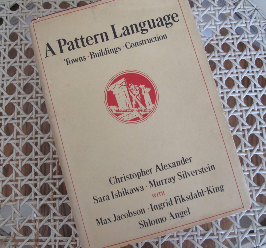
But, back to the COVID clearout, since the last of our kids cleared off, the room in which he festered has been where everything material gets discarded, and was becoming impassable. So it was there that the great undermining began. It wasn’t long before I came across a pile of books, discarded but kept, because of a “one day I will read that again” sentiment. My eyes settled on a book that I have read and gushed over for nearly forty years, and I sat down and started leafing through it once again. I don’t know much about the authors, I think they are American, or at least naturalised Americans, the names look English, Japanese and Jewish, but together they have produced a universal language, which has since established a format that is used repeatedly, notwithstanding the specialised blog format, where the host invokes others to chime in by way of comment, and sometimes submit their own pieces.
*************
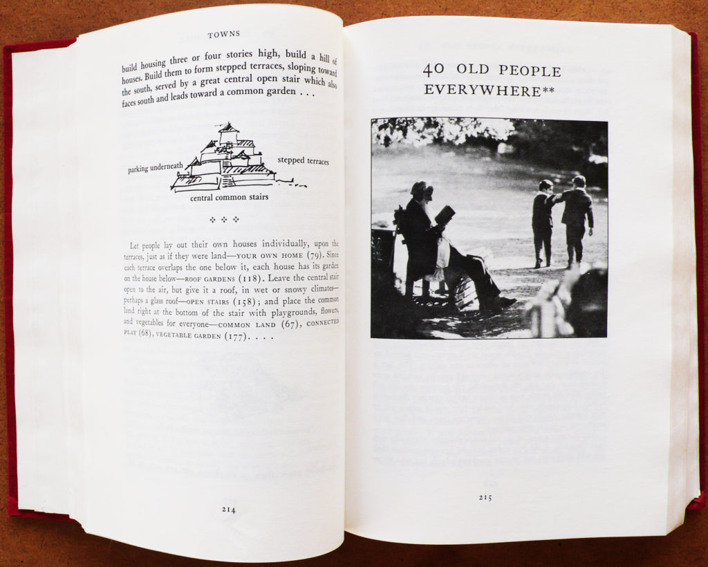
The book is called A Pattern Language and the credited authors are Christopher Alexander, Sara Ishikawa, Murray Silverstein, along with contributions by Max Jacobson, Ingrid Fiksdahl-King and Shlomo Angel”. Think of it as a photo book about issues of social architecture; there are many excellent photographs and illustrations accompanying the text, many by well-known exponents, some unattributed snappers and daubers, and I presume, some by the authors.
The theme of A Pattern Language is in a nutshell, how to approach, conceptualise and plan for the built environment for a beautiful, practical and sustained past, present and future. It is profoundly conservative in sentiment rather than its political allegiances, regarding human beings as essentially animals that are universally similar, yet differ locally and thus and employ different ways of being, different traditions, different gods. The layout is very structured, the book indexed by levels of what the authors regard as layers of significance.
There are several main headings which are then further subdivided, beginning with a “summary of the language”, then describing “independent regions”, “towns”, “buildings” and finally “construction”. Those main headings are further subdivided into small one or two-page chapters, which are described in levels of importance by the addition of either no, one or two asterisks appended to the title. Each chapter describes a particular aspect of human habitation along with an illustration or photograph by way of visual explanation. The photographs serve the text well, lending an added meaning that isn’t capable of being articulated by words. The book is an object lesson on the different meanings conveyed by the written and the visual, how the two are distinct yet can accommodate each other to produce a larger meaning.
I had never really appreciated the importance of the photographs until I read Roland Barthes book again, even though I had not related that book to A Pattern Language until I picked it up and read it again. The feelings that a good photograph can imbue, and the memories that resurface, being what I believe Barthes devotes Camera Lucida to.
One of my favourite little chapters is entitled “Zen View” and the opening illustration is a painting by Pierre Bonnard. The text describes a beautiful view in Japan, including in the distance, the sea. Many a modern architect would design a massive window into the main room of the building that he is constructing. The Zen approach might be to instead, include a small window facing the view, halfway up a staircase. It is only seen as one climbs or descends that staircase, sometimes one stops, usually in a slightly different position to look and consider, every time, the prevailing conditions whether it is night or day, sunny, raining or shady, the view, the light, is different. It never bores, but since you deliberately stopped, invokes a new thought or memory. The effect is to really see. Sublime.
The experience that I derive from this book, is that human beings all have similar needs, even though at a local level, we have different ways of solving them. They are never fixed, since newer ideas and threats regularly surface and need to be incorporated into those ways, and the best way to do this is to ensure that the paramount human urge is conservative and localist and most importantly, not de(con)structive. In my view and that of the authors, the manner in which we can solve our global problems is by looking after our local community issues through negotiation, a public secularity, local judgements where disputes arise, and a sense of history applied to the present and held in trust, for the sake of those yet to be. It is what the ancient Greeks, and Roger Scruton (among others) sum up in one word – “Oikophilia”. The love of home and beauty, and the avoidance of mere utility. If we look after the parts that are within our scope, we can manage the whole planet, and hold it in trust for the foreseeable future. And the method for achieving this, is what the Irish politician and philosopher Edmund Burke described as “The little platoons”.
Anyway, to sum up, this book is an essential read, and I note that Amazon still lists it, if anyone wants to take a punt.
It is always good to keep your eyes wide open, because you never know what you will discover. The drive to live life more alertly being an instinctive need, whether you are an artist by trade or desire, the art of seeing well is a necessary skill, which fortunately can be learned. -Michael Kimmelman
What’s the point of photography? Maybe the bigger question is: what’s the point of looking at things, really looking at them? That’s what we’re doing when we photograph. Granted, we’re placing a value on preserving how something looks, whether it be a lover, a pet, a glimpse of what we daily encounter…. but we’re also attending to it in the moment. That’s why we value simple photographic tools – mechanical rangefinders the perfect example – that get out of our way and allow us to experience the moment without having to ‘interface’ with a machine and its requirements.
A good example is the difference between using my M5 or my Ricoh GXR with the M module. I rarely even use the meter in my M5; I find it more a disturbance than a help. What I like is the big, clear 35mm window, no clutter, just a focusing patch and you’re done dealing with the machine. Look at the light, set your exposure and forget the little details. The rest is looking. The Ricoh? Great little camera, but I’m constantly fiddling with something – a menu, an ISO setting, something flashing on the damn LCD – my attention drawn away from what I’m trying to see. It’s the story of every digital camera I’ve ever used; once you reach a certain level of competency i.e. you’ve distilled the photographic act down to its basics, all those technological ‘aids’ – those things camera makers promised us would make our experience better – just get in your way.
*************
For that matter, what’s the value of what we as photographers create? What’s the value of looking at a photo hung in a gallery or museum or published in a book? Why is it so important to us? For me, the point is the process of perceiving itself. It meets some primal need humans possess. But it also has to be disinterested to be an aesthetic experience. Looking at porn isn’t aesthetic, no matter how well done; the reason it isn’t is because we’re motivated by something other than the enjoyment of beauty. A genuinely aesthetic experience of beauty is aimless. We only fully apprehend the experience when we remain disinterested. A vested interest in what you’re looking at gives you tunnel vision. You see what you’re looking for, and as such, you don’t really see.
Photography allows me to move through the world with an attitude of detachment, in a state of heightened awareness. I’m always looking…which means I’m seeing things people habituated to their environments typically don’t. That’s pretty cool; we’re not here long. Best to pay attention while we are.
Photography – or, more precisely, film photography, where there’s typically a lag between what we see and how we see it reproduced by the camera – amplifies the enjoyment I get in looking. It allows me a second chance to see something I’ve already seen and to see it with new eyes. It’s why I find myself increasingly drawn to photograph the people I love. I’ll run a roll of HP5 through my camera in a day or two, just shooting domestic scenes around me – my wife, the kids, my dogs – and throw it in the pile of rolls to be developed at some later time. That invariable means a year or two down the road, when I’ve accumulated enough unexposed film to shame myself into doing something about it. When I develop them I’m always amazed at what I get. The banal circumstances of my domestic experience seem somehow re-valued and take on a larger meaning. The photo puts them in context. I understand what I see – and value it – just a bit better.
*************
Howard Axelrod, in The Stars in Our Pockets, addresses the technological processes that remove us from having to pay attention. GPS is an instructive example: with it we passively navigate our environment without reference to its larger context or where within that context we fit. It’s all end result – do we get there, or don’t we. (He doesn’t address the larger issue – that we’re also using a machine to move through space which itself mitigates our environmental interaction). Axelrod asks, “Will we still be able to achieve a kind of orientation that is really a kind of wisdom?”
It’s this “orientation that is really a kind of wisdom” that photographic looking gives. The heightened attention it cultivates can be difficult to practice. Really looking with disinterest requires effort. You can’t do it if your attempts to do so are mediated by tools that divert your attention instead of focusing it. In a photographic context it requires the correct tool, something that remains transparent to our purposes. This is why we hold onto those cameras that become extensions of our seeing through excellent haptics and long usage. Usually I don’t even recall putting the M5 to my eye; it’s such a simple act, done so many times, that its reflexive now. The digital camera? Not a chance. Even though it’s full of the technologies that supposedly simplify my experience – auto exposure, autofocus, auto ISO, facial recognition, etc etc, they’re never transparent to the act; I’m always scrolling through some fucking menu, or looking for some dial to turn or button to push in response to some LCD readout. The camera is telling me what to see.
There’s a reason we love our old mechanical film cameras. When used competently and correctly, they allow us to give ourselves over to the moment. We can exist in the moment for no reason or purpose other than that of the experience alone, for the appreciation and apprehension of what’s in front of us. That’s a remarkable gift. It’s also what’s required if one wants to produce work of any meaning, work that will help others see as well.
I’ve been looking at a lot of photographs lately. Photo books, to be more precise. I spent last night looking through Josef Koudelka: Nationality Doubtful, (2014), a retrospective of Koudelka’s career published in conjunction with an exhibition of the same title co-organized by the Art Institute of Chicago and the J. Paul Getty Museum. Along with Robert Frank, Koudelka may be the photographer I admire the most. There’s something incredibly luxurious about his work, especially Gypsies and Exile – both shot with 35mm b&w film – when viewed as printed photos and not simply images on a screen. It’s something the current generation of photographers may be missing, which is a shame. The times a photograph has really moved me, not simply as an interesting visual experience but as something existentially and profoundly alive, have all been when viewing a physical print, whether hanging on a wall or printed in a book.
There’s something remarkably satisfying about looking at b&w film photographs printed in a high-end photo book on 100 weight semi-glossy fine-art photo paper. There’s a tactile dimension to the experience that incorporates both the hand and the eye. It’s so much more rewarding and inspiring than viewing the same photos on a screen, something about the instantiation of the photo as a ‘thing’ which makes the experience of the image on a screen so remarkably impoverished in comparison. Some of the most intense visual experiences I’ve ever had have been either standing in front of a matted and framed photo hanging in an exhibition or printed on the pages of a fine-art photo book. Viewed on a screen, it’s just another image, one of thousands we consume daily. Viewed on a gallery or museum wall, or as a page in a book held in one’s hands, it’s a unique thing having specific tangible qualities. One thing I’m sure of, and that’s b&w film photos print better than b&w digital photos. There’s some essential character of a printed 35mm negative that can’t be duplicated with digital capture no matter how you attempt to post-process it to mimic film. If you don’t see that, well, I’m not sure we have much to talk about.
*************
Which leads to the larger question: Why do we love photographs? What is it about them that makes their experience so important to us? Joseph Addison, an English essayist, poet, playwright in his 1712 essay “The Pleasures of Imagination” sees it as a matter of possession (as in physical possession of a thing): “A man of polite imagination is let into a great many pleasures, that the vulgar are not capable of receiving. He can converse with a picture, and find an agreeable companion in a statue. He meets with a secret refreshment in a description, and often feels a greater satisfaction in the prospect of fields and meadows, than another does in the possession. It gives him, indeed, a kind of property in everything he sees, and makes the most rude, uncultivated parts of nature administer to his pleasures: so that he looks upon the world, as it were in another light, and discovers in it a multitude of charms, that conceal themselves from the generality of mankind.”
If you agree with Addison, the pleasure we derive from looking at photos is a solitary thing, not beholden to being shared or intensified by being experienced with others. Experiencing Art is not about shared pleasure; in fact, it’s the opposite. It’s because it’s an experience fundamentally incommunicable; I’ll be damned if I can explain to you why I sat up till 3:30 AM last night looking at Koudelka’s photos, or why I find myself obsessively going back to Robert Frank’s Valencia 1952, or why I could stand slack-jawed in front of a simple Walker Evans photograph in the Getty museum.
One thing that Koudelka, Frank, and Evans have in common, and that is their aversion to captioning their work. They present their photos without explanation, and we the viewers get to decide what it means. As Gerhard Richter has noted, “pictures which are interpretable, and which contain a meaning, are bad pictures.” A good picture “takes away our certainty because it deprives a thing of its meaning and its name. It shows us the thing in all the manifold significance and infinite variety that preclude the emergence of any single meaning and view.”
Italians have a word dietrologia — literally translated as “behindology.” It’s the art of looking behind the surface of things to find their meanings, the hidden meanings of things. The Italian dictionary defines dietrologia as the “critical analysis of events in an effort to detect, behind the apparent causes, true and hidden designs.”
I’m pretty sure it’s a necessary trait for creativity, the ability to see more than the surface of the thing. Creativity is the ability to generate novel insights, to see behind the surface banality of a thing and suggest a glimpse of what it might mean if looked at from a novel perspective. To do that, it helps to have a head full of other things – things you’ve seen, and experienced and read about or heard or thought through. All of these things you weave together with what you’re observing and the end result is seeing something new.
The trick, of course, is to possess the ability to show others what you’ve seen. Successful creatives communicate their visions. Think of someone like Martin Scorcese in film, Trent Parke in photography, John Coltrane in music. They each have a unique vision that ties together their work and makes it theirs, and they possess the skill to tell that vision to others. There’s two parts to the creative equation – 1) seeing, and 2) telling. In order to be successful creatively, you need to be good at both. Unfortunately, recently I’m having trouble with both. I used to be a fairly proficient dietrologist. Lately, not so much. I’m, as they say, stuck, seeing nothing new or interesting. I’m hoping that eventually changes. Who knows. If past experience is any indication, one day I’ll wake up and see compelling pictures everywhere.
*************
According to 19th-century art critic John Ruskin, the “greatest thing a human soul ever does in this world is to see something, and tell what it saw in a plain way.” I’m not sure I’d go that far, but I do agree to the extent that seeing and telling seems a uniquely human thing to do, and it’s something really important to us, both as individuals and as a species. And specifically, image-making – a type of seeing and telling – is a necessary part of our emotional, psychological and intellectual make-up.
Literally, the earliest evidence we have for human culture are images, paintings of animals deep within caves that date to times before we’re sure humans even possessed language. The cave paintings of Pech Merle, Font-de-Gaume, Rouffignac, Chauvet and Lascaux are thought to be more than 30,000 years old. Bisons, lions and other extinct creatures cover the cave walls. What’s interesting about these pre-historic cave drawings is their undeniable aesthetic quality. Whatever their purpose, it was more than just transmission of knowledge, as some anthropologists claim (i.e. information about the location and movement of prey animals etc); there exists a vision behind these images, a felt need to communicate something aesthetically, the same thing that motivated Boticelli or Jasper Johns…or Walker Evans. Many animals are depicted in vivid color, with a sense of perspective and anatomical detail requiring significant artistic skill. Picasso was awed by their aesthetic power. “We have invented nothing,” he remarked after a visit to Lascaux in 1940.
*************
The question is why the ability or desire – or both – comes and goes as it does. Part of it, for me, has been the exponential inundation we’ve experienced via digital media. Technologically compelling images are everywhere, and, as such, they no longer have any value because they have nothing beyond their surface glossiness. They say nothing by representing everything superficially, everything glossed over with the hyperreality of marketing. They’re meaningless visual trinkets mindlessly created and consumed, all alike in their technologically mandated perfection. They represent the antithesis of a unique vision, all surface, saying nothing.
I started Leicaphilia years ago because I thought there needed to be someone advocating for film photography before it was totally swallowed up by digital. In the years writing it I’ve come to see the issue in more nuanced terms. What I’ve been really criticizing is the conflation of excellent images with images that rely on technology for their visual interest. Maybe shooting film is a self-imposed means to marginalize the ability of technology to hijack the creative process for its own ends. But, let’s face it – shooting film is a pain in the ass. Mind you, I ‘love’ the process, but I’ve come to realize that you don’t get points for difficulty. As to its success or lack thereof, a photograph stands on its own. It doesn’t matter how you produced it. Or does it?
I love the photo above, taken by Surrealist ‘Art Photographer’ and photojournalist Lee Miller. There’s something dislocating about it, something difficult to read at first glance, something disorienting about the reality on which you as the viewer stand, a function of the questionable dimensionality of the photo itself. Produced by the indexical process of analog photography, it’s something more than an indexical account of the real, a view turned to a subjective vision by what appears to be an interplay of literal and fictive frames.
Portrait of Space is a “mise en abyme” or an image-within-an-image. It’s a visual puzzle, a play on ambiguity and the permeability of boundaries. The title itself is part of the puzzle. What’s the subject of this ‘portrait?’ Given the multiple frames, it’s up to you to identify what space is the subject. Is it all of it, or some part of it? What can be considered inside and what outside?
Pretty cool that all of that can be summoned up via an indexical photograph that, in the words of Susan Sontag, “stencils off the real”. It’s testament to the infinite creative possibilities inherent in our simple ‘documentary’ medium.
In actuality, the photo is taken within a tent in Egypt. The viewer looks out onto a desert, through a window with a torn mosquito net, the tear itself serving as a frame. A wooden picture frame hangs from the net above the tear, creating a second frame nested with the window frame which itself is nested within the frame of the photo. The appears to be a stone border demarcating the landscape within the netting tear and the window frame. Beyond lies desert. Above, occupying various ratios of different frames, and about 2/3 of the image, is sky with wispy clouds.
*************
I realize, in reviewing my work over the years, the “mise en abyme” trope is something I’ve been intuitively drawn to since I started photographing things. Maybe it has something to do with having an early education in the arts, where one learns to think of visual art, whether painting or photography, as layered abstraction, although I find that I was doing things like shooting out car windows or using windows as frames within photos since I was 12. So who knows?
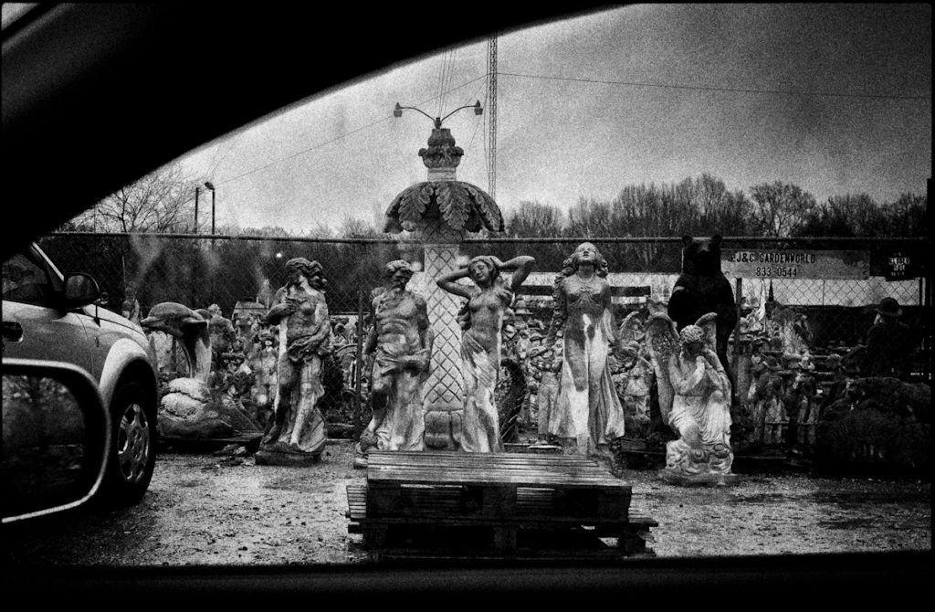
Of course, it’s at the root of whatever is inspiring me to publish a book like Car Sick, and hopefully it’s part of the reason many of you good folks have reserved a copy. In any event, the photo above is something more than some funky statues in some god-forsaken place somewhere; it’s the view out a car window of those statues, which introduces a layer of complexity absent in the straight shot. Now the photo infers a viewer of those statues, a viewer in a vehicle, the vehicle itself in a certain relationship to the statuary, the viewer in a certain relationship to both the statues and the vehicle. The interpretive possibilities of the photo have expanded exponentially, all with the inclusion of the sense of a car window that brackets the view.
So that’s the idea I’m selling you in Car Sick. Think of it not as a collection of marginally interesting, semi-competent views out of car windows – think of it rather as a brilliant collective “mise en abyme“, a celebration of image-within-image, “in which notions of inside and outside, are endlessly placed and displaced”, as critic Patricia Allmer noted of Miller’s work, challenging you the viewer with its layered details, made possible by the artist’s [that’s me!] “unique sense for presenting a slice of dislocated reality. “
I’ve never cared much for color photography. Never shot it in the film era, don’t pay any attention to it in the digital era. Not that I’d be so militant as to buy a Monochrome; it’s much easier to simply chimp, edit and print RAW files in B&W. It’s partially a function of when I came of age photographically – the early 1970s, when B&W constituted the majority of both journalistic photography and whatever photography aspired to personal expression. Color photography was the product of the inconsequential snap-shot, the throw-away photo taken with the Instamatic. Color photographs were thin and transparent, lacking the visual ‘heft’ of B&W. They valued the superficial – color! – at the expense of the visually complex – form. I’ve carried these prejudices with me into the present.
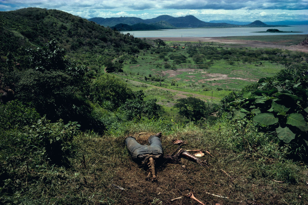
Of course, that’s ancient history, certainly by the 80’s with the introduction of ‘professional’ color films, which was itself the result of larger trends in visual media – the rise of color television as the common visual medium, replacing print media like LIfe and Vu and Look as defining the visually normative. You see the change most obviously in the transformation of photojournalist imagery from the 60s to the late 70s and onward. Compare Larry Burrow’s B&W Viet Nam photos – while thematically distinct from the WW2 photographs of Capa etc, still sharing a common B&W visual language – with the late 70’s color work of Susan Meiselas in Nicaragua and El Salvador. Both are exceptionally skilled and thoughtful photographers; what differentiates their work is the medium they used. To my eye, Burrow’s work has an emotional impact that Meiselas lacks; it’s almost impossible for me not to aestheticize Meiselas’s work, even though some of it is remarkably gruesome. It’s the color, which seems to connote two things to me: banality, and cheap beautification. Understand, I’m not accusing Meisalas of cheapening what she photographs, rather, I’m reflecting on my own inherent biases and using them as an example of how each of us constructs meaning from photos.
Susan Meisalas, “Cuesta del Plomo”, showing a half-devoured body on a hillside outside Managua. Gross…but I can’t help thinking of how beautiful Managua’s landscape must be. Need to put that on my “to visit” list.
*************
Above is a photo that will probably find its way into Car Sick, the book I’ve been shilling for the last few weeks. While it looks like a B&W film photo (nice Tri-X contrast and grain) it’s from a RAW file taken with a Ricoh GXR (10 years old now, and “obsolete” or so I’m told, it remains a remarkable camera, especially when using the M-Mount mated with an older LTM optic; why anyone shooting “leica style” would need anything else is completely beyond me). The “original” leads off the post; a banal color snap of no visual interest. But monochromed, with some pronounced grain added, a hint of light fall-off at the edges of the frame, now, to my eye, it’s just right, the perfect confluence of B&W contrast and grain and film era optics to produce my idea of what a photo out a car window should look like. 5 years ago I’d have a vague sense that I was ‘cheating’; now I couldn’t care less. I’m tired of arguments about media and technique. It’s the image that counts; who cares how you get there (up to a point: see below for the usual qualifications). The point is the aesthetic. I understand and have internalized the B&W aesthetic, maybe in a way that photographers born after 1980 can’t. I ‘see’ in grainy B&W. Luckily for me, there’s seemingly no Instagram ‘filter’ for my look, so I get to claim it legitimately. Instead of selecting a random ‘filter’ on a photo app or social media site, I learned it the hard way. I earned it; it’s been incorporated into my vision. It’s how I see, not some pre-selected veneer I’ve made an arbitrary decision to paste over my subject. My style is, in some way, my subject.
What’s remarkable to me is how foreign this is to today’s photographers. Raised with the easy color capture of digital – but also raised in the visual language of color TV and the ubiquity of public advertising – color is their normative way of seeing, which it should be, right? Talk to them of B&W and they’ll reply, “The world is color. We should reproduce it as such. It’s B&W which is artificial, necessary only for so long as the technology hadn’t matured to the point to transcend it as a limitation. It’s no longer needed. we’ve moved past it.”
Except that, ironically, one can argue that this new visual language- the language of color that’s become synonymous with photography since the 1980s – is the ultimate artificiality now at the core of photography. It is so because it further obfuscates for us the inherent artificiality of photography as a medium. We hold a 3×5 piece of paper with 2D colored ink (or silver halide) representations engraved on its surface and consider it a transparent slice of the real. Its color is one more means of obscuring the fact of its artificiality, of its inherently constructed nature. It seduces us, the viewer, into thinking we’re seeing an objective representation of something real out there, when what we’re really looking at is a piece of paper of abstracted signs in our hand.
What we’re viewing on that piece of paper (or screen) is someone’s coded representation of their subjective interpretation of the real, subjective in the same sense that Cezanne’s paintings of late 19th Century French life were subjective takes on that life. And just like paintings, some photographs are more compelling than others, they being so not because they more accurately reproduce reality than that they create a coded reality that compels us as viewers. It’s why we venerate Robert Frank while laughing at the junk that gets posted on enthusiast websites. And it’s why some people – myself included – continue to shoot in B&W. It’s how we see.
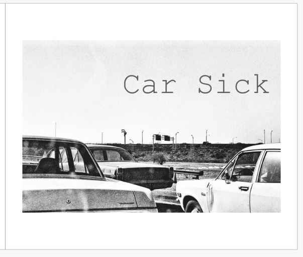
Above is a dummy copy of the cover of a book of b&w photographs I’m intending to publish. The tentative title of the book is Car Sick. The book’s premise is simple: it will contain photographs I’ve either 1) taken from my car, or 2) got out of the car to take i.e. it’s a view from the car. Specifically, it’s a view of America from the car.
While containing an introduction written by a third party, it will be minimal. There will be minimal text throughout, as I find photo books that tackle and pin their subjects via forced explanation to be of minimal interest. The photos will be sequenced and presented in a manner that suggests a narrative, with appropriate design and production to allow the message to be accessible to the viewer…but you’ll have to work too. My intent is to engage the viewer visually, emotionally and intellectually with a mixture of beauty, banality, sentiment, and formal abstraction.
The book will be +/- 140 pages with +/- 80 photographs.
Trim size will be 10 inches (width) x 8 inches (height, spine)
Photo printing: 4-color on 80# matte Titan white, 510 PPI.
Pages: 10 pt C1S/heavy white stock (120gms) with matte layflat lamination, bleeds, prints one side only.
Cover: Hardcover linen with jacket
Spine width: 0.2901 inches
Binding: PUR perfect section sown bind.
I’m not thinking of the work as a ‘book of photos;’ rather the book, the physical, three-dimensional object, is the work. Physical quality – how the book itself appears and feels – will be of paramount importance. This won’t be a POD (“print on demand”) or standardized ‘Blurb’ book; the type of book cannot be arbitrarily chosen and then the content stuck into it. The book will be a thoroughly considered production – content (editing and sequence), the mise-en-page, choice of paper stock, reproduction quality, text, typeface, binding and jacket design all considered in how such choices interact to produce the finished work.
After much back and forth, I’ve decided to self-publish i.e. I’m not going to hire a book agent to solicit a Publisher and jump through their editorial hoops for a limited production run when the internet offers me considerable resources as a self-publisher.
It will be produced by Bookmobile Printing in Minneapolis, which produces fine-art books for museums and galleries among others. I chose them for the following reasons: First, books are their only business. They are artists immersed in the world of books, and every single step of the process (with the exception of the manufacturing of the metal dies for foil stamping and larger hardcover runs) is done in house. As such, they are able to carefully oversee each element of book production and constantly maintain the highest quality standards.
*************
Defining the audience for a photo book is incredibly important when soliciting potential publishers. In fact, it may be the most important factor. I’ve got a built-in potential audience for the work, a function of cranking out this blog for 6 years. As such, self-publishing makes sense. Most aspiring photographers make the mistake of assuming their potential audience much larger than it in fact is. In truth, small fine-art publishers often print runs of 500 copies or less, with recognized masters selling, at best, 3000 copies. This is especially true of idiosyncratic subject matter like photos out of car windows.
Who is the book’s audience? You. Readers of Leicaphilia.
*************
Give me this much: I’ve written over 400 posts for you, some of it marginally thought-provoking, all of it ad-free. I’ve never begged for your money. I’ve deliberately chosen not to monetize this website so as not to insult your intelligence or to guilt-trip you into a “donation.” That’s tacky and demeaning, both of me and you; we’re better than that. I write Leicaphilia as a labor of love. No remuneration needed or required. And I’m grateful for the readership I have.
So, my question is this: Let’s assume I do enough of a print run to justify selling individual copies for $30 US. Hell, I’ll probably lose money at that price, but that’s OK. Add $5 US shipping within the US, $15 US shipping to Europe/Asia. How many of you would buy Car Sick?
I love taking photos from car windows. They’re the sort of views people don’t give much thought to and so rarely think to photograph. Yet, many of us are in our cars for a substantial part of our day, and much of what we see is mediated through the car window.
I’m intending to publish a book of photographs out of car windows. I’ve begun the process of winnowing down what works and what doesn’t. Like all photography grouping, much of it is dependent on context and sequencing. Narrative focus is what separates good work from bad.
The initial question, before questions of context, is the innate quality of the photo itself – does it stand on its own in terms of form and/or content? This leads to issues of the larger connective theme of the work – is it content i.e. all photos taken out of car windows, or is it formal similarity i.e. a certain ‘look,’ or aesthetic? My sense is it should be both.
With that in mind, here are a few in no specific order or context. I see them as having the potential to anchor a large narrative that extends the subject both in content and formal coherence.
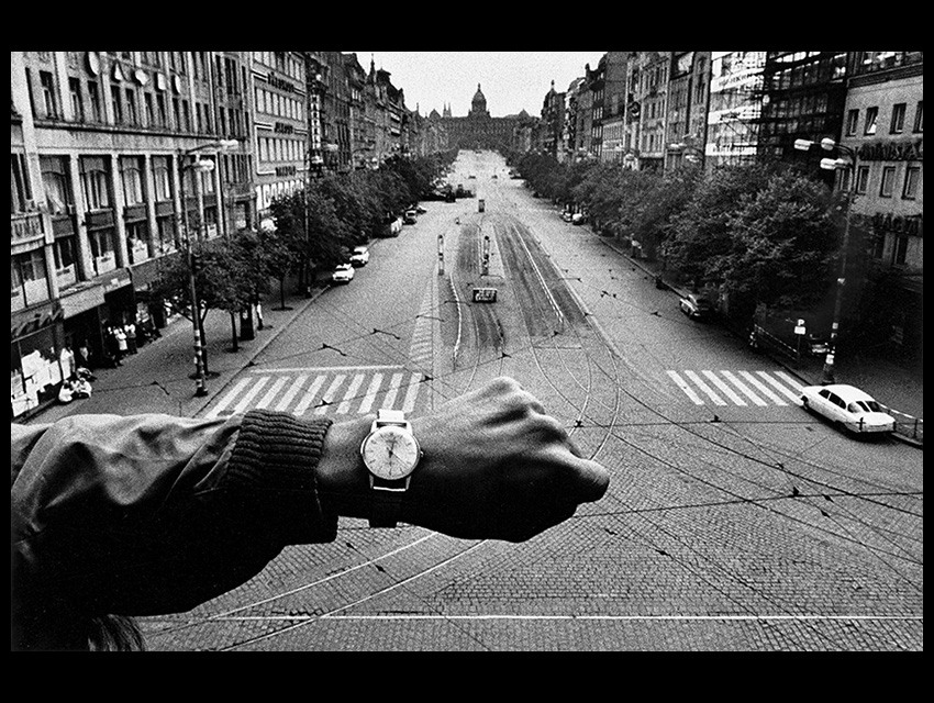
Josef Koudelka, Wenceslas Square, Prague, 22 August 1968, 5:01 PM
The view is in black and white, the grainy look of 1960’s era black and white film so typical of the journalistic photography of the time. The photo has the greyish cast of an overcast central European late-afternoon, what’s left of the day’s sun hidden somewhere behind a sky of low, scuttering clouds. Josef Koudelka, the Czech photographer taking the photo, has framed the photo horizontally in a 2:3 format, a function of the 35mm film used by the Exacta camera he was known to use throughout the ’60s. The photo is a view onto Wenceslas Square in Prague, Czechoslovakia on the afternoon of August 22, 1968. 5:01 PM to be precise. The photographer’s perspective seems to be a few floors up, seemingly in the middle of the Square itself, probably standing atop whatever monument graces the center of the Square.
Wenceslas Square, stretching out to a vanishing point, is empty, devoid of automobile or pedestrian traffic, although there are a few tiny, out-of-focus bystanders at the lower-left edge of the frame, some of them crouched together in what looks like commiseration of some sort. In the close foreground, a disembodied arm with wristwatch intrudes into the frame from the lower left, the watch face and the arm’s clenched fist positioned in the lower middle of the frame where it draws the viewer’s eye as the first plane of focus, but low enough that one’s glance wants to shift fore and aft, first the arm and wrist, then the Square behind, then the wrist again and the watch with its face on display. Presumably, the arm and fist and wristwatch belong to the photographer. The wristwatch says the time is 5:01.
Absent context, it’s unclear what this photo is asking of the viewer. The choice of black and white points to a documentary intent, although the view offered by Koudelka is banal, confusing, without an easily identified subject on which to focus. The camera’s optical focus is on the arm; the compositional focus seems to be both the Square and the watch, although, without further context, we’re not given any clues to make sense of which might have priority or what the relationship is, if any, between the two subject planes. While there’s a superficial inertia to the composition created by the compositional elements – no visible movement to be seen – upon closer viewing there’s a balanced tension radiating from the composition, a tension charged with potential energy that suggests something is about to happen, soon. The wristwatch, its minute hand in a wonky, off-axis position, connotes not stasis, but its opposite, an impending action about to shatter the delicate equilibrium of the captured moment. What it is that’s going to happen seems to be in the balance. The truth of the photo seems to be a function of the past, the present, and the future, whether it be more of what appears to be a temporary lull or rather of developing conflict and sinister atrocity. It’s as if the photographer, and us as viewers, are waiting for something to happen to help us finally make sense of what we see.
Determining anything more from within the four corners
of the photo is futile. To understand what Koudelka is trying to tell us, we
need context.
*************
On Wednesday, August 20, 1968, soldiers from the USSR, the German Democratic Republic, the Polish People’s Republic, the Hungarian People’s Republic and the Bulgarian People’s Republic invaded the Czechoslovak Socialist Republic and occupied the Czech capital of Prague. The invasion was led Soviet troops at the behest of the leaders of the Communist Party of the Soviet Union in response to the spontaneous Czechoslovak socio-political movement called the “Prague Spring,” wherein Czechoslovakia’s Communist leadership experimented with various political and social reforms deemed unacceptably liberal by Soviet standards.
Via a declaration by Czech leaders conveyed to the “People of Prague” by radio on the morning of August 21, both the Czech Army and Czech citizenry were ordered to stand down and not engage in any provocation or retaliation, as such would be counter-productive to the stated aims of the Prague Spring: “We call upon the people of Prague, in particular, the workers – Prevent any possible provocation! At this moment, defense by force is impossible! Our defense must be a dignified, prudent approach, unswerving loyalty to the process we began in January! In response, the Czech citizens who flooded the streets of Prague restricted their outrage to shouting slogans and peaceful resistance. Yet, as more residents crowded into the streets and surrounded the invader’s tanks and troop transports, Soviet soldiers fired into the crowd, killing a number of Czechs. Czechoslovak Communist Party leaders were arrested and removed to locations outside Prague and martial law was declared throughout the country, including a ban on public assembly. By that night, given limited knowledge of the Soviet dictated curfew, the occupying forces were driving their vehicles into the crowds and shooting random protestors who remained on the streets.
The next morning, August 22, Prague’s streets were empty. But as the day progressed, the news spread that there was to be a massive demonstration on Wenceslas Square at five o’clock. It was, in fact, a Soviet provocation, meant to provide a justification for the occupiers to crack down further. Warsaw Pact tanks and troop transports idled in the streets outside the Square, awaiting the arrival of what was expected to be massive crowds of Czech resisters. Czech Radio, still in the hands of Czech partisans, pleaded with its listeners to stay inside; the alternative would be a massacre. The question was – would the residents of Prague stay home?
At 5:01 Koudelka took the photo. His wristwatch tells
you as much.
*************
There are two aspects of ethics
implicated in the practice of conflict photography: 1) the doing of it, i.e. can
the practice itself be justified ethically, or is it, as critics claim, inherently
voyeuristic and exploitative; and 2), if it can be justified ethically, is a
justification dependent on the specifics of the practice i.e. are some ways of
doing conflict photography ethically justified while others are not?
The ethical premise which justifies conflict photography as a practice is this: the photographer will be a passive observer of what’s happening in return for being able to document it. This presupposes a stance of non-intervention on the part of the photographer, whose role as witness precludes active participation in what’s being witnessed. This is what allows the photographer to stand passively aside while a Viet Cong prisoner is summarily executed on a Saigon street, or as an emaciated child lies helpless in the dirt while a vulture hovers nearby, waiting for the inevitable. The act of documenting is meant to serve a higher ethical purpose, that of educating others about what’s happening, with the understanding that the knowledge imparted by the photographer’s witness will motivate others to act.
Those others are us, the viewers. As such, we’re implicated ethically as well. The unsettling reality we’re confronted with is not simply the photographer’s ethical obligation but ours as viewers. Our response, however, is dependent to a large extent on what we’re given by the photographer. The photographer is the curator of what the viewer will see and how they will see it. The photographer must choose what to show and what not to show. This is where his power lies, it’s part of his obligation in the process, and it’s where the second ethical aspect of the practice of conflict photography is implicated. How a photographer ‘frames’ what he is presenting will constrain the potential range of viewer response. By ‘framing’, I mean both the technical specifics of the photo, but also what is chosen to be seen and what is chosen not to be seen, and, to my mind, what’s most important, the context within which the photo is presented. If the ultimate end of conflict photography practice is to activate an ethical response from the viewer, then the photographer’s responsibility is to present what’s being documented in a manner both factually and ethically true to the narrative the photographer is ‘documenting.’
Conflict photography, by definition, always has a didactic purpose. This is true, to some extent, of all photography. A photo isn’t simply a statement of fact; it is always, in some sense, an argument. As Susan Sontag notes in her monograph Regarding the Pain of Others, it is “both objective record and personal testimony, both a faithful copy or transcription of an actual moment of reality and an interpretation of that reality.” It’s only within a context that the photo can serve the purpose presupposed by the premise. A photo without context quickly floats free of any meaning imposed upon it by the photographer. If a photo isn’t given form by a narrative sequence, or description, or accompanying text, then it’s the viewer who will bring that context to the photo. And ultimately, if the viewer is left to impose meaning on the conflict photo without guidance from the photographer, the photographer has abdicated his/her ethical responsibility.
Given the didactic purpose of conflict photography, the issue of rhetorical strategy has always occupied a necessary role in the genre. Magnum Photos was founded with a moral perspective on injustice which was specific to its mission. Magnum photographer Abbas Attar, better known by his mononym ‘Abbas’, reflects the means to that end when he says “I am interested in the world, sure, but also in my vision of the world…I try to show my point of view.” As for the specific content of Magnum’s mission, Magnum member Philip Jones Griffiths epitomizes the didactic tendency of Magnum’s photography: “There is no point in pressing the shutter unless you are making some caustic comment on the incongruities of life.”
As the genre has progressed – from the ‘Heroic’ WW2 images of Capa, Chim and Rodgers to the ‘Ironic’ images of Larry Burrows’ Viet Nam era work, to 90’s era work of Giles Peress and Susan Meisalas – conflict photographers’ rhetorical strategies have become more self-consciously evident, more an obvious feature of the work. This has been the consequence both of the imagery itself, the images “more dynamic,” the pictorial emphasis on the action of conflict itself, and, with the passing of the photo magazines like Life and Look, the narrative structures in which those images have been placed. Where Life era photographers were often constrained by the editorial prerogatives of military authority and the publishing magazine, more recent conflict photographers have the ability to publish extended photo monographs that highlight their unique ethical perspectives uncompromised by bureaucratic, social or military obstruction.
In spite of the stated ethical emphasis of recent conflict photography, much of it, when wrenched out of context, as it too often is, seems gratuitous, appealing to a viewer’s baser human motives. A glimpse of an image, usually of graphic violence and human suffering, shorn of the context the viewer would need to properly understand it, appeals to viewers’ baser motives and serves no real purpose but to titillate. Traditional conflict photography tropes that utilize images of atrocity are often counter-productive, exploiting those they mean to advocate for by re-victimizing them, while causing compassion fatigue for viewers. The “forensic aesthetic”, currently in vogue, where victim and violence remain outside the frame and the photographer documents the spaces associated with the conflict, is a response to such criticisms.
*************
I’ve long been an admirer of Josef Koudelka’s photography. A member of Magnum, he’s been producing exceptional photojournalistic work since the early 1960s, most notably his depictions of Roma (“Gypsy”) culture, which Magnum published in book form in 1975, and his documentation, at great personal risk, of the Warsaw Pact invasion of Prague in 1968. Koudelka brings a unique aesthetic to his documentary work, producing some of the most beautiful and sumptuous film photography of his era. While he considers himself a photojournalist, his works can be found in the collections of The Museum of Modern Art in New York, the Art Institute of Chicago, the Los Angeles County Museum of Art, and the Victoria and Albert Museum in London, among many others. It’s the tension between his aesthetics and his subject matter that gives Koudelka’s work its bite, but it also leaves him open to the standard criticisms of any documentary work that retains a strong imprint of the documentarian’s subjective eye.
Koudelka’s Wenceslas Square photo is one of his most reproduced. It’s often found in anthologies of his work, one of the iconic photos for which he is known. This has always confused me, because my exposure to it has been within the context of my appreciation of Koudelka as an artist, someone whose work I appreciated for its formal beauty and coherence. Wenceslas Square, Prague, 22 August 1968, 5:01 PM, doesn’t possess the grand aesthetic beauty Koudelka is known for. It appears uncontrived, almost accidental in its form, more of a throw-away than most of his mannered work. To put it simply, it isn’t that good of a photo if one’s criterion is formal interest. Yet, it’s considered one of his iconic photos.
The reason, of course, is context, or the lack thereof. To understand and appreciate the photo the viewer must be privy to the historical, social and political context within which the photo operates. You’ve got to know the backstory, the specifics of the conflicting parties, the historical, social and political currents that are in the process of intersecting in Wenceslas Square in Prague on August 22, 1968, at 5:01 in the afternoon. If you have that context, the photo is now charged with meaning. It makes sense. You can understand what Josef Koudelka is trying to tell you.
Ostensibly, Koudelka’s subject is an “old style” subject, the heroic resistance of a nascent democratic movement with world-historical consequences. Much of Koudelka’s Prague Spring work retains that traditional didactic style, the style made famous by Capa and Chim and Rodgers. But the photo in question – the Wenceslas Square photo – has more in common with current forensic approaches. Koudelka has always been a cerebral photographer, and at some level, he meant this simple, uncontrived photo to possess a conceptual complexity that would require de-coding by the viewer, much like what’s required of current forensic approaches. Why else place that forearm and watch as a central pictorial element? I read the photo as Koudelka’s rejoinder to the ethical problems inherent in conflict photography. It’s conflict photography as meta-narrative, a conflict photo that comments on the practice of conflict photography itself.
Superficially,
the photo is a factual description – ‘this is what Wenceslas Square looks like
at this time’. No coherent story is denoted, no Romantic trope of sacrifice or
heroism. No encouragement of broader connotative issues. No good vs. bad, right
vs. wrong. It leaves the didactic message, if any, embedded in the broader context
within which the photo exists.
The photo itself is sui generis, there’s no falling back on previous tropes or personal signatures. It is screaming for context, a context that the photograph, standing on its own, can’t provide. Koudelka seems to be playing on this issue of context, his photo, standing by itself, a black box, indecipherable as to motive or allegiances, a screen onto which the viewer must project their passions, beliefs, and biases if they’re to make any sense of it.
The indecipherability is accentuated by the absence of action. It makes the viewer think, question. Whatever the photograph’s attraction, it isn’t dependent on titillation nor is it exploitative in any way. The photo suggests dynamic forces operating underneath the surface calm. What those forces are, and what message they reveal, waits for the context in which they operate. In this respect, it’s honest, deferring to the inherent limitations of conflict photography and, in effect, utilizing them to comment on the practice itself. It’s almost as if Koudelka is posing himself – and his viewers – a question.
Through all of this there’s a person behind the camera, the person with the arm and the watch, presumably the person of Koudelka who ‘takes’ the photo. Koudelka is reminding us that photos aren’t disembodied statements of fact; they are subjective views, the result of infinite choices made by the photographer – where to be, when to be there, what to include, what not to include. ‘Oh, and by the way, don’t forget I’m back here, staging all of this for you’, he seems to be saying.
Consider this the second part of my previous Holy Week post [I’d link to it but the “new, improved” WordPress software doesn’t allow me to do even basic things without incredible hassles. Suffice it to say that it totally sucks, and explains, why, among other things, I’ve been unable to give many of my posts ‘Catagory’ tags]. Go back a few posts and you’ll find it. There, I had posted a series of photos taken with a medium format film camera, a Fuji GS690. The photos had subsequently been tweaked to get them to look like I wanted them to look.
The bulk of the photos I’d taken that week were taken with a Leica M4 loaded with HP5 and pushed to 1600 ISO. I subsequently found a number of scans I’d done from those 35mm negatives – straight scans without much manipulation. Of course, the scanned files of the best 3 or 4 of the entire series were corrupted, so I’m unable to post them. I do, however, have the negatives, So I can go back and re-scan them, which is something I couldn’t do if I was dealing with native digital files.
The point of posting these photos is to note the difference one’s choice of format can make for a given subject. The 6×9 negatives are huge and produce beautifully detailed prints with subtle tones and gradations. The 35mm negatives obviously produce a much rawer look, grainy and indistinct. My intent was to use those specific characteristics to my benefit. I chose to shoot night scenes in available light with the M4, all handheld at very low shutter speeds. That’s how I envisioned the subject, sort of mysterious and furtive. At the risk of showing you my failures, this is what I came up with.
While I love the photo that leads off the piece, the rest is, at best, hit and miss, or, to put it bluntly, they don’t work. In retrospect, the day-time medium format photos are far superior insofar as they allowed me to document what I saw in the manner I saw it, albeit with the posthumous aide of digital software manipulation. Same subject, same photographer, different film format and camera, remarkably different output. The camera sometimes does matter.
Took this in 1976. Still Love It, Because it Says Something to Me.Bonus Points: What’s the Punctum?
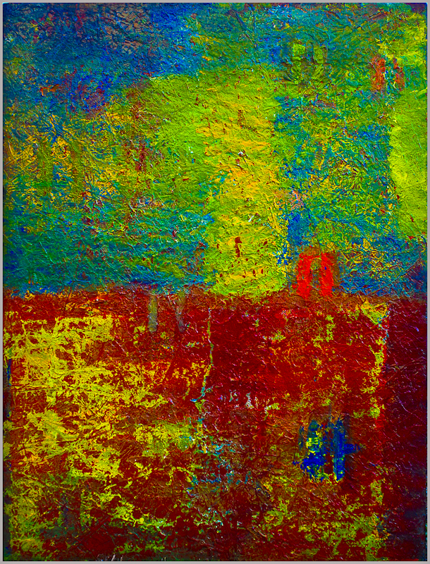
As I’ve mentioned before, I became a ‘painter’ for a while. I’d had no formal training, nor did I really know much about the history of painting as a representational or creative medium apart from having read about Carravagio and Picasso and van Gogh and Pollock. I knew what I was supposed to like, what I actually liked (van Gogh and Pollock!) and that was about it. Some of my photos hung in a gallery that also represented the Macedonian abstract painter Robert Cvetkovski, and it happened that he needed a place to stay while hosting a major exhibition of his work here in North Carolina, so he stayed with me for a few months. I watched him work and, being bored, decided to take a canvas and try to paint in a similar non-representative fashion. Hell, I thought, if he could do it, so could I. So I did, and, in my initial flush of excitement, foolishly thought I wasn’t bad at all. In fact, I talked the gallery owner into giving me a show, at which a pleasant, enthusiastic couple stood with me in front of one of my paintings and inquired as to my creative influences. It was at that moment I realized I was a poseur.
Basically, being the dummy I was (am) – and leaving aside the larger question of the Macedonian guy and his authenticity – I foolishly ignored the vast functional difference between what I was doing and what those did who created the genre of abstract painting, artists who sought to express deep convictions about life, emotion, and experience through what they knew about color, line, shape, and representation. My paintings of drips and blobs and primitive shapes – sometimes quite visually appealing – weren’t really art, because they weren’t authentic to me. They were, at best, decoration, which is what I see them as now, with the benefit of hindsight. I was mimicking creating ‘Art’, appropriating the symbols and modes of expression of others. I was a poseur.
Untitled, 2005. At Least I Didn’t Title it “Metaphysical Daydream Part 14“.
This concept of ‘authenticity’ provides us a way to differentiate legitimate art or action from those that merely pretend (the ‘pretentious’), those done in what Jean-Paul Sarte calls ‘bad faith’ – modes of expression not true to the artist or actor’s essential individuality. Authenticity is about using a form of expression that comes from within, not merely appropriating someone else’s form of expression. As long as what you’re doing is expressing who you are as opposed to signaling who you admire or who you think you should be to impress others, you’re not a poseur.
*************
Being true to your essential creative nature, as opposed to apeing other’s, can be frightening; you’re exposing the most vital part of yourself to other’s critical judgments, and other people can be clueless, mean, judgmental pricks [guilty as charged]. Sartre claimed that exposing your real self to the gaze of others could be so overwhelming it could cause mental, emotional and physical distress, what he referred to as “nausea.” Yet he saw this profound discomfort as necessary if you were going to be true to yourself ***. This was the price of being authentic. Sartre saw it as a process driven by discomfort, where to be true to your inner calling happened when the psychic embarrassment in being inauthentic became greater than the discomfort of expressing something true to yourself, in effect putting you out there for others to observe and critique. And that’s what happened to me: after that period of painting in ‘bad faith,’ after the profound internal embarrassment of standing in front of my work mouthing inauthentic babble about what ‘it meant,’ I made a decision to abandon the idea that my output needed to please or impress anyone but me…and in the process became a much better photographer and painter.
All this doesn’t mean you have to be completely unique, without influences – sui generis – to be authentic. I certainly have influences that show in my work. That’s the nature of creative expression – it always comes from antecedents that it can be linked to the current work and in some partial way help explain it without exhausting its meaning. Look at Trent Parke, the guy whose video I previously posted; if you’re a photography aficionado, you can see his influences, but those influences don’t define him. He’s added something to make what he creates his own. Likewise, it doesn’t mean you can’t be commercially successful. It doesn’t require you laboring in anonymity or critical irrelevance, trusting that someday someone will recognize you. It just means that you’ll need to ignore whatever commercial or critical pressures that encourage you to conform to anyone’s ultimate vision but your own.
Authenticity is the drive to achieve something from within, to create work you know feels ‘right’ as opposed to work that appeals to other’s sense of right. It manifests itself in devotion to your unique vision backed up with hard work to achieve it, the ultimate irony being that authentic expression usually appears effortless and belies the amount of work invested, while the inauthentic gives the unmistakable impression of “trying too hard.” The “Train Guy,” the guy I was critiquing a few posts ago, he’s trying way too hard.
*** Which begs the question: how can Sartre talk about being authentic when his entire philosophy is premised on the claim that we have no ‘true’ self but rather that we make it up as we go along?
That’s me, to the right, said “Old Man’ of the title to this piece. No question, I’m old. According to at least one of my readers, (I presume) a millennial, I’m also clueless, at least to the extent I’m resistant to newer manifestations of ‘photography.’ In response to my last post, he submitted a reader’s comment dismissing me as “an old man yelling at clouds,” the proverbial addled old guy standing in his bathrobe yelling at the kids playing ball in the street, the smug implication being that the world has long ago passed me and my kind by, and I should wake up, take note of the fact and move the hell out of the way while a new generation advances our notions of creative possibilities.
Specifically, my previous post concerned my off-hand dismissal of the “photographs” of a guy who authored a piece wherein he extolled the virtues of current digital photography tech and used examples of his work to bolster his claim that current digital technologies make it difficult to not take a great photo. I metaphorically face-palmed at his claim and the “photos” illustrating it. While I didn’t come out and say it, you could infer that I found the illustrating photos to be bad, bad in a way that only someone profoundly unaware of their aesthetic incompetence could produce. And then, after taking a deeper dive into his website, it turns out he’s a relatively well-known “photographer,” having shot stuff for all sorts of ‘hip’ publications. Holy shit, I thought to myself, has it come to this, that these hyper-processed, computer-generated in-your-face graphic simulacra are now what the millennial generation consider to be ‘photography?’ Is this what we now hold out as excellence, what current ‘photographers’ are aspiring to? No thanks. If you know the history of the medium and the necessary role photography plays in the visual arts and the larger culture, if you knew the etymology of the definition ‘photography,’ if you’d read Barthes or Sontag, if you’ve ever developed a negative and wet printed it, you wouldn’t tell me that what this guy is doing is ‘photography,’ because it’s not.
So I wrote about it; there was something unsettling about the fact that the mass understanding of ‘photography’ could have arrived here, at this point; that we’d gotten here, at a place so far removed from a traditional understanding of the medium…and nobody really notices, probably because they’ve come of age in the digital era – an era wherein graphic novels, video games, photo apps and augmented realities are “the real”; because they’re so profoundly ignorant about photography and its history as a visual art, and have no real understanding of the radical shift in consciousness this all entails.
*************
“C’mon in. Buy What We’re Selling. What Have You Got to Lose?”
Already in the 1930’s, Martin Heidegger warned of mechanized technologies transforming modern man’s internal life. For Heidegger the mechanical typewriter was a harbinger of a larger problem: by veiling the essence of writing and script, the typewriter “withdraws from man the essential rank of the hand, without him experiencing the withdrawal appropriately and recognizing that it has transformed the relation of his Being to his essence,” [italics mine] which is a convoluted Heideggerian way of saying that new technologies rob us of our creative powers without our even realizing it.
Obviously, we’re now infinitely advanced from the humble technological advances of the typewriter. Were he alive today Heidegger would go further, saying not only that we aren’t aware of our impoverishment by our technologies, but we’ve been duped into thinking that the very technologies that rob us of our creative autonomy are in fact enhancing it. We’re so mesmerized by the marketing hype produced around these technologies as a means to their replication that we’ve intellectually and emotionally refashioned our loss of autonomy as creative enhancement. It’s a textbook example of what the Existentialists called “Bad Faith,” “Stockholm Syndrome” with respect to technology.
*************
Above is a ‘creation’ of mine. I did it completely myself, if by ‘completely’ one means pushing a button or two and initiating an algorithm created and controlled by someone else to create the end result. Likewise with the self-portrait that leads off above. Twenty years ago I could have offered these ‘creations’ to you as evidence of my artistic skills, and you’d probably be impressed, although you certainly wouldn’t accept them as ‘photographs.’ But they are ‘photographs’ in the currently accepted sense of the term – they were generated by a camera and have some link, however tenuous, to the capture of light. (That’s me, standing in front of my bathroom mirror, the car a 71 Camaro I cycled past parked on a back road.) Now? Created with the push of a button, the rest done for me by a computer algorithm and AI, whatever link they once possessed to the real now completely severed. Anyone can do it. Welcome to ‘photography.’
*************
Why the old-man angst about inevitable technological advances? What’s at stake? it’s certainly not as simple as what I suspect digital millennials think is going on, that of resentment and inflexibility of those of us supposedly psychologically and emotionally wedded to outdated technologies and the concepts on which those traditional methods rest. It’s way more existential than that, something that’s been in the air since the inception of digital, something that forward thinkers have been warning was coming and is now upon us full-bore. It involves a fight for the real and photography as a means to document the real, recognition of the pernicious consequence of severing indexicality from photography, transforming the medium into a means of subjective expression with no link, however tenuous, to brute factuality. It’s about the ‘transformation” Heidegger sees occurring to us – to “Being’ -in this process, a transformation that’s two-fold: first, an increasing retreat of photographic consciousness from the objectively real into subjective virtual worlds, and second, the creation of those virtual worlds not by our own imaginations but imposed on us via the push of a button, the result of it all being a false consciousness confusing imaginative subjection for creative flourishing.
So, next time you smug technological sophisticates begin to feel all superior to us film era Luddites, take a step back and consider that some of us may have articulable philosophical and creative reasons for rejecting the more outre aspects of digital technologies, and those reasons may be grounded in legitimate concerns based on deep historical sympathies. In other words, we may know things, important things, you’ve never even thought about, and you may be wise to listen.